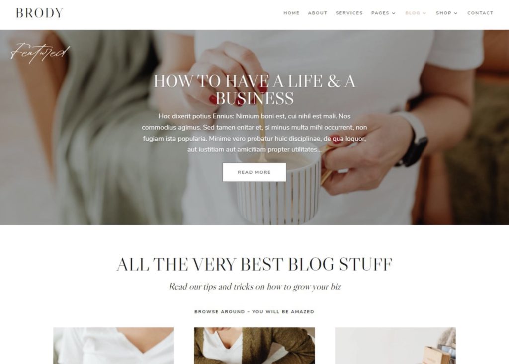
One of the first things visitors see when they arrive on your blog is the banner, which appears at the top of every blog page. An excellent blog banner, also known as a header, is a perfect blend between clean design and crystal-clear navigation to the blog’s inner pages. As a result, it’s essential to focus on best practices when designing a banner for your blog so that your visitors can quickly understand what your blog is all about.
In this article, we have compiled a list of top 10 tips for designing a banner for blogs and five mistakes to avoid when designing a banner.
Let’s get started!
10 Ways to Design a Banner For Blogs
Here are ten banner designing tips for designing banners for your blog.
1. Use clear, easy-to-read fonts in your blog banner
A blog’s banner text must be readable at a glance. Use short and simple words and pick fonts that are clear, visually appealing, and in relatively large sizes. Avoid using stylized fonts in banners as they’re difficult to read. Popular fonts for banner texts are Roboto, Lobster, Playfair Display, and Open Sans.

2. Emphasize the most important elements
Consider what you want blog visitors to do most when they land on your blog and make sure that this element is prominently displayed in the banner.
In general, banners include information that helps users engage with the blog more efficiently, such as,
- Logo
- Tagline
- Navigation links
- Social media icons
- Contact information
Consider which of these are the most crucial for your blog and place a greater emphasis on them.

3. Use a CTA (call-to-action) in your banner
After attracting the visitor’s attention, the banner must direct them to other pages of your blog. A CTA on the banner fulfills this. It tells users what to do next, such as “browse more try-on hauls,” etc.
CTAs on web banner designs reach 200% more people than banners without them. So, if you include a prominent CTA with straightforward action-oriented wording that prompts the visitor to click and visit other pages of your blog will help you increase traffic and engagement.

4. Use design elements that express the blog’s personality.
Color is one of the most important non-verbal communication tools available. It elicits powerful feelings and has a direct impact on likeability. As a result, color is an essential consideration while designing a banner for blogs.
Use colors and effects in your web banner design that match your blog’s mood. It’s preferable to stick to a three-color palette for your blog. If you go over this limit, your blog may start looking disorganized. Try not to use different colors and effects for the web banner design from the blog theme.
Moreover, men and women have different color preferences, so if your blog is gender-specific, it’s a good idea to do some research on color preferences before designing a banner. If your blog is unisex, use colors for your banner design that best represents your blog, keeping in mind that each hue elicits a certain feeling.
When it comes to ad banner design, use bolder colors to stand out and catch your viewer’s eyes.

5. Use drop-down menus
Drop-down menus in banners are ideal for blog banner designs as they give images plenty of room to shine. Many blogs have already adopted them when creating mobile websites, and they are becoming increasingly popular on desktops as well. Using a drop-down menu for banners lets you display your blog in an organized manner and cleans up a busy layout.

6. Use transparent banners for blogs.
Consider using a transparent banner for blogs with appealing visuals. This maximizes image exposure while still displaying important links.
If you’ve used a sticky banner, making it transparent on scroll can be annoying because as the visuals move, the background will move too. To avoid this, add color to the background, so viewers aren’t distracted from the links while scrolling graphics.

7. Shrink the blog banner on scroll to keep important information visible
The shrinking web banner design is an excellent way to keep important blog information accessible while reducing the amount of space banners take up while visitors scroll. They’re beneficial if you’ve created a large, impactful banner. As visitors scroll, the shrinking banner shows essential navigation items and the logo and changes color.
8. Add effects in your banner to navigate visitors.
Effects are important in designing a banner for directing visitors through their navigation. So, choose noticeable effects to draw visitors’ attention, but they should not be so visible that they become distracting. Some effects (such as a color change or an underline) are only visible on desktop computers, so make sure you choose effects that are also visible on mobile devices.

9. Pick a blog banner layout that flatters the logo.
As banners are often the first thing people notice when they arrive on the blog, having a logo is essential. When designing a banner, choose a layout that compliments the logo design. Normally, round and square shape logo designs look best in the center of the banner, and rectangular logos look good on the right or left side of the banner.
10. Change them up to keep your blog updated.
Web banner designs are pretty versatile and have a significant impact on the appearance of your blog. Updating your blog’s banner layouts is a great way to keep your blog looking new.
5 Common Mistakes To Avoid While Designing Blog Banners
Take a look at these five common web banner design blunders you should avoid:
1. Cluttered design
People frequently make the mistake of cramming too much information onto banners. They usually feature their complete bio, photos, and more. It’s important to note that the banner isn’t the best place for all of this information. A cluttered design can appear unclear to your viewers. So, make sure you keep the banner texts short, especially when creating the ad banner design.
2. Wrong size
Most people overlook the significance of selecting the proper banner size. It is important to remember that the banner is visible from afar, depending on its location. Furthermore, the information contained within it must be readable. And the only way to do so is if it’s the appropriate size.
3. A long or complicated message
Viewers who land on your blog and pass by your banner will likely only have a few seconds to read your message and comprehend its intended meaning. This is why you should always keep your message concise and to the point to be grasped quickly. It will not capture the readers’ interest and will turn them away if you make it too long and complicated.
4. Spellings and grammatical mistakes
One of the most annoying mistakes you can make when designing a banner is spelling and grammatical errors. The first thing people notice is what is written on the banner, and mistakes stand out easily. It can make your blog appear unprofessional and as if you aren’t paying attention to details. As a result, double-check the intended message before displaying the banner.
5. Using bad quality pictures
Pictures are said to be able to convey a thousand words in a single glance, and as visual creatures, we are drawn to stunning photographs. Most people overlook this factor, and as a result, their blogs do not obtain the results they require. Using low-quality images is not an excuse; there are numerous free and paid banner design websites and banner design companies where you can design your banners.
The Final Word
Finally, the style of your blog banner will be determined by the blog’s goal and the outcomes you wish to attain. To increase the effectiveness of your blog, you should always include a banner.
FAQs
A good web banner design has a lot of graphics or photos but not a lot of text blocks. It also uses colors that are complementary to the blog’s theme.
Any banner design company or online application can be used for designing a banner. You can also choose to hire a graphic designer.
The blog’s banner design is vital for optimizing the appearance of the overall blog, i.e., how it appears to visitors—this aids in user retention and greater search engine rankings.
Latest Blogs
Learn how to rank on AI search engines like ChatGPT, Perplexity, and Gemini by optimizing your content for authority, structure, and relevance. Stay ahead in AI-driven search with this strategic guide.
Explore the best healthcare SEO services for your medical practice. Improve online visibility and effectively reach more patients in need of your services.
Discover top social media agencies specializing in banking solutions, enhancing financial services and driving engagement.
Get your hands on the latest news!
Similar Posts

Design
7 mins read
15 Best Firms Offering Design Services in India

Design
5 mins read
All You Need to Know About Data-Driven Design

Design
6 mins read