11 Advertisement Design Tips to Cut Through the Noise (Using Examples)

Table of Contents
- What is Noise in Marketing?
- 11 Advertisement Design Tips to Cut Through the Noise (Using Examples)
- Key Takeaways
- Conclusion
- FAQs
The typical person views 10,000 ads every day. The human brain couldn’t even process all that data, let alone apply it to alter their purchase habits. Despite the number of marketing messages, marketing is compelling and profitable when done correctly. So, how do you do it correctly?
It’s difficult to ignore the constant barrage of ads. Consumers are better than ever at shutting out promotional advertising, but one that fails to convey the product’s core message is ultimately unsuccessful. Too long or sophisticated ads lose viewers’ interest, yet too brief ads may not generate enough interest.
It’s hard to predict consumer preferences, but it doesn’t mean you have to strive to please everyone. Brands need to send compelling, targeted messaging. It’s more challenging to know what that message should be and how to communicate it. It’s not easy to create balanced marketing material. While there is no magic recipe for designing the ideal commercial, some traits might make your message stand out.

What is Noise in Marketing?
Anything that detracts from your brand’s central message is marketing noise. Marketing noise comes in many forms. In the first case, an ad is overstuffed with text, pictures, numbers, or other material. The “noise” or clutter prevents your message from being seen or understood. A poster ad with too many words may mislead the viewer about which content to read first and what you are truly offering. Too much information might overwhelm potential customers.
Consider your audience’s attention span – you have only seconds to gain their attention. Even if you capture their attention, a crowded design wastes time and prevents them from understanding your crucial message. If you don’t pay attention, you’ll lose their attention. Have you noticed how many commercials play before a YouTube or Facebook video? The growing quantity of social media advertising shows that businesses are more eager than ever to sell their goods and services. So you’ll have to put in efforts to get recognized. But if you play your cards well, you can get there quickly.
11 Advertisement Design Tips to Cut Through the Noise (Using Examples)
Your design must sell your copy before your text can sell your goods. In advertising, your design draws the audience’s attention to your document. Then it’s up to your copy to keep them interested.
Here are 11 advertisement design tips with examples to help your company stand out from the crowd. Read on to create innovative advertisements that turn viewers into buyers.
1. Make your presence known
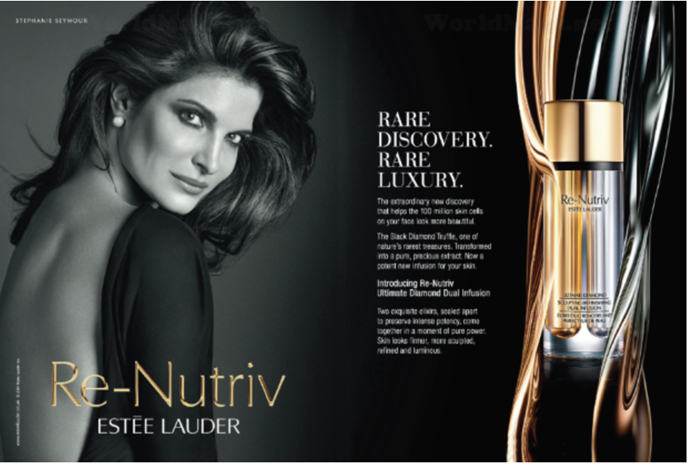
If you want people to pay attention to your ad, you must stand out from the rest of the competition by being unique.
Even if your rivals may have already jumped on the current marketing fad, it might be tempting to follow suit. That which everyone else is doing must work, after all. If you want to hold an audience’s attention, though, you must fight this temptation.
Cliches are a turn-off. Their inability to stimulate the frontal cortex—the region of the brain responsible for feeling emotions—saps the inventiveness of your commercial. However, how precisely do you come up with an innovative ad?
Take, for example, one of Estée Lauder’s print ads from the 1960s. L’Oréal, Revlon, and Helena Rubinstein produced bright magazine advertising before Estée Lauder. Beauty ads were always stunning and full of color. However, even though they were striking at first glance, viewers quickly became tired of seeing the same old commercials. They began to merge into one another.
With full-color beauty advertising filling publications at the time, Estée Lauder decided to do something “radical,” “dumb,” and even “ugly.” They realized that no one could distinguish between the brands anymore. So, they ran their commercials in sepia.
Estée Lauder’s foray into print advertising was met with some skepticism, but the company’s ability to be creative helped it stand out from the pack and get 25% more replies than their prior color print ads.
2. Concentrate on the benefits, not the features
A feature is anything that sets your firm apart from the competition. When consumers compare service providers and make purchase decisions, features are critical considerations. This can be one of the finest advertisement design tips. On the other hand, advertising requires you to reach a large audience, many of whom may not be aware of your company or need your products or services.
As a result, promotional elements might be ineffectual and unduly pushy in their message. With that said, it is significantly more effective to communicate the product’s advantages than its drawbacks.
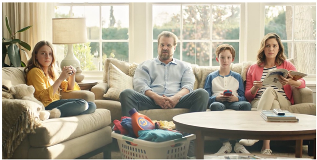
In their Super Bowl ad, Tide effectively illustrates this concept. If they wanted to explain how their product works, they might have done so by showing a dirty shirt being cleaned. Instead, they concentrate on what they have: neat, clean clothing featuring a hero from a super-hit series (“Stranger Things”). They even joke about it by referring to it as the #ItsaTideAd campaign.
3. Humor is a great way to get your point across
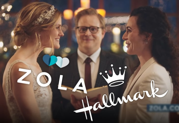
Humor is one of the most powerful advertisement design ideas because it elicits a favorable emotional response. Advertising is the most pleasing way to make your products and services memorable. Another thing it might do is correlate the memories with happy feelings.
Zola uses this in their wedding website commercial. Everyone knows they’re in time for celebration when it comes to weddings, but Zola takes a different approach by making the audience laugh at themselves. Couples chat about the details of their wedding, which Zola may assist them with, instead of visualizing deep “I dos.”
4. Communicate a single message – and just one message

Advertisers believe that including additional advantages and features would increase their conversion rate. If you want to get people’s attention, you can’t just stuff an ad full of content into it; that’ll only make them think twice about it.
Consider using one message per ad to catch people’s attention and urge them to read the remainder of the ad. Highlighting your product’s primary benefit, feature, or service makes it easier for your target audience to comprehend its value. It is a good ad design idea that increases the likelihood of them doing business with you because even after they see your advertisement, they will remember only one message that pertains to the primary benefit or feature of your product or service.
A single line of language and a simple image explain the value of Citizen’s Eco-Drive watch to its audience: a look that never requires a battery.
5. Make it visually appealing
Infants use visual cues like a ball indicating playtime to make associations between items and their associated actions. The only way to learn about the world is by seeing. You can process visual information in under 250 milliseconds, and your optical system is activated by more than half of your brain. Using visuals to convey information is the most effective approach for understanding concepts and facts.
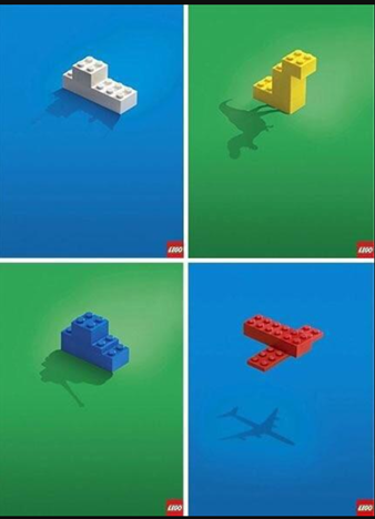
With simply two pictures — a simple LEGO block design and a depiction of the shadow of a dinosaur, war tank, ship, or airplane — LEGO’s commercial conveys its central message: everything is possible with LEGO. This is a fantastic example of the finest advertisement design ideas.
6. Be familiar with your target audience
If you don’t know who your audience is, you won’t get their attention.

A clothing brand Pop Fit specializes in legging designs for women of any size or shape. Their primary demographic is women who are underrepresented in the fitness industry and have trouble acquiring sports clothing. It’s a deal-maker for these ladies to see someone who looks like them in an advertisement – one of the exemplary ad design ideas.
7. Make use of exaggeration
An ad for Nikol Paper Towels displays fresh and dry apricots, showcasing how a simple paper towel that drains moisture can turn them into dried apricots.
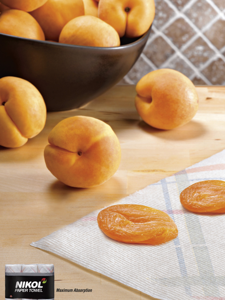
One of the finest ways to include wit in your advertising is to exaggerate the benefits of your product in a humorous and evident way. It will grab your audience’s attention and elicit an emotional response from them. Wit and humor are the best ad design tips.
For example, Nikol’s paper towels can’t convert apricots into raisins. Still, this ad demonstrates the product’s absorbency so clearly and creatively that it didn’t require them to write a single line.
8. Don’t just tell, show
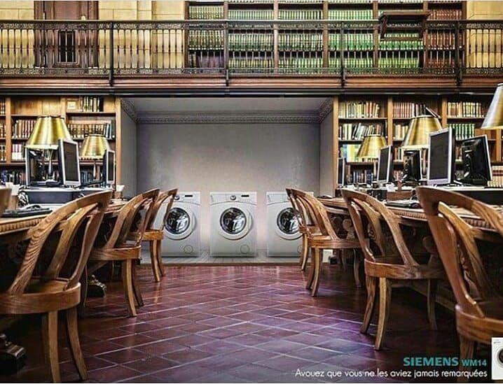
This Siemens advertisement features washing machines in a library. It’s considerably more intriguing and engaging to show your audience something than to tell them about it. As a result, your audience will enjoy the challenge of deciphering what you’re saying. This is one of the greatest ad design tips.
The quietness of Siemens’ washers and dryers is demonstrated in an unexpected location, such as a library, in the innovative commercial that promotes the company’s product.
9. Switch connotations
This Heinz ad shows= someone gripping the ketchup bottle with an oven glove.
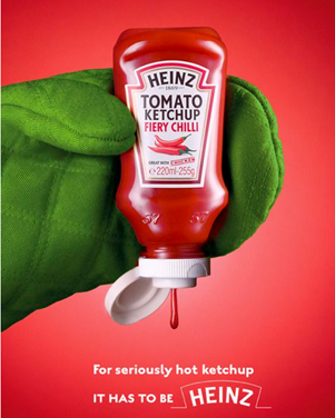
In food, “hot” can refer to both a high temperature and a spicy flavor. Heinz’s clever use of the high-temperature connotation to emphasize the spiciness of their ketchup drew immediate attention to the brand’s value proposition.
Heinz ketchup used the word “plant” in another ad to promote their new plant bottle packaging, which has multiple meanings, including planting a tomato seed, planting a seedling, or simply placing a bottle on a table. Such advertising goes directly to the heart and minds of the people who see them or use their products. It is undoubtedly one of the finest examples of advertisement design ideas.

10. Authenticity is key
As indicated by its “judgment-free zone” policy, Planet Fitness has long sought to make fitness less terrifying and more accessible to individuals.

People are encouraged to be themselves as part of that purpose. They published this video commercial introducing improved sanitizing methods when several of their facilities opened in keeping with tradition. This video depicts a group fitness class where the participants are dancing despite their inhibitions. Ads like this one are an excellent way for Planet Fitness to spread the word about their brand.
11. Create a game out of your advertisement

Predictable ads are too easy to grasp and hence too dull to engage people. With this in mind, removing predictability from your ads forces your audience to think harder about your message, causing them to pay closer attention.
Making your commercial into a game is one of the finest methods to engage your audience. Your audience may earn an intellectual reward by spending the proper mental energy playing your brand’s game and absorbing your advertisement’s message, which most people won’t pass up. Take this Mazda commercial as an example.
Key Takeaways
- Authenticate your narrative: Making a brand identity goes beyond logos, taglines, and package designs. Your brand represents everything you do, from product creation to client use and eventual discontinuation. Then they will think about your brand. That image might be uninteresting without a story. Associate your brand with a narrative.
For example, you might describe how your company began or aided consumers. We need stories to communicate. Stories may help clients learn more about your brand than just your name, products, and tagline. Create captivating films to share your narrative instead of just articles. If you haven’t figured out your brand’s narrative yet, getting to know your consumers better will help.
- Understand what your consumers value: Identifying your target market’s goals and requirements is a primary marketing strategy stage. But you may go farther by knowing marketing psychology. Knowing your clients allows you to adjust your advertising plan to appeal to them.
Approving their community is a specific method to gain their attention. People in communities typically share values, and communicating those beliefs may help you create relationships with potential customers.
Keeping up with trends is part of knowing your customers. Millennials and Gen Z strive for brands that are ethical and ecologically sustainable. If your product is targeted at a specific demographic, you should source from ethical sources and use eco-friendly packaging.
The power of storytelling may help you build strong business relationships.
- Be proactive and deductive in your digital marketing efforts: When selecting a digital marketing channel for your company, keep in mind your target demographic and the type of your organization. If your firm is related to art or design, you should use photo-sharing social media like Instagram. But some marketing channels, including a website and email, are required for any firm.
Digital marketing involves keeping up with search engine optimization (SEO) changes, upgrading your website to improve the consumer experience, and sharing news, photos, and videos on social media.
Deductive reasoning involves analyzing data from your website, social media, and email marketing initiatives. And the most clicked ads? How many clicks resulted in sales? Who responded to your ad? Using primary campaign data will help you create better ones.
- Give your clients an unforgettable brand experience: Don’t just strive for more sales. Strive to become the go-to firm for customers. Having a great product isn’t enough. Escalate and handle any inconveniences that may cause individuals to give a second thought to their buying choice. Buying your stuff should be straightforward. Having a functional and intuitive website helps. Training and using the newest technology are additional options. In this case, you may use chatbots to ensure that your clients can always reach you.
Remember that first impressions matter when creating a client-customer connection. A solid first impression will lead to recurring business and referrals.
Conclusion
Your brand competes with noise from your crowded commercials, an indistinguishable marketing message, and the ads of your competitors. Distinguish yourself from the competition by sharing a real narrative, knowing your audience, being active and engaging on digital marketing platforms, and providing an exceptional brand experience.
FAQs
Stop selling and start assisting your target market
Share your knowledge
Focus on the target demographic
Marketing function advancement
When it comes to innovation, walk the talk
Pick your target market.
Perform market research
Select your platform and ad format
Achieve brand or product awareness
Create a memorable message
Amass creatives
Customize videos
Use stunning images
Advertising design is the development and organizing of visual artwork used in product and service advertisements. Advertising designers are creative and understand marketing and how to sell products and services visually.
“Creative design” encompasses more than simply aesthetics or graphical drawings. Beautiful and appealing graphics that your consumers will enjoy are the goal of outstanding design.
In marketing, “noise” is too much promotional clutter, which makes customers tired of it and forget specific messaging.
White noise is described as meaningless background noise that drowns out all other noises. Every ding, ping, and notification can turn a potential client away.
Environmental, physiological, semantic, syntactical, organizational, cultural, and psychological noises are examples of noise.
Latest Blogs
Learn how to rank on AI search engines like ChatGPT, Perplexity, and Gemini by optimizing your content for authority, structure, and relevance. Stay ahead in AI-driven search with this strategic guide.
Explore the best healthcare SEO services for your medical practice. Improve online visibility and effectively reach more patients in need of your services.
Discover top social media agencies specializing in banking solutions, enhancing financial services and driving engagement.
Get your hands on the latest news!
Similar Posts

Design
7 mins read
15 Best Firms Offering Design Services in India

Design
5 mins read
All You Need to Know About Data-Driven Design

Design
6 mins read