
Email newsletters remain one of the handiest online marketing tools used by brands worldwide. What has kept changing over the years, though, is the approach taken to create newsletter content. Many marketers underestimate the art of creating a company newsletter, and are unaware of just how much goes into newsletter design.
8 Best Ways to Make a Newsletter
We’ve compiled a list of pro tips to help you discover the best way to create a newsletter that is engaging and interactive. It will also help improve your open as well as click-through rates, and won’t take you eons to create.
1. Define your reasons
Before you start making a newsletter in Word or any other platform, it is important for your business to define why you need the newsletter.
Email newsletters serve multiple purposes. For example, some are used to generate B2B leads. Others are designed to retain customers or are meant to increase revenue on ecommerce websites. The content and design aspects of the newsletter will depend entirely on the purpose it will serve, which is why this ought to be your first step in building an attractive newsletter.
2. Get inspired
While it is true that originality is one of the most essential factors in any sort of creative marketing, knowing what is currently trending in the market is a great way to get some much-needed inspiration before creating a company newsletter. This includes spending some time checking out what your competitors as well as others from unrelated business spaces are successfully doing to engage with their customers.
3. Pay attention to the colors and fonts
The colors and the fonts you use in your newsletter have a lot to do with grabbing the attention of the reader as well as with brand recall. Ideally, the color scheme for the fonts and borders ought to be the same as that of your logo and other branding collateral. Using this will help build a brand identity, and will make your subscribers think of the brand every time they see those colors. A great example of how colors help brand recall is how Coca-Cola is identified by red and white, while Pepsi always uses blue.
The font type that you use in your newsletter is also equally important. The prime objective when choosing a font is to keep the newsletter legible. Therefore, it is advisable to use commonly used fonts such as Arial and Times New Roman. You also do not want to visually overwhelm the reader. This means you ought to limit the number of fonts you use in your newsletter to two.
4. Keep it short and simple
People lead busy lives with packed schedules. What this translates to is that no one has time to read lengthy content. That is what your company’s blogging microsite is meant for. Keep the copy on your email newsletter short, crisp and intelligent. Always make sure you have a clear and bold header to start the newsletter off. Mentioned below is an example of a well-designed email newsletter.
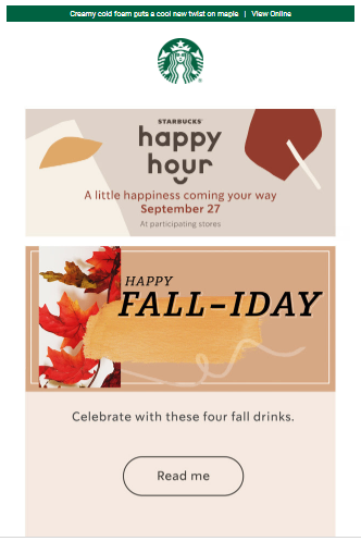
If there are multiple messages you need to convey, use subheadings to segregate them. Make sure you use the same font as that of the header, but a smaller font size. Along with these subheadings, segregate the content using sections or stacks. It will make for a more pleasant reading experience.
Keep your newsletter writing basic and simple as well. Using complicated words is often frowned upon as being bougie or pretentious. The last thing you want to do is confuse your subscribers. In keeping with the ongoing theme of simplicity, limit the call to action in each newsletter to a single one. Too many links to click on means too many choices, and in a lot of cases, that just confuses customers and convinces them not to do anything.
5. Use catchy images
Smart copy alone isn’t sufficient to keep your subscribers engaged. You need to offer additional visual stimulation to pique their interest. A lot of companies use custom images that align with the text to do the job. However, not everyone has the right photographs lying handy all the time. The use of custom graphic images works just as well.
Of course, there has been some evolution in the use of images as well. Email newsletters no longer use static images. The best way to make a newsletter that grabs the reader’s attention now is by using animated GIFs instead. The use of animated GIFs is becoming more popular because it is easier to catch the attention of a reader with a moving object instead of a static image. In fact, using an animated GIF as a CTA increases what marketing gurus call “clickability.”
The use of animations is not limited to images alone. Some brands, especially in the fashion and apparel industry, have taken this to the next level by including interactive product galleries in their newsletters. Subscribers get to not only view products on these galleries, but they can also look for sizes and colors, all without leaving the email. If they click on the “Buy Now” or similarly named CTA tab, they’re led directly to the checkout section on the website.
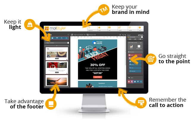
6. Keep it light
40% of all subscribers lose interest in a page that takes more than three seconds to load. From a design perspective, this implies that the use of graphics, animations, images, and other eye-catching elements must be applied in a way that makes sure that the content does not take too long to load on any device.
7. Make it mobile-responsive
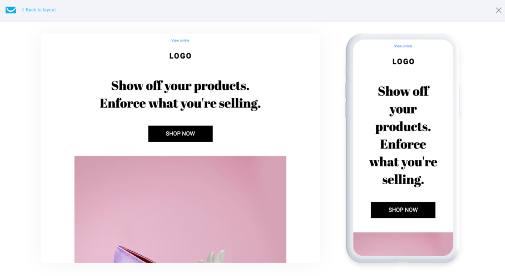
People nowadays are fluid when it comes to devices. In a single day, they are likely to switch between mobile phones, laptops, desktops, and tablets multiple times. Over 50% of users prefer using emails to communicate with brands, and 50% of all email campaigns are read on mobile phones. This means your email newsletter needs to be optimized to open on all of these devices seamlessly, without compromising on the experience the reader expects.
8. Use technology
Doing everything that we’ve spoken about in-house is going to be challenging. In many cases, it may even cause a strain on resources. Fortunately, you have multiple service providers that specialize in different aspects of email marketing to help you along the way.
For example, companies like Mailchimp and HubSpot offer email templates and a host of other email-related services, including marketing services. Companies like SmartWriter and EmailTree AI can help you create personalized newsletters, helping you build a more solid relationship with your customers. So, spend some time exploring the multitude of tools and services that can help make the look and feel of your email newsletter more vibrant.
The way email newsletters engage existing customers and help acquire new ones will keep evolving, with newer technologies and customer behavior dictating shifts in trends. This makes it important for businesses to constantly stay abreast with these changes and evolve their marketing strategies accordingly. Change, as they say, is the only constant.
Key Takeaways
- Well-designed email newsletters have better click-through and open rates.
- In order to design a great newsletter, you need to know its purpose, be it lead generation, customer retention, sales, or anything else.
- Colors used in the newsletter ought to represent the brand. It is best to use common fonts and restrict the number of fonts used to two.
- Images speak louder than words. Newsletters also use a lot of animation to increase customer engagement.
- Email newsletters should be optimized to open quickly and on multiple devices.
- There are multiple service providers that help make the process of designing attractive newsletters easier for businesses.
FAQs
Here’s what every email marketing strategy should inculcate.
– Define your email marketing goals.
– Align email marketing with other digital marketing strategies.
– Maintain a fluid process that can easily change to mirror market trends.
Simply put, customized content has been shown to increase both customer retention and revenue. Considering the amount of marketing emails people receive, they are likely to remain loyal to brands that show they recognize them and value them.
While there are AI tools that help with personalization, it is essential for the business to create valid customer profiles based on age, spending habits, most purchased products, and other details to help design better content.
BuzzFeed has one of the largest numbers of newsletter subscribers. One of the main reasons for that is that they offer a variety of engaging and interactive content to choose from, ranging from cooking tips to a weekly subscription of nothing but cute cat videos. This makes it one of the most successful newsletters today.
Latest Blogs
Learn how to rank on AI search engines like ChatGPT, Perplexity, and Gemini by optimizing your content for authority, structure, and relevance. Stay ahead in AI-driven search with this strategic guide.
Explore the best healthcare SEO services for your medical practice. Improve online visibility and effectively reach more patients in need of your services.
Discover top social media agencies specializing in banking solutions, enhancing financial services and driving engagement.
Get your hands on the latest news!
Similar Posts
B2C Marketing
5 mins read
Top Choices for Best Content Marketing Services in B2B Industries
Artificial Intelligence
5 mins read
How A Lead Generation Specialist Can Use AI-Powered Content Funnels to Drive Conversions
Artificial Intelligence
4 mins read