Demystifying Email Design: How to Create Impactful Emails

Email marketing is essential for building relationships with prospects and leads, in addition to existing and past customers. It enables you to speak directly to them at a time and place that suits them most. Demystifying email design becomes imperative, so that more and more people, including content creators and marketers, can derive maximum value from their email marketing efforts.
Similarly, the need for demystifying design thinking stems from people’s growing detest for marketing emails. But as a content creator or marketer, you can’t ignore this marketing technique. Keeping this in mind, we present an overview of email design, along with some time-tested and expert-approved design tips for creating impactful email templates.
What Are Email Templates?
An email layout or template is a pre-written or pre-formatted email that allows you to create and send email campaigns quickly and easily. All you need is to replace the images, text, and other elements in the template with the ones you want to use, and you are good to go.
Templates save a lot of time and effort, as they eliminate the need to create an email from scratch. You can upload your photos, modify the text, and choose relevant and new content that is appropriate for your subscribers. You won’t have to decide how your email should appear, where to insert your images, or how to write the text; the template will act as your guide. And since you won’t be spending time brainstorming the email design, you will have more time to work on the message.
Also, using an email design template means you won’t need to double-check the formatting. This is a boon for most users, as it’s common to miss important sections or make mistakes in formatting when creating marketing emails from scratch.
Why Does Email Design Matter?
Gone are the days when emails resembled office notices. Today, they are designed to be visually attractive and interactive. So, whether you want to create your own marketing email or are looking for a free or paid template, it’s important to make sure the design is great.
The world we live in is filled with information. So, no matter how passionate your audience is about your brand, they won’t want to go through all the information you provide them with. People simply don’t have the time for it. So, they prefer to gloss over content instead of reading it word by word.
But then, you can’t realize your marketing goals without your audience consuming the information directed at them. This is where custom email design templates come in handy. With the right template, you can not only entice readers but also guide them through the email’s content in a way you desire. This will allow you to relay your message without hindrances, and drive success. That, however, isn’t the only reason. Here are some other reasons that make email design so important.
- It helps grab the audience’s attention.
- It can be used to promote brand identity.
- It helps build a connection between the audience and the brand.
- With an impactful design, you can create a lasting impression.
- With the right email layout and content, you can also make your readers convert.
Try to create the best email designs, so that they can act as a solid foundation for all sorts of marketing strategies.
8 Important Components of an Email Template
Email design can be divided into multiple vital components. And all the aspects together contribute towards a pleasant user experience. Note that every element listed below plays a key part in how an email is perceived.
1. Copy
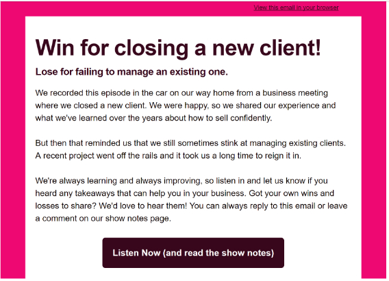
Writing newsletters for companies is not easy. However, it can be made simpler by following a few tips. To make your content shine, break it into smaller sections of text, use headings and subheadings, and keep the alignment consistent. You must also include visuals, such as infographics, images, and videos to support the content and make the reading experience not just enjoyable, but also memorable.
2. Layout
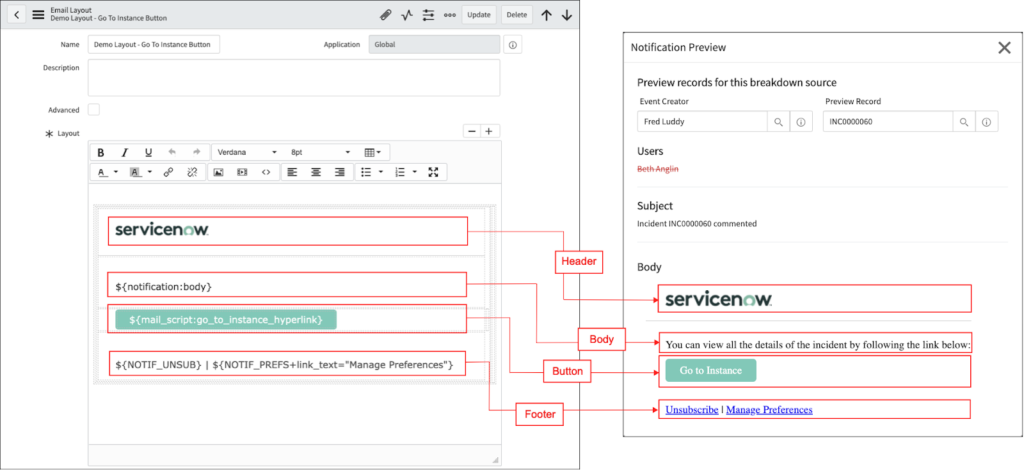
A well-planned layout lays the foundation for a great marketing email. Without a good structure, your email design would simply fail. To ensure your email layout is solid, consider having separate logical divisions to enhance its visual appeal. Make sure the header, footer, and body are easily visible.
Opt for a single-column layout if possible; it will make the information easier to grasp while scanning. Besides, single columns easily adapt to different screen sizes. Also, having a single column means preventing mixed reading paths. Finally, don’t forget white space. Offering some breathing room is important to make readers stick around.
3. Subject lines
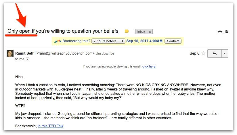
Subject lines are extremely crucial because they act as visual focal points for those who usually skim through content. You need headings for every block of text with an individual idea. A heading offers an overview of what the content is all about. You don’t need to use a special typeface, color, or other decorative features for headings; keep them as simple and crisp as possible. Remember, when it comes to headings, the simpler, the better.
4. Links
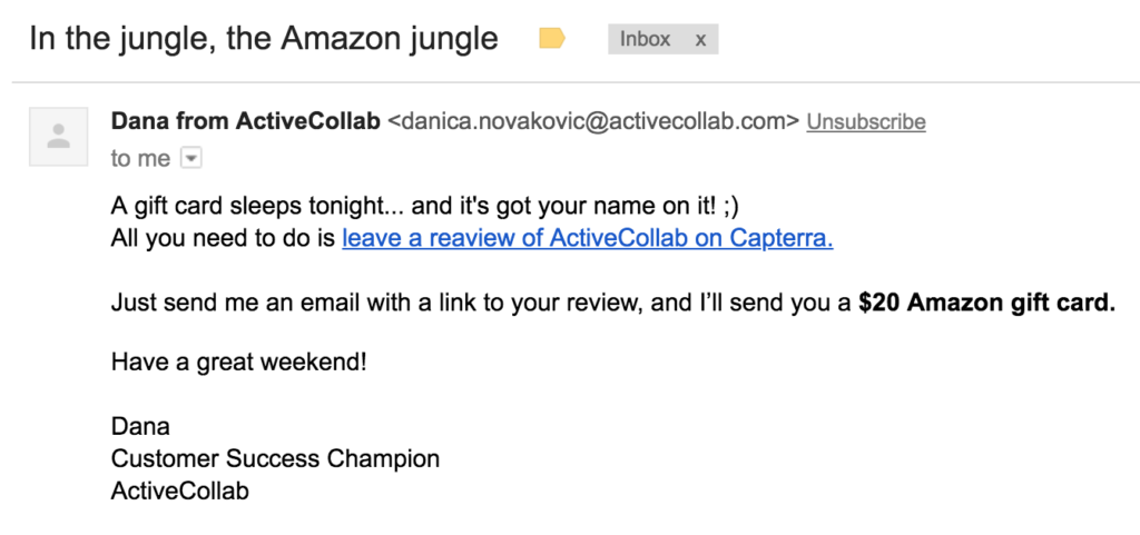
Links should look like links: blue and underlined. However, in case this convention doesn’t go with your color scheme, you can experiment with other stylistic options. Just make sure you don’t over-decorate any link you use.
5. Calls to action
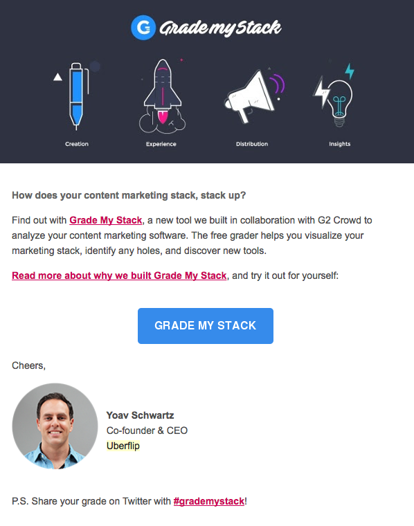
When demystifying design for emails, we felt call-to-action (CTA) buttons deserved a special mention. They are one of the most vital elements involved in designing an email template. Make them so catchy that they act as magnets and guide the audience to your landing pages. If you check some of the best email designs online, you will notice how prominent and attention-grabbing their CTAs are. Make sure the CTA has action words to tell users what exactly you want them to do.
6. Visuals
Illustrations, images, animated GIFs, icons, and even emojis: think about all the tools in your kitty, and choose from them wisely. Visuals help grab users’ attention, engage them, arouse their interest in the brand, and make the message memorable.
7. Color
Every color relates to an emotional experience. And that’s why you can immensely benefit from color psychology when designing an email template. You may choose from one or more color schemes, depending on your target audience’s demographics.
8. Typography
Typography has a significant impact on readability, user experience, and aesthetics. And that is why your email’s fonts should be carefully chosen.
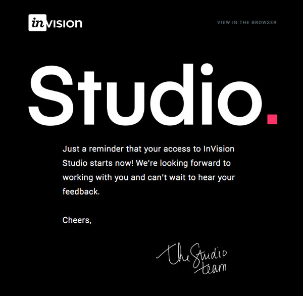
Different font families relay different meanings and relate to different emotions. For instance, while sans serif fonts feel casual, serif fonts look more elegant and sophisticated.
9 Tips for Designing a Highly Impactful Email
A brand should aim to design high-converting emails. Here are some tips and tricks to help you create one for your next email campaign.
1. Concentrate on the message
Remember, you only need one message for one email. Too many messages in a single email will distract the reader. You can use a series of newsletters for all the information you want to provide. Note that a complicated email layout stuffed with content could be hard to understand, and hence, won’t add any value to your campaign. So, it is imperative to focus on one message at a time and make sure it is conveyed well.
2. Create content with utmost care
Keep the text brief and concise, as people have limited attention spans. The most crucial information should be at the top of the page, where it will be most visible. You can also emphasize critical details with bold typography, headings, and color.
3. Format your text properly
To make your copy easily scannable and easy to digest, you can use headings and bullet lists. They help break textual monotony as well.
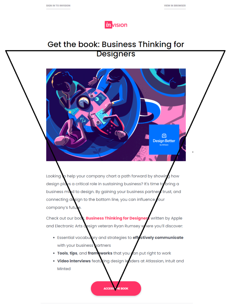
4. Use the inverted pyramid rule
For conveying the message, you can use an inverted pyramid. Although simple, it is highly effective and is perfect for single-message emails. You can also use it to send a newsletter with multiple messages. In this method, the topmost part is used to grab attention, followed by the body copy that is used to build curiosity, and lastly, a strong CTA.
5. Align your email design with the occasion
You need to design the email depending on the event. For instance, a Christmas sale email will only make an impact if it has a fun and peppy design.
6. Make unsubscribing an easy activity
Never keep the “unsubscribe” button hidden. Make it easy for people to opt-out. This will foster good relationships and help keep your subscribers happy. Also, add links to your support page, privacy policy, and social networks to provide customers with an easy way of reaching you.
7. Make it uniform
Your email is a reflection of your company. So, it should be consistent with your brand image. If possible, align your email with the landing page design. This will ensure consistency and trust, which can help increase credibility.
8. Make it mobile-responsive
A mobile-responsive design will increase customer retention. After all, too many people now check their emails on their mobile devices. Your email template design should, therefore, adapt to all possible screen sizes. Also, accessibility is key in making an email campaign successful. So, keep the design light; there will be a lot of people reading your email with a bad internet connection.
9. Test
Tests are a must. It doesn’t matter how impressive your email design is; it could fail miserably if it doesn’t resonate well with your audience. It could be that your colors are not suitable, images are boring, or the typeface isn’t right. You should always run A/B tests and examine the results to adjust your CTA, images, colors, and more.
Demystifying email design is key to creating emails that convert. Remember, your brand identity is your face in the business world. And your email design should mirror it accurately. It must represent your company in a way that your regular users become your brand’s advocates. With intelligent design, you can make your email stand out in a crowd of emails.
Key Takeaways
- Demystifying design thinking is important to help content creators and marketers view email design from a reader’s perspective.
- The best email designs are those that make readers inquisitive.
- Templates save time and reduce the effort required to create an email.
- The most important components of email design are structure, typography, headings, visuals, and the like.
- Keep your email content crisp and concise for improved readability.
FAQs
An email template is a pre-formatted email that can be customized as per need.
Email design is imperative for capturing the attention of readers. It is also vital because it allows readers to navigate the content as the writer intends.
Some of the most important elements of email design are color, typography, copy, structure, visuals, and so on.
The most effective way to make an email clickable is by aligning its design with the message so that it strikes the right chord with the audience.
Embedding videos in emails can improve open rates and click-through rates. But make sure you have optimized your clip for your email, because heavy videos can make your email difficult to load.
Latest Blogs
Learn how to rank on AI search engines like ChatGPT, Perplexity, and Gemini by optimizing your content for authority, structure, and relevance. Stay ahead in AI-driven search with this strategic guide.
Explore the best healthcare SEO services for your medical practice. Improve online visibility and effectively reach more patients in need of your services.
Discover top social media agencies specializing in banking solutions, enhancing financial services and driving engagement.
Get your hands on the latest news!
Similar Posts

Email Marketing
6 mins read
11 Tips to Design Impactful Email Banners

Design
9 mins read
7 Benefits of a Simple Mailer Design

Email Marketing
7 mins read