Design 101: How We Designed a World-Class AI-Powered Content Tool

A copywriter running out of headlines for his/her social media ads is looking for a tool to make life simpler.
A content strategist wants blog ideas to fill up their content calendar and quickly move on to the next thing on his/her to-do list.
An e-commerce brand manager wants to generate product descriptions in bulk, fast.
So many use cases across several personas. All of this made it adequately clear to us that Peppertype.ai needed to be a tool that can be used by beginners as well as advanced users, familiar with such tools.
What Is Peppertype?
Peppertype.ai is an AI-powered instant content generation tool that lets YOU create high-quality original content at the click of a button.
If you write any content on the internet, Peppertype.ai is your new best friend.
Imagine this as a fountain of never-ending creative ideas, taglines, descriptions, bios, and other forms of copywriting that you can tap into whenever you wish.
Why Peppertype?
Peppertype.ai is an AI-powered copywriting tool that helps you write better and faster. It draws on the experience of copywriters and artificial intelligence to generate crisp, clear, and engaging content.
The service helps take us a step closer to our dream of a full-stack content creation platform and makes the content creation process more innovative and seamless! In fact, Peppertype.ai will be the first of many in the stack that we aim to build for our friends, spearheading content as creators or businesses.
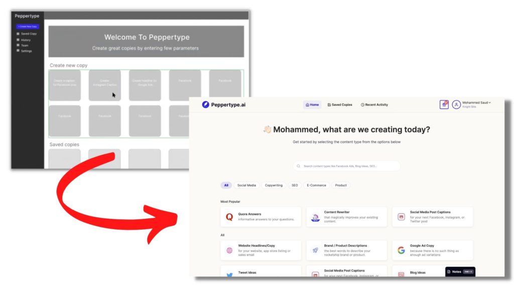
Peppertype.ai aims to hold your hand in the content creation journey thanks to its intuitive UI and simple UX. We’ve been listening to all your feedback over the last one year, the good and bad, and this led to us documenting our process!

The Process
Competitor Analysis
As we ventured into creating this new tool, we realized there are one too many competitors in the space doing the same thing. How would we stand out? After a lot of deliberation and research, we came to an understanding that the Peppertype.ai design could be a real differentiator. Why?
Competitor products were too cluttered, and customers needed a product walkthrough to understand their features.
The solution was staring us in the face. We had to build a simpler AI content generation platform while ensuring it revolves around content. Our primary goal?
- It would have to be self-explanatory
- Our customers should get value from the platform quickly
To do this, we had to come up with three key design pillars for Peppertype.ai.
The Three Design Pillars
“You cannot overestimate the unimportance of practically everything.” – Greg McKeown, Essentialism: The Disciplined Pursuit of Less
Minimalism
From lifestyle choices like how much to buy and what to eat to how to design the UI of the next app you’re working on, minimalism is the mantra of our times. Essentialism, then, is an extension of the same idea.
What you leave out is as important as what stays on the page.
Our competitor analysis further solidified the fact that most products showcased all their features to the customer without keenly focusing on the primary features that the end-user actually wants.
As the Pareto Principle goes, 80% of your customers use 20% of your product. It also leads to cognitive overload or is unnecessarily complicated or confusing for the end-user.
Design tip: “If the amount of information given out exceeds the user’s capacity to process it, the design has a cognitive overload. Complicated, busy, confusing interfaces cause cognitive overload.”
We decided to change that by focusing on the 20% our customers genuinely needed. Our motto then became ‘Content is King’, so we would help our customers generate content. The idea was to onboard our customers one feature at a time instead of overwhelming them.
Content generation would be our key area of focus instead of features like editing, sharing, or collaboration.
Stick to the essential. Be minimal. Keep it clean.
Ease of Use
“Ease of use may be invisible, but its absence sure isn’t.” – IBM
Design teams define specific metrics per project—e.g., “Users must be able to tap Find within 3 seconds of accessing the interface.”—and aim to optimize ease of use while offering maximum functionality and respecting business limitations.
Our vision behind ‘ease of use’ was simple:
- how self-explanatory can we make the tool
- how can we help users generate content with minimum inputs
- how do we create a seamless experience for beginners and professionals alike
Were we able to achieve this? A good way to measure the success of ‘ease of use’ is because we have a lean customer service team managing 200K+customers globally – and we hope to keep it that way. With very few customer queries coming in, we know that we’ve managed to build a tool that requires minimal customer handholding.
Design tip: The irony is that designing for ease can be difficult! Building an intuitive product requires one to start with a completely fresh mindset, strip back all our perceived ideas and beliefs, and understand our user personas well.

We deliberately gave the background of the landing page a yellowish tinge on which you can “write” your search query to imitate the feeling of writing on a piece of paper seated on a wooden desk. In the design world, this is called designing an interface that imitates real, physical spaces.
Usability testing
Testing was a big part of our design process.
We were working on an almost impossible-looking timeline: we were a lean team building this product in 30 days – almost imitating the hackathon mentality. (Read How we built Peppertype.ai in 30 days)
This meant working together seamlessly and fast. We quickly started wireframing the screens, shared them with the team to get feedback, iterated, and came up with the designs. Quick feedback cycle was the key. We regularly collaborated and brainstormed on the concepts. This helped us come up with better solutions, faster.
The key was to collaborate with the frontend team actively to understand feasibility.
Our initial beta users were our own team members. We built clickable prototypes using the initial screens to understand how simple it was for users to navigate and generate content. We were constantly looking at their pain points as they were navigating through the platform and would go back to our desks to fix these issues – almost in real-time.
Creating Peppertype in 30 days was no easy feat, especially with all of us working remotely. At one point, we had an online session that ran for four hours! We all did our work and solved issues on the call itself to work more efficiently.

Design – Learn – Adapt – Repeat
We launched Peppertype a year back, and there is a lot that has happened since then. In the short span since we began, we have been showered with attention and accolades like:
- G2 Leader for Fall, Winter, Summer2021
- Recipient of the Golden Kitty Awards 2021 under the AI & Machine Learning Category.
- Voted #1 Product of the Day, Week, and #3 as Product of the Month on Product Hunt
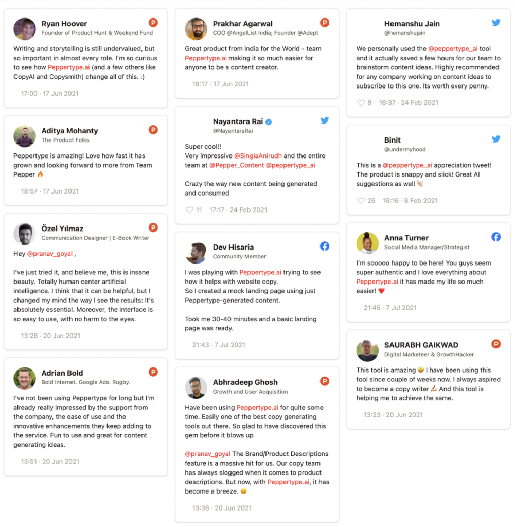
- Received rave reviews from our customers all over the globe
We’ve also launched several new features, but all of them are demanded by our users.
The ‘Submit a request’ feature on our Notion page allows users to to share features they’d like us to build and this dictates a lot of what we build next
Community-Backed Design
Another tenet in the Peppertype.ai design handbook is that of community-backed design. We are in constant conversation with the Peppertype community. We’ve got on over 1000+ so far with our key customers and have our finger on the pulse at all times.
In fact, our recent release, the long-form content editor, is something that our customers repeatedly asked for over calls. The result? We’re seeing adoption of over 50% amongst our users.
Peppertype.ai definitely has a great UI and is probably one of the simplest UX among several AI writing tools on the market. However, reaching that point wasn’t a breeze. Building a product that is ‘easy-to-use’ – isn’t always easy, especially one that is so deeply rooted in a very strong consumer need and designed to answer that alone.
This blog is written by Saud Bakhar, the Design Manager for Pepper, and Arpit Gupta, who manages design for Peppertype.ai
We’re hiring designers!
If you think this kind of work is your cup of tea, apply for the open positions on our careers page and work with us.
Latest Blogs
Learn how to rank on AI search engines like ChatGPT, Perplexity, and Gemini by optimizing your content for authority, structure, and relevance. Stay ahead in AI-driven search with this strategic guide.
Explore the best healthcare SEO services for your medical practice. Improve online visibility and effectively reach more patients in need of your services.
Discover top social media agencies specializing in banking solutions, enhancing financial services and driving engagement.
Get your hands on the latest news!
Similar Posts

Peppertype.ai
4 mins read
Taking Writing to the Next Level with Peppertype.ai and GPT-3’s Text-Davinci-003

Peppertype.ai
7 mins read
How Content Generators Work And How To Use Them Effectively

Peppertype.ai
6 mins read