
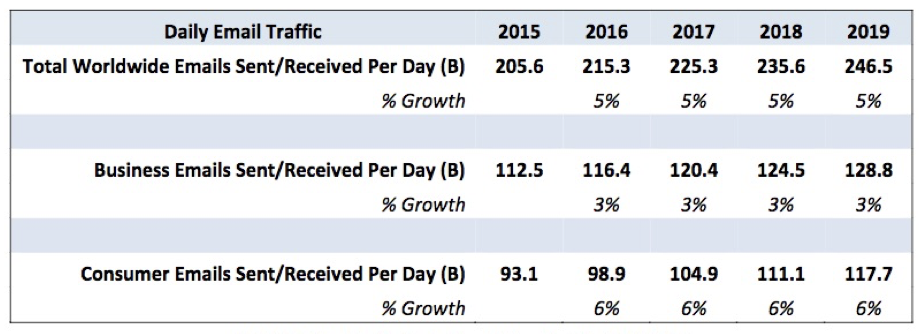
As per Radicati, an American worker received an average of 126 emails every day. However, studies also show that emails only hold approximately 8 seconds of attention before readers lose interest.
The most critical aspect of an email design guide is to ensure people actually read your email. According to email design guidelines, emails should be inviting and easy-to-read, for readers to engage.
Email is one of the easiest ways to connect with your customers. Email template design guidelines recommend using attractive yet simple, professional-looking emails to grab readers’ attention. This email design guide will help you elevate your game and ensure that recipients open your email, read them, and take action.
What is Email Design?
The process of designing and creating an email that connects with your reader is email designing. Email design guidelines guide you on the placement of your content so that the email engages the reader and generates leads, and helps in conversion.
In other words, an email design guide looks into every aspect of creating an email and includes tasks like selecting a color scheme, subject lines, content, and more. While sending an email, you only get one shot. Hence, following email template design guidelines, make sure your message holds their attention and gets through to the reader.
With the flood of emails an average person receives every day, the most common tendency is just to scan through and retain only required information, filtering out the rest. However, you can successfully design a marketing email or a transactional email for existing customers and business partnerships with an email design guide.

Benefits of Email Design Guidelines
An email graphic design guide is not just about how an email looks but also the structure of an email. Even if the customer is very loyal and engaged with your brand, it might be difficult to process and retain too much information. Most readers just scan through the emails and simply read the one that catches their attention.
Email template design guidelines help your email style, and design solutions grab attention and deliver the right message. A well-designed email is aesthetically satisfying and optimized for every metric, from clicks to conversions.
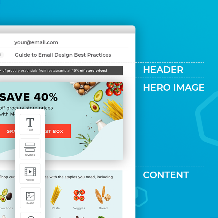
For your marketing email to engage and not get lost in the sea of emails, you must follow the email template design guidelines to improve your email’s performance. The different elements of email design include text, layout, color, and images, among many more. This email design guide helps you design amazing emails that are visually appealing.
Top 10 Tips for Creating Great Email Design
Email is considered the oldest channel of digital communication. Today, email marketing is growing rapidly. With people receiving emails every minute, email template design guidelines play a vital role in designing your email and making it stand out. Below, we will discuss the 10 essential features in this email graphic design guide.
1. Content
Content is king in marketing. Every email sent out should have a purpose. And the design of the email should be driven by that purpose.
The basic rule of content is to keep the message simple and, wherever possible, break it into bullet points. Using headings and subheadings, divide your content into sections. Focus on one clear message. If you have more information, add a link for readers to learn more.

2. Structure
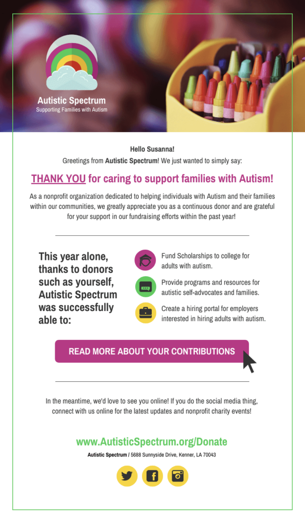
You can either make a template from scratch or save a template that can be replicated repeatedly. Email template design guidelines add a logical visual separation between the header, central body, and footer.
It is important to pay attention to your brand identity on the header and the menu. The footer should have a CTA (call to action) and social media link icons. A one-column layout makes the design clutter-free; however, a two-column format helps in including more than one story on the same page.
Breathing space or white space is an essential part of any email design guidelines. That said, avoid too many white spaces.
3. Headings and subheadings

Headings and subheads act as short phrases that stand out among all the text to catch the readers’ attention. Use headings that are simple, brief, and to the point. Page sections with subheadings improve text readability as per email design guidelines.
To optimize the effectiveness and add clarity, give headings a hierarchy with appropriate heading tags like H1, H2, and H3. This segregation helps in SEO, provides an aesthetic visual impact, and helps in quick scanning through email.
4. Subject line
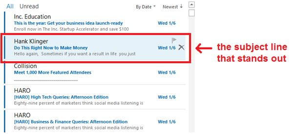
Subject lines are vital as they tell the readers what to expect. It should not give away details but should draw the reader in. The subject line should be as brief as possible. It should set the tone of the email content. Be creative with your subject lines but not flashy.
5. Color
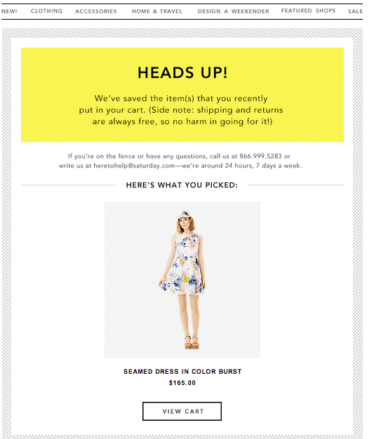
According to the email graphic design guide, color plays an important role in guiding the readers. Just as too many colors can be distracting, too few can make it uninteresting. If possible, try and pick colors similar to your brand logo.
Choose colors from complementary colors or monochromatic schemes in an email design. Always ensure the text on a colored background is legible.
6. Images
The image used should make a statement and be the central focus. Images in an email based on email graphic design guide design can range from photographs, icons, or illustrations. The rule of thumb for email design is that images should not be more than 50% of the entire content and text together. Images should be of paper size to avoid squishing or stretching.
7. Links
Make sure to include links in your emails, as links allow readers to understand better or read in detail about a particular thing. Links offer information without distracting them from the main email. They should be labeled and easy to identify. However, before sending out emails, ensure the links work.
8. Font

Fonts are critical in email template design guidelines. They should always compliment your brand’s tone.
Fonts not only add visual impact but also influence readability and user experience. Some basic guidelines for fonts include using different fonts for headings, avoiding using decorative fonts, spacing should be in line with the font size, and most importantly, the font should be consistent.
9. CTA
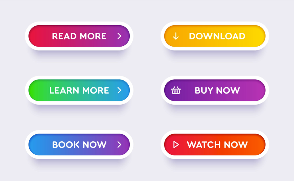
Every marketing email should conclude with a call to action. A CTA, as per the email design guide, should be short, clear, and tell the reader exactly what to do. It is recommended to personalize your CTA for the target audience. This can be a simple link also for readers to take action.
10. Add a footer
The email design guide suggests you always provide the option of unsubscribing to your reader. It should include an easily visible “unsubscribe” button in case readers feel the need to stop receiving your content. In certain countries, you are required by law to add an opt-out button.
Key Takeaways
- An email design should balance image and text with 60% text and 40% images.
- Incorporate plenty of white space to visually separate design elements for a clean look.
- Design responsive template emails for optimizing on both desktop and mobile devices.
- Email content should be designed for recipients to glance through to understand and click your CTA.
- Prioritize content with headings and subheads with the most important content featuring on top.
- A good email design helps in promoting the product and services.
- A well-written email can leave a lasting impression on the reader.
Conclusion
When designing for email, various aspects need to be kept in mind. Our email design guidelines should help you design a good email for your marketing strategy. Improving engagement and conversion rates is also an integral part of the email design guide, as they help you churn awesome emails.
Best practices from email template design guidelines ensure that your message grabs attention, has a clear message and is actionable. The email design guide helps you design a good email; however, you should ensure that the design doesn’t take over the actual message you want to convey.
FAQs
The email’s complete look and feel or overall appearance is known as the email layout. The layout structure should be connected when putting it together in an email as per the email design guidelines.
Your email where the viewer can scan through quickly, know what to check first, and the next steps from there, is a good email design according to email design guidelines.
An email designer is a tool that enables the effortless creation of personalized emails. It allows the creation of email content and email content templates.
An email template is a module that lets you customize the format and email text. An email template can be text-only or a combination of HTML and text.
In other words, email template design guidelines are the code that defines the structure and content of an email.
Emails should be brief and to the point. Make sure it has no grammatical errors and keep the language simple, easy to understand. It is advisable to avoid complicated and long sentences.
Responsive email designs are emails that modify themselves depending on the viewer’s screen size to accommodate the content. These emails will always render correctly regardless of the device and allow the viewer to view the entire content of the email.
Latest Blogs
Learn how to rank on AI search engines like ChatGPT, Perplexity, and Gemini by optimizing your content for authority, structure, and relevance. Stay ahead in AI-driven search with this strategic guide.
Explore the best healthcare SEO services for your medical practice. Improve online visibility and effectively reach more patients in need of your services.
Discover top social media agencies specializing in banking solutions, enhancing financial services and driving engagement.
Get your hands on the latest news!
Similar Posts

Design
7 mins read
15 Best Firms Offering Design Services in India

Design
5 mins read
All You Need to Know About Data-Driven Design

Design
6 mins read