Email Newsletter Design Best Practices: Essentials For Success

Table Of Contents
- Introduction
- Step-by-Step Procedure For Newsletter Designs
- What Everyone Ought To Know About Newsletter Designs
- 12 Things That Boost Your Newsletter Design Skills
- Key Takeaways
- Conclusion
- FAQs
In every field of business, the 80/20 rule applies. 80% of your outcomes come from 20% of your efforts.
The email newsletter is one of the elements that lie in the 20% of your business efforts that yield 80% of your outcomes.
A minimal quantity of effort in creating the best newsletter design for your business gives more than proportionate results to your brand value and bottom line. Email newsletter design best practices ensure more results from your newsletter.
An email newsletter is the marketer’s effort to reach the customer directly in their inbox; targeted advertising at minimum cost.
This article focuses on the best newsletter design principles that will help you crack the newsletter marketing game. Done right, a great newsletter means more cash to the bank.
Read on to find the various aspects of this e-biz game and learn newsletter design tips that will help you create effective, enticing newsletters.
Step-by-Step Procedure For Newsletter Designs
Newsletter design is easy when you study and implement it as a step-by-step procedure. The following newsletter design tips list principles that can be implemented one after the other.
Step 1: Decide newsletter size and dimensions
It’s a good idea to begin newsletter design using fixed width instead of a fluid/liquid layout.
Doing this keeps horizontal scroll bars away; the kind that appears when you don’t use full-screen width.
Newsletter design tip 1: The optimal width is between 550-600 px. Keep the important information within the top 300-500 px.
Step 2: Create the document in Photoshop
After opening Photoshop, create a new document with height 1000px, width 800px and resolution 72dpi.
Newsletter design tip 2: The color mode should be RGB.
Step 3: Enable user viewing in browsers
Users should be able to view the message in their browser. This improves accessibility. It is useful for instance when an email client is not correctly displaying images.
Step 4: Design the header for the newsletter
The next step is designing the newsletter header, which can also be done in Photoshop. You can easily copy the graphics and slogan to the email newsletter template.
Step 5: Craft the matter of the newsletter
Create a rectangle below the header and pull it close to the bottom. This will house the meat content of the email. Drag and drop the images and text you want into this area.
Step 6: Allow social sharing
Make the newsletter easily shareable by adding an area for RSS syndication and social media icons. Add a call to action.
Newsletter design tip 3: Keep all parts of the newsletter’s colors in sync with the branding.
Step 7: Add a footer
Add a footer that allows subscribers to get in touch with you or unsubscribe from the newsletter. Include an email signature to allow subscribers to click through to your website.
What Everyone Ought To Know About Newsletter Designs
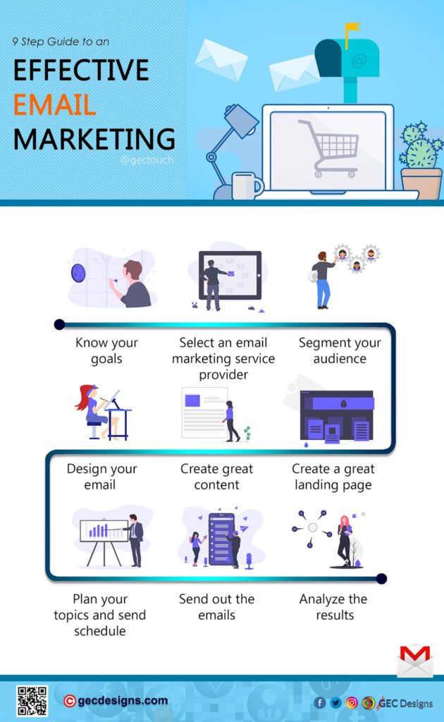
1. Identifying your audience is key among newsletter design best practices
Your newsletter is made to cater to audience needs. Who is your audience, and what do they need? Answer this question and you already have a headstart on creating the best newsletter design you can.
Are you notifying your audience of a new business? Are you promoting a new offer? Do you want your audience to know of a discount? What is it that you want to do? What response do you want to elicit from your newsletter readers?
Identify your audience. Make them your priority. Then find ways to fill the need gaps. This will point your newsletter in the direction of success.
2. Using the right tools is essential for effective newsletter design
There are newsletters, and there are newsletters. Often what separates average newsletters from great ones is the distribution tool.
Campaign Monitor and MailChimp are two of the popular distribution tools in the market. Squarespace has introduced an email marketing service that appears promising.
Ideally, the tool you use for email marketing should offer easy campaign and list management. It should make templating easy and send plenty of emails without being blacklisted.
3. Choosing your format is an extremely important part of newsletter design
Among the great newsletter design tips is to decide the format. To do this you have to answer these questions:
- Do you want your newsletter appearance to be the same across devices?
- Which mobile devices do you want your matter easily viewable on?
- Do you want to provide an option that enables readers to view in the web browser?
- Which email clients should be supported?
Once you have answered these questions, decide the form the email newsletter is going to take.
4. Research other newsletters to throw up ideas
Check out these online newsletter examples at the Really Good Emails site.
5. Narrow down the focus of your content for the best newsletter design
Your newsletter should never be generic like those that spew out as much content as they can. They need to be focused on purpose and method of expression.
Newsletters should fit branding guidelines. Avoid noise when communicating via newsletters. Adopt a tight focus. What should your reader come away thinking/feeling after reading your newsletter?
6. Newsletters, like people, should have personality
People and emails are interesting when they have unique personalities. Simplicity is important. Cleanliness is next to godliness in newsletter design as in life.
What does one glance at your newsletter tell your reader about your company? Are you original? Are you different? Does your USP shine through?
7. Good headers and footers are essential for a great newsletter
Much like the beginning and end of a story are its most essential parts, good headers and footers define the newsletter as nothing else does.
A good header is the reader’s first impression of your message. Spend time on it. Make it sync with your brand personality. A good header’s colors match your logo’s.
A good footer is as important as a good header. It completes the story you are telling through your email. It is where you include the CTA. It also allows subscribers to unsubscribe. It is the last impression a person has of your newsletter and hence is important.
8. Create expectations and tell a story
Newsletters are great for drumming up expectations. Take readers on a journey with you. Let them share your ups and downs. Make them excited about your company.
Make your readers a part of your story. Convey your story visually and creatively.
9. Regularity is an important part of newsletter success
Out of sight is out of mind. Keep the newsletters coming to subscriber inboxes. This is the way to turn readers into customers.
Essential elements of newsletters are:
- Table of contents
- Headlines and subheads
- Masthead
- Page numbers
- Nameplate
- Bylines
- Running heads
10. Newsletters are a great way to brand and position your business
The colors used in your newsletters, your fonts, your logo, and other design elements subtly convey to your subscribers the nature of your company.
A newsletter can be used to position your company in a certain manner, in a certain part of your mind just like advertising does.
Maintain and grow your company brand using newsletters. Let your company name and logo evoke feelings around it – feelings created by email newsletter design best practices.
11. Grab attention using images
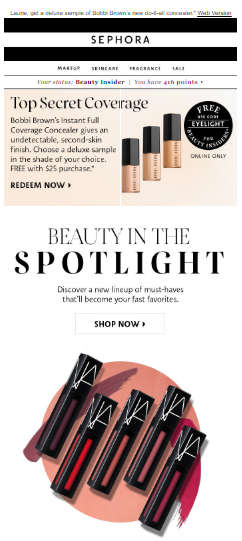
A picture is worth a thousand words. Images could be used to grab attention and evoke positive feelings toward your brand. Images could be used to tell a story. Use the right images for the right purpose and grab attention using images.
12 Things That Boost Your Newsletter Design Skills
1. Create mobile-friendly design
According to the Pew Research Center, more people own smartphones than computers. In addition, people spend more time on them than on computers.
This is the reason current popular email design platforms come with a variety of mobile-optimized newsletter templates. Good newsletter designers consider how their newsletter will look on the smallest smartphone devices and use a mobile-first approach to newsletter design.
Design for single columns and with slightly larger fonts to ensure great mobile-compatible design.
2. Use the KISS principle while drafting text
Use the “Keep It Simple Stupid” principle while drafting newsletter content by making text short and sweet.
Attention spans are declining. The right newsletter content should include a decision on the number of topics a newsletter should contain.
Newsletters should be valuable continually. They should be easy to scan and read. In addition, they shouldn’t be sent too often.
3. Make the layout organized and neat
A neat and organized layout eliminates distractions and holds the reader’s attention as they parse through the entire newsletter.
Sketch out the newsletter layout using a newsletter template and then add content as you refine your design.
4. White space is good
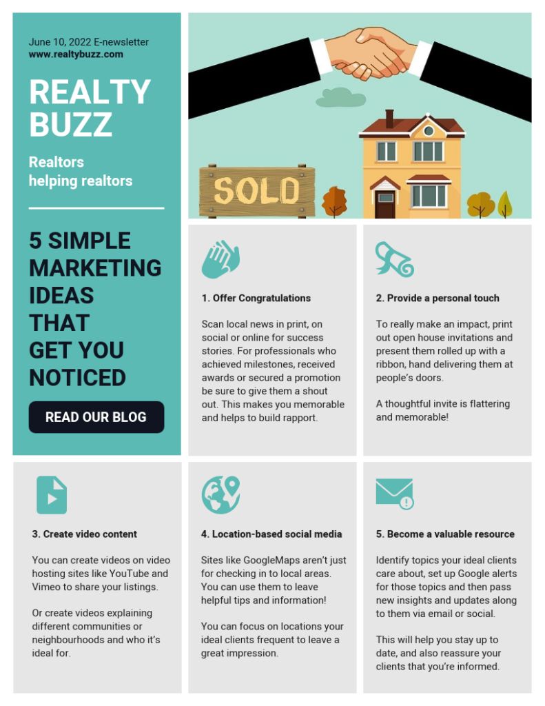
Using white space optimally allows the brain to scan, break down, and digest content easily. Apple is the standard for using white space effectively.
The principle here is less is more. By giving the content breathing space, you can make a strong impact on the reader. Use white space to provide emphasis to content.
5. Lead reader attention down the visual hierarchy of your design
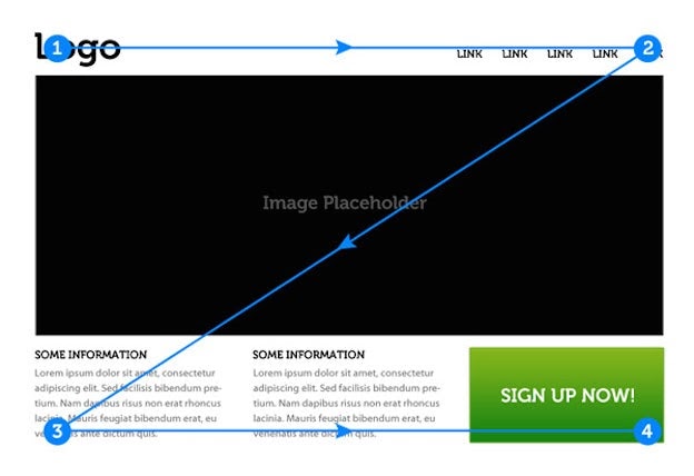
The best newsletter design is one that follows a visual hierarchy from top to bottom and left to right.
This design principle uses shapes, contrast, color, size, and position to transmit a sense of importance around newsletter elements to the reader.
It lets the reader know what elements in the newsletter are important and need to be focused on. Font sizes and color are key elements of visual hierarchy.
6. Use headers/footers to frame content
Among the top Email newsletter design best practices is the part that assigns importance to headers and footers.
The header is the first chance you have to make an impression. The footer is the last impression your newsletter subscriber has of your content.
Use email template builders to frame content within headers and footers. Ensure CAN-Spam compliance by including social media icons and an unsubscribe button.
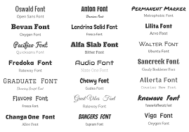
7. Make font choices simple
With a multitude of fonts available, choosing a font can be the most difficult part of newsletter design.
Too much choice in fonts isn’t necessarily a good thing!
Adobe Garamond is a good choice for print, Arial is a great choice for the web, and Palatino works for both.
An option is to choose fonts that work together and gel in style and substance.
8. Vivid colors are a friend
Use colors to set the mood.
- Black conveys power, sophistication, mystery, and death.
- White conveys hope, simplicity, cleanliness, and goodness.
- Yellow conveys intellect, friendliness, warmth, and caution.
- Blue conveys peace, sincerity, confidence, and integrity.
Use colors to convey subliminal messages to readers and make them vibe with your brand.
9. Use videos and GIFs
Videos and GIFs are being used more and more frequently within newsletters. Use relevant GIFs and make them so they gel with your overall message.
10. Use impactful images
Stunning images leave an impression on the reader. Use them to make a big impact using the minimum of space. Don’t use extremely large pictures or overuse images. They shouldn’t occupy more than 30% of the newsletter space. Remember, sometimes simple text messages are all that is called for.
11. Use infographics to inform readers visually
Infographics are a great way to get the message across while being easy on attention spans.
12. Call-to-actions are called for
The call to action is the part of the message where you get to ask for something in return for the information presented. The call to action could be a click, share, like, or purchase.
Use call-to-action effectively by positioning them correctly and using the right emotion in your words. Done right, the call to action makes your entire effort worthwhile.
Key Takeaways
- Email newsletters are a cost-effective and efficient marketing method.
- Email newsletter design best practices are a science that can be learned and applied.
- Each element of the email newsletter works in conjunction with the other.
- Follow step-by-step procedures for effective newsletter design.
- With diligent effort, the best newsletter design can be achieved.
Conclusion
Newsletter design is among the new-age digital techniques that can prove to be a game-changer for enterprises of all sizes.
Email newsletter design best practices when applied can effectively change the nature of your e-biz game.
From choosing fonts to mixing colors, branding, and coming up with the right content the science of newsletter design leaves plenty of mixing and matching to be done.
A proper application of this new-age ebiz principle of economical targeting of prospects is changing the game for good.

FAQs
It is an email sent to subscribers that informs, communicates, updates, and advertises. All newsletters aren’t created equal, some are more effective than others because they follow newsletter design best practices.
1. Email Newsletter Basics
2. Blog Posts
3. Events & Recaps
4. Company News
5. Upcoming Promotions and Subscriber Exclusive Deals
6. Links and Calls To Action
1. Strong Subject Line
2. Audience Knowledge
3. Good Content Marketing
4. Contact and Social Information
5. Visually Appealing Templates
6. Call to Action
20 lines of text or 200 words are the sweet spot for successful newsletter templates
Email newsletter design best practices ensure that your newsletter is more than useful, that it is a magnet for sales, likes, and shares.
55% of people scan before reading and surprisingly 20% read nothing at all. This is why you should follow Email newsletter design best practices to achieve the best newsletter design.
Latest Blogs
Learn how to rank on AI search engines like ChatGPT, Perplexity, and Gemini by optimizing your content for authority, structure, and relevance. Stay ahead in AI-driven search with this strategic guide.
Explore the best healthcare SEO services for your medical practice. Improve online visibility and effectively reach more patients in need of your services.
Discover top social media agencies specializing in banking solutions, enhancing financial services and driving engagement.
Get your hands on the latest news!
Similar Posts

Design
7 mins read
15 Best Firms Offering Design Services in India

Design
5 mins read
All You Need to Know About Data-Driven Design
Design
6 mins read