
Table of Contents
- 5 Things to Keep in Mind When Designing an Event Banner Ad
- Top 5 Benefits of Designing Banners for an Event
- Banner Design Must-Haves
- 6 Top Tips on How to Design Banners for Events and Campaigns
- Key Takeaways
- Conclusion
- FAQs
One of the wonderful ways to spread the word about any event is through banners. They are an important medium of communication between a business and its clients, both present and potential. For this reason, a banner needs to be engaging and attractive. With several tips on how to design banners online, you can sail through the design stage easily. Going forward, we find out how to design banner ads and the steps involved in the process.
With a properly planned out strategy, you can create the perfect banner ad. Designing a banner may seem simple, with so many online tools available, but you have to ensure that no single detail is amiss.

5 Things to Keep in Mind When Designing an Event Banner Ad
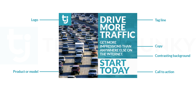
Just like how billboard owners rent out space for banners, websites do so too. The onus is on the business to use that space for a compelling banner. In order to learn how to design banner ads that are persuasive, you need to keep the following things in mind.
1. Have a well-aligned purpose
You have to identify the main intention for creating a banner. When you have a clear understanding of the purpose, the design process becomes easy. In this case, the purpose is to make people know about any event or campaign. The target audience for this event would have been identified by you.
To create an instant appeal, the information about the event must be displayed in bold. The banner should be simple and drive home key business goals. Your banner design should appear either on personal email or published on your website. In order to understand what kinds of people to target with your ad, you need to analyze buyer behavior. Ensure your goals for the event align with the overall brand identity.
2. Keep a consistent color scheme
You should make your banner unique using the perfect color scheme. The color is the first thing that attracts people towards a banner, even from a distance. The color you use should be a representation of your brand.
Maintain a color scheme that can stimulate instantaneous action. A bright and attractive design does not mean you can play with colors as you wish to. Use colors wisely to depict the interests of your business. The color used should transfer energy in the form of action.
It can be the color of your logo or the color your company associates itself with. While doing this, care should be taken to maintain the exact hue so that there is not even the slightest variation. Otherwise, it could be perceived as a counterfeit advertisement. The color of the banner can bring out the desired outcome since each shade evokes a certain emotion in the customer. It makes heads turn and gives expected results.
3. Make the text readable
The text that you use on the banner should be readable instantly. You should first understand the position of the ad. With this, you should be able to judge the type and size of font you need. It is important not to use overly stylish fonts, as they are difficult to comprehend at a glance.
You don’t need to worry too much about how to design banners with the correct font style, as there are several online templates you can try out. Keep in mind that the text is not too long or too short. It must be compelling and attention-grabbing. Make it a powerful appeal, as you have only a few minutes before the buyer skips the ad.
It is imperative to mind the length of your text too. Always try to keep the text concise rather than making it read like a boring, long essay. Your words must instantly stimulate action. People don’t like reading lengthy text, and if you go beating around the bush, they will skip your ad. Especially when banner blindness seems to dominate the internet, it is crucial that you create readable, crisp text for your campaign. The main sentence and one or two additional ones beneath it (with keywords) can drive the message constructively.
4. Use well-designed infographics
Infographics are visual representations of information that can help in instant comprehension of data presented. You can use them in your banner to augment its appeal. There are many ways in which you can present information through visuals.
Make sure the infographics align with your primary goals. When the banner is circulated digitally, the size and the clarity of images will be different. But, when the same is placed as a physical banner, care should be taken so that enlarging does not mar the picture. The quality of the images used should be great. Knowing how to create infographics is an important part of learning how to do banner design.
5. Choose strategically placed logos
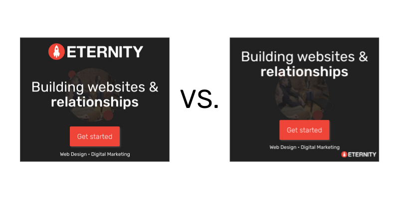
The most indispensable part of your banner design is an appropriately positioned logo. This helps capitalize on the already existing patronage. When the clients look at the logo, they are instantly hooked.
In the example below, take note of the difference a strategically placed and highlighted logo makes.
Top 5 Benefits of Designing Banners for an Event
Knowing about the benefits of banner design is essential to learning how to design banners online.
1. They create a great visual impact
Anything conveyed through the visual medium is easily understood by the recipient. The task for the business becomes simple when this happens. Good graphics capture the attention of the viewer and convey the intention in the most effective manner. Visuals are also known to stay in the minds of the viewer longer. When you want to advertise any campaign, you can use banners to your advantage. When the intention is conveyed effectively, the outcome will be as expected.
2. They help target more people
It is one of the greatest advantages of banners. A business thrives on its customer base. Without a strong customer base, the position of a business can only be null. Identifying buyer behavior and knowing how to design banner ads accordingly can help your business in many ways.
3. They help build visibility
The logo and name of your business appear prominently on the banner. By carrying these elements, banners can help to augment brand visibility. When visibility is improved, customer retention becomes easy.
4. They are cost-effective
Banners are a cost-effective way to position any event information. You can get them designed online. Various mind-blowing designs are available that can make your banner look exceptional. Your target audience can get the necessary information conveyed easily through a banner.
5. They help in conversions
Banner ads help measure the reach of the advertisement. This can be seen with the turnout at your event. It can reveal the impact your banner has created. Your ad should result in effective conversions. When it happens, your banner advertisement can be deemed successful.
Banner Design Must-Haves
Though many components go into a banner, there are certain must-haves. These are indispensable for any banner and can help to drive innumerable leads.
1. Focused message
A focused message should be part of your banner ad. It conveys the main goal of your event. The message should be simple and should include catchy phrases rather than lengthy sentences. This is one of the crucial elements of learning how to do banner design effectively.
2. Apt imagery
Relevant images should also be used in a banner. Images convey meaning more aptly than a written message. When a written message is combined ably with the relevant images, the impact is multiplied many times.
3. Clean background
The background choice is also an important component of your banner. Choosing the right color as your background will make the message more recognizable. Do not make the banner cluttered by including a lot of images for the background.
A well-designed layout is also an essential part of your banner. The right amount of negative space makes a great impression. Your priority should be to plan your layout so that it doesn’t look clumsy. Everything at its designated place should be your motto.
4. Ample whitespace
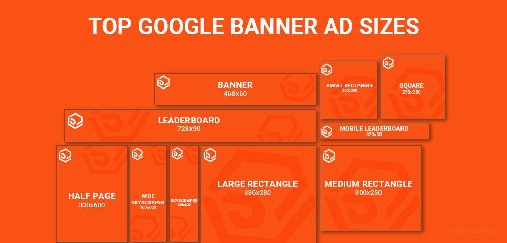
Include only a couple of main sentences in your banner. Ideally, there should be a headline and subheads. These are useful in making the banner an instant hit. Short sentences or slogans are more fascinating. Also, make sure you choose the right size for your banner.
6 Top Tips on How to Design Banners for Events and Campaigns
Here are some easy expert tips to create outstanding banner ads.
- The details of where your banner will be positioned are prominent data you will
need. This will decide the design of the banner. For example, whether it will be in a corner, with a black background, on a dais, etc., are all questions you should find answers to, to make the design a compelling one. For digital banners, the position on the site is essential information.
- What is your event goal? Make sure you align it with the design of your banner. This
the step should be given predominance because a single look at the banner can drive home the message.
- The layout for the banner is the next step in designing. Several layout templates are
available online to choose from. Some examples are F-pattern placements and above-the-fold placements.
- The next step is to decide on the placement of your logo and the main event
information. This will take up the majority of your banner space. With detailed knowledge about how to design banner ads, you can hit the nail on its head when it comes to this step.
- Adding text to your banner would be the next step. Always opt for short and crisp
content, as it helps convey messages better. You could also use infographics, as they are quite catchy.
- The next and final step is to add links to social media pages, websites, etc. This forms
a prominent part of how to do banner design. Make sure it is followed by a clear CTA button.
2 Awesome Event Banner Examples
Scroll on to look at two great examples of banner ads for events.
1. A banner ad for a workshop
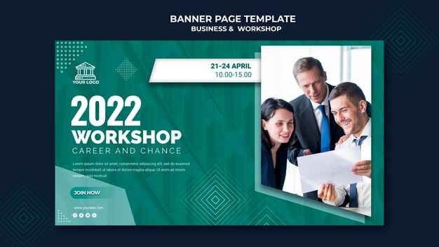
Prominent colors, the logo of the business, mild background, and simple text make this banner distinct. The workshop intends to teach how to build effective relationships at work. A small gist about the things that will be covered in the workshop should be given.
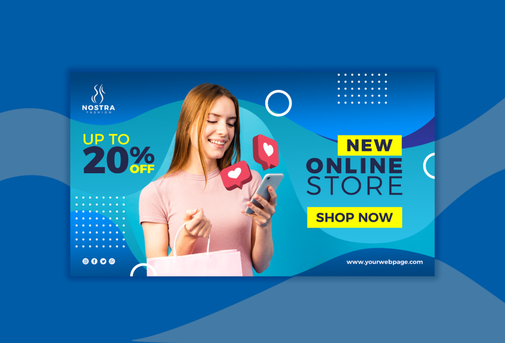
2. A banner ad for an online store launch
If you are planning to launch a new product, a banner to that effect can be created. Use your logo so that people instantly know it is you. Your banner should drive sales, so try and make it impactful.
Key Takeaways
- A banner is a powerful tool to make the audience aware of your brand presence. If you use it wisely, you can expect the desired outcome. Digital banners are marking a great presence in the current era. Learn how to do banner design and accomplish the task.
- A banner design involves a lot of planning and retrospection. It also helps you analyze what went wrong in your previous campaign. When you are exposed to the reasons, you can go for a more engaging design in the future.
- A banner can be used by a business for various reasons. It could be for a new product launch, a trade fair, an end-season sale, a conference of small businesses, and many more. No matter what the purpose is, sound design strategies are to be used to achieve the goal. Read the above-listed points on how to design banner ads to know more.
- The design for every banner is unique, and must be created mindfully to elicit the desired response from users. Understanding the purpose of design is crucial.
Conclusion
Banners are used by businesses as a means of advertising. There is a recent challenge of banner blindness for advertisers, and it is imperative to fight it out. The points mentioned in the above blog help you to tide over the hurdles faced by creating an attention-grabbing banner. When learning how to design banners, use these tips responsibly.
FAQs
The main priority is to provide information about an event, and so the key points must be easily readable. The context must look prominent and persuasive.
Yes, there are many apps available that teach you how to design banners online. It is quite easy to create one with self-explanatory steps.
Many elements go into making a banner attractive. Remember to follow tips about color selection, fonts, sizing, etc.
A banner gives an instant appeal and helps in business promotion. It attracts people’s attention through its design and forms a significant part of a marketing strategy.
Banners help in providing complex data in a simple form, along with images. They are useful for businesses to widen their customer base.
Latest Blogs
Learn how to rank on AI search engines like ChatGPT, Perplexity, and Gemini by optimizing your content for authority, structure, and relevance. Stay ahead in AI-driven search with this strategic guide.
Explore the best healthcare SEO services for your medical practice. Improve online visibility and effectively reach more patients in need of your services.
Discover top social media agencies specializing in banking solutions, enhancing financial services and driving engagement.
Get your hands on the latest news!
Similar Posts

Design
7 mins read
15 Best Firms Offering Design Services in India

Design
5 mins read
All You Need to Know About Data-Driven Design
Design
6 mins read