
Table of Contents
- 7 Tips on How to Design a Landing Page
- Key Takeaways
- Conclusion
- FAQs
A landing page in digital marketing is an independent web page that a person “lands” on after clicking on a link through an email, social media, or any other digital location. The landing page encourages viewers to take action, such as buying your subscription or products.
Although a vital element for your business, designing an effective landing page is by no means an easy task. You might wonder why your sales aren’t going up even after you’ve designed a stellar landing page that gets scores of visitors every month. In such a case, what you need is a landing page that converts visitors into leads or customers. So what should you do to get it right?
Here are some pro tips on how to design a landing page that is impactful and converts viewers into leads.
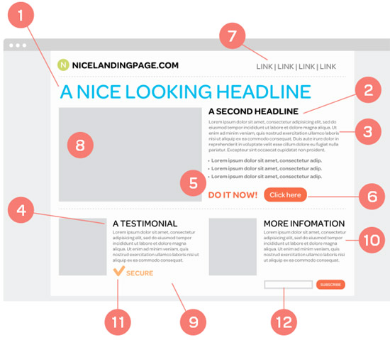

7 Tips on How to Design a Landing Page Effectively
Let’s check out these landing page design tips:
1. Craft a catchy headline
Your headline should be such that it grabs attention and captivates the viewer, and for this, you have approximately 8 seconds. Convince the viewer to scroll down. Headlines can make or break the deal.
A key thing to remember while designing a landing page is that the viewer doesn’t have all the time in the world; therefore, don’t bombard them with information in one go. You want to build anticipation, you want to keep them hooked and keep them wanting to know more. Therefore, the headline should be very concise, crisp, and, in a few words, tell the reader what your business or product is about.
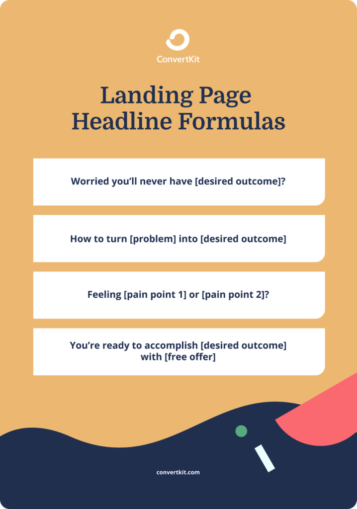
A well-designed landing page converts viewers into leads by triggering them emotionally. People want products or services that solve their problems and make their life easy. The headline should be such that the viewer relates to it. Identify specific problems or pain points and address them in your headline. Use vocabulary that indicates calm, satisfaction, and relief that eases their pain. Phrases like “saves time,” “easy hacks,” “life-saving tricks” indicate solutions to certain problems. It should intrigue them enough to scroll down and read what’s on the platter.
Mastering the headline is difficult but imperative as it’s the first thing the viewer sees. Don’t try too hard to be quirky or funny. Don’t be something you’re not. Believe in your cause and put it out there. This is probably the best landing page design tip out there.
2. Write a persuasive copy.
After the headline comes the copy, but remind yourself that you’re designing a landing page before you start. You’re not writing for a blog or social media. A landing page is independent, stand-alone, and has its distinctive style.
Following this model below will help you write a well-structured copy:
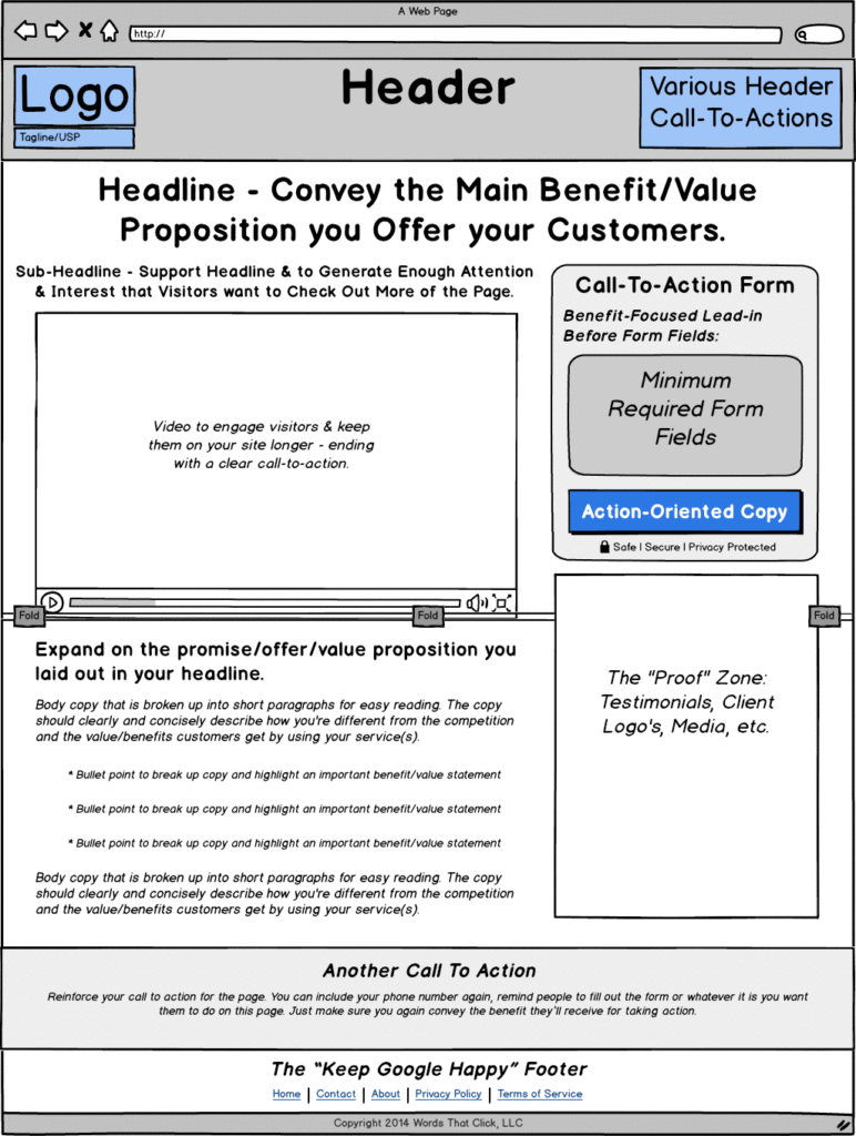
In the opening paragraph, address the problem and sympathize with it. Try personalizing your writing. Ask questions that make your reader answer in the affirmative. You can also start with an anecdote. Reading about similar issues to the reader’s concerns will encourage them to scroll down and eventually invest in your product.
In the second paragraph, introduce the offer. Give details about your product and how that feature will solve their problem. Your writing should flow from one sentence to the next. It shouldn’t jump from one thought to another. Take the time to explain the features and break them down. Use simple words and try to avoid technical jargon. Use bullet points and sub-heads for a neat and organized look that helps process information faster.
The third paragraph illustrates how your service or product is different from similar services or products offered by other companies. This bit is significant because the viewer has to understand that what you’re offering is unique and something only you can do. Your viewers are smart and well equipped to research on their own. And if they get a sense that your service is the same as every other out there, they will move on.
In the concluding paragraph, summarize the offer and encourage the viewer to buy your product. Write a strong call-to-action that motivates them to sign up. The call-to-action should make them believe that your service will solve their problem.
Take inspiration from landing pages that convinced you. If something worked on you, it would most likely work on other people. Just personalize the vocabulary and tone according to your target audience.
3. A visually stimulating layout
Designing a landing page without visuals is absolutely out of the question. Visuals have always grabbed attention before words, and in today’s digital age, people get taken in more by visuals than by text. Now you don’t have to be a total Picasso or Michelangelo to design a landing page, but some tried and tested tricks will be beneficial for its utmost optimization.
Go for a uniform color palette. Choosing the company colors is the most practical thing to do but at the same time have the gumption to experiment. Bold colors and fonts grab attention and stand out.
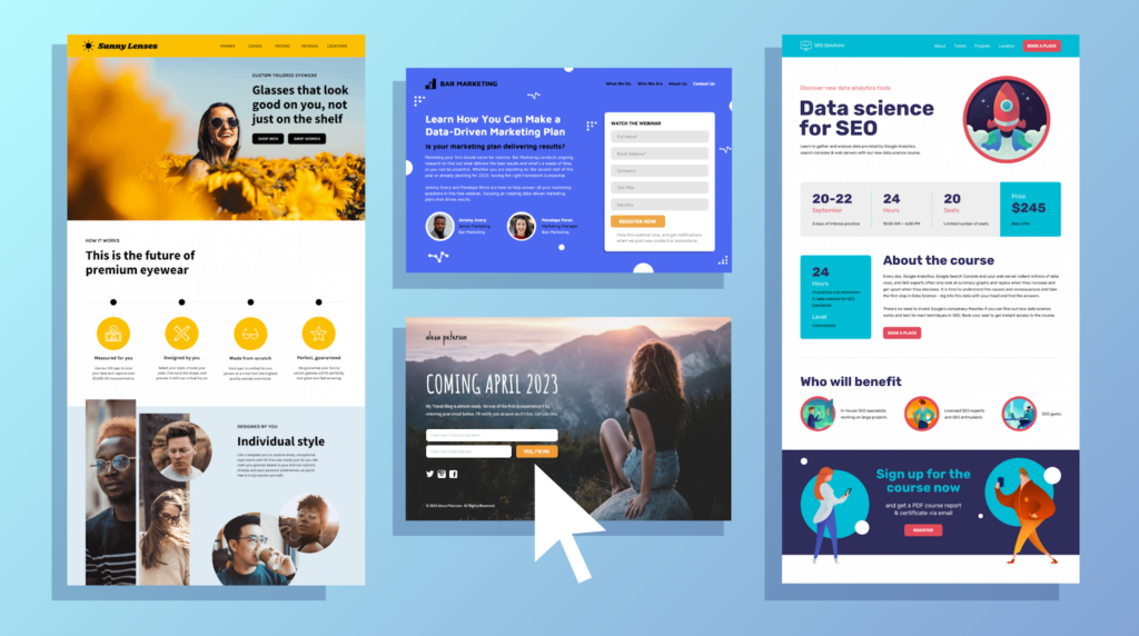
Add pictures that are relevant to your service. The pictures should complement and be in line with the text. Don’t just add images for the sake of adding. Avoid last-minute stock photos or hastily done photoshop jobs. Take the time to research your images, or even better, click your own.
Infographics are an underrated component of a landing page design. Visuals aren’t only about colors and pictures. Statistics and data, too, can be conveyed in a visually appealing manner. Adding numbers also lends a sense of authenticity.
For software and tools, screenshots are a great choice too. Repumatic includes large screenshots on its landing page to highlight the software’s functionality. Even before someone has used the software, they have a sense of how it will be. This gives potential customers a visual glimpse of what they’re getting into. This approach works well for service-based businesses.
You can also use a video that demonstrates your product features, how to use it, and its benefits. Your visual and text content shouldn’t eclipse one another. Keep this on the tip of your finger when you sit down to design your landing page.
4. Include points of contact
Is your business really a business? This is a question every viewer who visits a landing page finds himself asking.
While designing your landing page, make it explicitly clear that your service is legitimate and you are a trustworthy entity. Persuasive landing pages usually have multiple contact methods, including a phone number, email address, and even a contact form. It assures that you are a real business.
Popup windows where a customer service representative asks if they can help go a long way in building authenticity. If visitors are skeptical about converting, they can chat with a representative who addresses their concerns. However, using live chats is a tricky business, and put it up only if you have excellent reasons.
Apart from Live Chat, Contact Forms also prove immensely helpful in the endeavor. However, users might be hesitant to provide their information on an unknown website. You can alleviate this by stating that their information is strictly confidential.
Whichever method you choose, make sure you make it easier for the viewer to reach you. The more accessible you are, the higher chances you have of converting your viewers.
5. Proof of authenticity
Your landing page should have some form of trust signal. A trust signal indicates to the viewer that what your business claims to offer actually works. HubSpot research shows that 71 percent of millennials claimed they’re more likely to buy something if it has been recommended online. If people see that more and more people are buying or investing in something, they would want to get on the bandwagon.
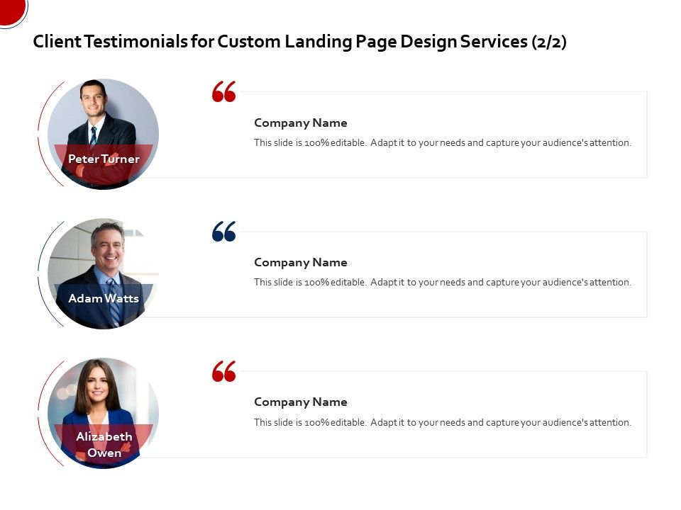
User testimonials are a classic way to let people know that they are in safe hands. People are more likely to buy from those they know and trust. Why would they share their personal details if they’re unsure about your service? When more and more people get scammed and robbed in this digital age, Internet users are already wary of sharing information.
Use real people and real conversations that are specific to your features. Getting celebrities to talk on your behalf is expensive and becoming archaic. Real people like you and me are more relatable and appealing to viewers.
If you can convince viewers that you’re a likable entity that acts on their promise and a high number of users agree, then a new viewer will be more inclined to convert and be a part of your group.
Another method of testifying your authenticity is through social proof. Social proofs are the number of likes, shares, subscribers, pins, or tweets obtained by your company. When designing your landing page, make sure to display these prominently through tickers or images.
Getting social proof in the initial stage of your business is difficult and might turn out to be negative social proof (under 1000). Do not display them unless your download or subscriber count is high.
6. An effective broadcasting plan
You have now written a persuasive and well-thought-out copy, given it a catchy headline, planned the color palette, added appealing visuals, and everything’s done. You’ve launched your page. But there’s one big problem. You don’t have enough visitors. What’s the point of designing a landing page which doesn’t get enough visitors?
People aren’t going to land on your page magically. You need to publicize it using several channels that will drive the traffic to your page, and here’s how:
The go-to platform to promote your landing page is social media. The simplest way to do it is to copy the URL and share it on your social media handles. However, don’t just put up the URL and be done with it. Write a little something along with the URL, so people know what it’s about. Maybe a line or two on your product or service or an invitation to your followers to check out your new venture will increase the flow.
Promotional emails work just as well. A survey has shown that email still has the highest conversion rate (66%) compared to social media. So do not hesitate to send that email. You’ve spent hours and days designing the perfect landing page; now, all you have to do is trust it and let it fly.
Tap into the power of public relations and pitch your service to publications specific to your industry. Stories about a new product in the industry can be a great driver for new users who haven’t heard of your company and want to know more. Media coverage is a formulaic way to increase visibility in the industry.
7. Test and tweak your page
An essential tip for maximum optimization of your landing page is to test its effectiveness. Sometimes marketers design two landing pages, A and B, to compare which template drives the most traffic. This is called the Split or A/B Test.
HubSpot and WordPress come with integrated Content Management System plugins that allow you to run the Split Test.
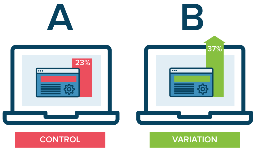
Tweak the page design according to your findings, and it’ll surely give you an edge over your competitors.
Key Takeaways
- Craft a catchy headline that grabs the viewer’s attention and captivates them enough to read on.
- Write a persuasive and well-structured copy highlighting the key offers and benefits. Also, explain how your business is different from the others out there.
- Write a solid call-to-action that encourages viewers to pay for your business.
- Design your landing page using appealing visuals, images, infographics, distinct color palettes, etc.
- Try to include multiple points of contact in the form of email, phone number, contact forms, chatbots so the viewer can reach you should they have any doubt about your business.
- Display trust signals like user testimonials, screenshots of chats with clients, or social proofs like the number of likes, shares, and pins to show you deliver on your claims.
- Broadcast your landing page by sharing on social media, pitching to industry-specific publications, and sending promotional emails.
- Test your landing page using A/B Split Test or integrated CMS to track its impact and make necessary changes.
Conclusion
Designing a high-converting landing page requires patience and effort. Nobody gets it right at the first attempt. The secret is not to lose hope and keep going until you get it right. Take inspiration from the landing pages that worked for you and follow the above 7 tips. You’ll soon be on your way to captivating visitors and converting them into paying customers.
FAQs
A landing page is an isolated web page in digital or online marketing created for a marketing or advertising campaign. It’s the page where a visitor “lands” after they’ve clicked on a link in an email or any other web platform. It aims to convert visitors to leads.
If visitors who land on your page pay for your business, they become leads. High optimizing landing pages aim to generate maximum leads by converting visitors into paying customers.
The homepage sets the stage and focuses more on informing the visitor, while the landing aims to persuade the visitor by converting them. The landing page comes with a strong call-to-action.
Yes. Designing an SEO-optimized landing page will give it a higher ranking and increase your page quality rating. Visitors looking for similar businesses will find your page when they need it the most. This will drive more traffic to your page resulting in higher conversions.
Google likes landing pages and considers them imperative to drive traffic and build your brand. Google encourages designing a high converting landing page to increase sales.
Target one keyword specifically on your landing page. Create other pages to cover variations of that keyword in greater detail. This offers the best possible reach to viewers.
Latest Blogs
Learn how to rank on AI search engines like ChatGPT, Perplexity, and Gemini by optimizing your content for authority, structure, and relevance. Stay ahead in AI-driven search with this strategic guide.
Explore the best healthcare SEO services for your medical practice. Improve online visibility and effectively reach more patients in need of your services.
Discover top social media agencies specializing in banking solutions, enhancing financial services and driving engagement.
Get your hands on the latest news!
Similar Posts

Design
7 mins read
15 Best Firms Offering Design Services in India

Design
5 mins read
All You Need to Know About Data-Driven Design

Design
6 mins read