How To Design Newsletters That Your Audience Will Love To Receive: 6 Secrets To Know

Table of Contents
- Basics of newsletters
- How to design newsletters
- Six newsletter design secrets you never knew
- Do’s and Don’ts of newsletters design
- Key Takeaways
- Conclusion
- FAQs
Newsletters have been around since 1978. And we won’t be kidding when we say 99% of the internet users own a mailbox and are up to sending emails. Perhaps, it’s the most effective and intimate way to connect with your customers, prospects, and friends, too. People mostly use emails or newsletters for professional purposes, and they form a really important part of email marketing.
At most, the particular manner has changed. Earlier, newsletters used to be only a piece of content. But, now it’s more!
Your audience now loves to receive beautifully-designed newsletters. To be more precise, well-crafted newsletter designs.
No matter how good you are as an email marketer, there could be days when you face a creative block. We’ve got your back with some cool tips on how to design newsletters in this blog.
We know what it takes to create a well-designed newsletter that gets your audience’s attention. So, if you want to ace your email game, you will find this blog super amazing!
How To Design Newsletters
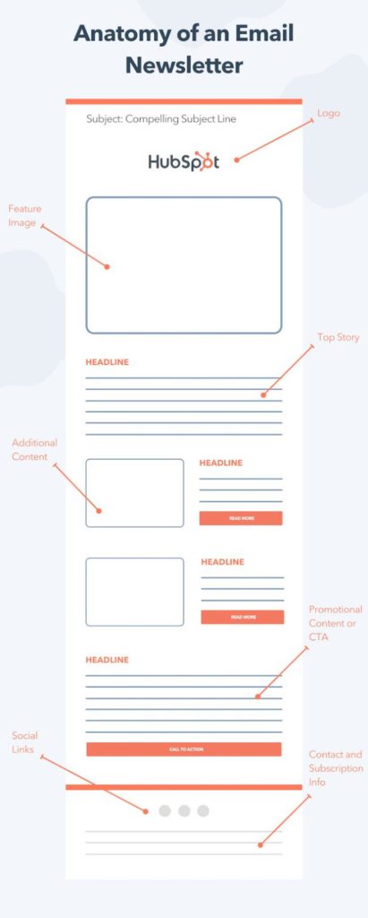
- Decide the size and dimensions of the newsletter: Start with formatting, what size would be the best. Keep the width between 550-600px.
- Create a document: Use photoshop to create another document of 800×1000px. The resolution should be 72dpi.
- Craft the header: Use your creativity to entice the readers with your newsletter design. Keep up with your brand colors and fonts.
- Add content: Now comes the most important part, adding the main copy and images to the document.
- Social links and permissions: Finally, add the links to your social platforms and permit them to view the designed newsletter in a browser.

6 Newsletter Designs Secrets You Never Knew
We are sure that if you do these things the right way, your audience will love to receive newsletters from you. Clearly, newsletter design is much more than just a design. It’s about creating a perfect outline, putting out original content in it, sticking to your newsletter design, and much more.
We will spill the secret on six awesome facts about how to design newsletters. Here you go:
1. Write ‘Original’ content
First things first, we need to dig into the purpose of a newsletter; to build credibility and get engagement in return. The best possible way to do this is by sharing information and adding value to your readers’ lives. A great newsletter design is an added bonus. Tell your readers about your business in a creative manner. Never copy the content and design from other resources. Create your own original copy.
Getting returns from a newsletter is a long-term process. And before getting into it, it is important to understand that people will only click on your newsletter if they find it interesting, unique, and informative. Hit the nail on the head with story-telling.
2. Make it easily scannable
Whether you’re writing a long newsletter or a tiny one, its scannability matters more than you think. A newsletter design should be such that it is easy for readers to understand its message or messages in one go. So split up the content in easy to read and short points. No one loves long-winding paragraphs anymore. The sheer text volume can seem overwhelming to readers who will immediately close our newsletter. Break up the text into small sections and give each section a headline of its own.
Understand the reading hierarchy and ensure that the important stuff comes first or at least grabs the readers’ attention first. Arrange your information starting from most important to the least.
All this information was about what to do with your plain text. However, you know that just text is simply boring; the need of the hour is to use fonts and colors that are easy on the eye. Also, try to use infographics and visuals to make a point.

3. Insert several Call-to-actions (CTA)
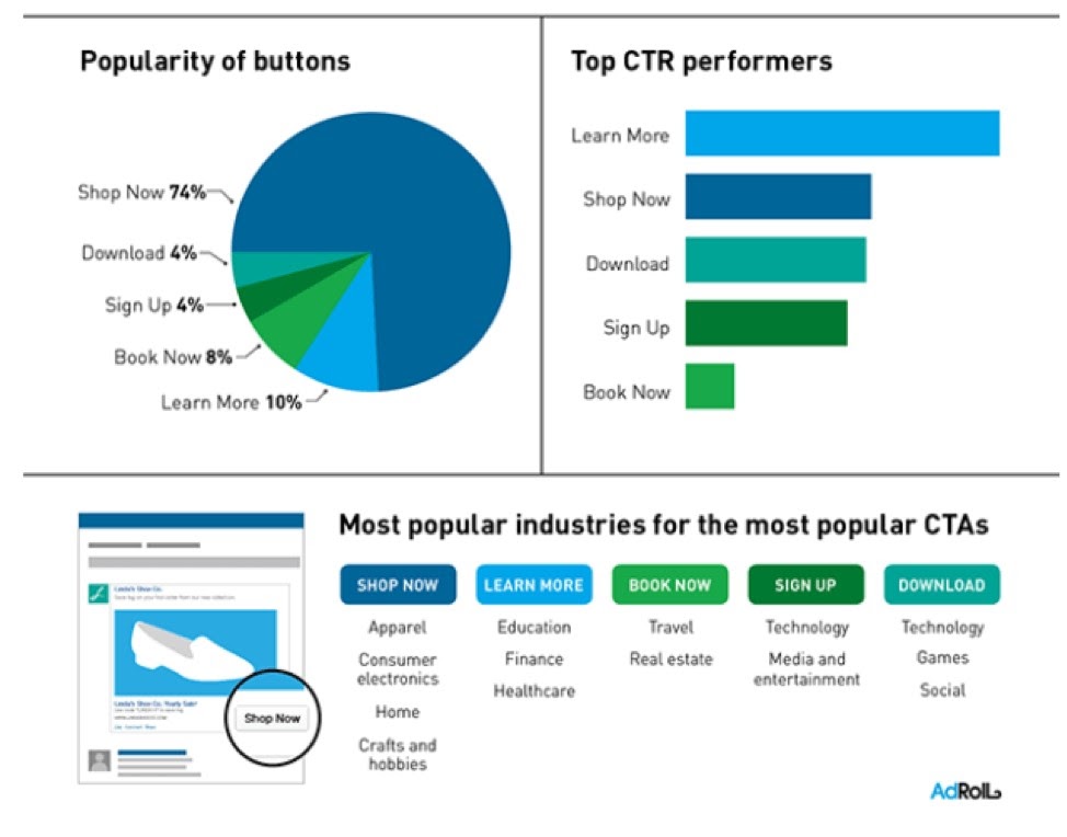
If you’ve delivered the best possible content in your audiences’ inboxes and didn’t tell them what to do next, your efforts are probably going to go in vain. They will read the content and walk away with their hands in their pockets. CTAs precisely tell your readers what’s next. According to Campaign Monitor, button-based CTAs can improve click-through rates by 127%.

Newsletters are all about value and information. Entirely depending on your marketing campaign, you can induce multiple CTAs in your newsletter design. One could be a part of the text, one could go at the bottom as a button, or you could have different CTAs along with different text boxes in your newsletter. However, remember not to overstuff and only use multiple CTAs if your text demands it.
4. Use relevant images
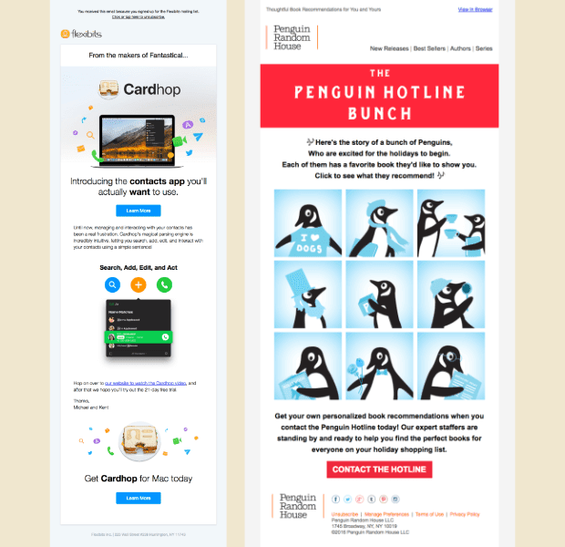
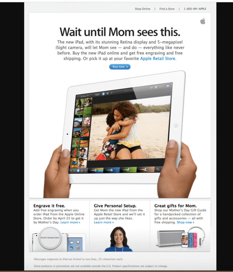
Adding images to your newsletter design makes it look appealing and engaging. Incorporating images in your newsletters is the best thing to do to reap the most out of your newsletters and cut out the boring factor.
Informative images such as charts, infographics, tables, etc., do really well in a newsletter and convey your message while occupying less newsletter space. While some email marketers prefer to stick to simple and neat text, we recommend you find your own call. You can experiment with both. It certainly depends on the niche and the business type.
For some niches, text-based newsletters do wonders, while images are a must for others. Remember, adding too many images or links can also land your email in the spam folder.

5. Stick with your brand image
It’s one of the many ways to get noticed by your audience. It enhances brand trust and credibility. If you want to ace your long-term game, stick to one header for your newsletters. Be consistent with your efforts, and don’t forget to discover your brand voice.
The best approach to do this is by getting a newsletter design template that you’ll use throughout your unified marketing campaign. You just need to edit the content you want to send over, and you’re done!
This way, your subscribers would be able to spot you with your newsletters design solely. It also makes it easy for your audience to jump onto information they want to read. The opposite may lead to annoying your subscribers and may impair your image as well.
6. Ask them for the engagement
The best possible way is by adding the links to your socials in your newsletter designs. It works in two ways; it evokes interest in your audience to know more about your product/service, and your subscribers are also redirected to your socials.
Please note that you don’t get it if you don’t ask for it. So you need to insert effective CTAs throughout your newsletters, telling your subscribers what to do next. A little design switch here and there can help you reach your goal with ease.
Further, never hesitate to ask your subscribers to share your content with their friends and family.
Dos And Don’ts Of Newsletter Designs
We’ve listed down some pitfalls to avoid while designing newsletters and what to do instead:
- Don’t send too much content: We know you might be thinking about how long your newsletter should be. Remember, newsletters aren’t blogs. They need to be shorter.
Do: Your audience is busy; they don’t have much time to read such very long content. The ideal length of a newsletter is 20 lines of 200 words.
- Don’t send attachments: Do you remember when the last time you opened an attachment that landed in your inbox with a newsletter was? You never did! No one does.
Do: Send relevant links instead of attachments like a booking link or shopping link of your product.
- Don’t send newsletters rarely: Coping up with your consistency is the most mandatory thing for newsletters. People are now used to receiving and reading emails even daily.
Do’s: Make a marketing plan and decide the frequency of your newsletter communication.
- Don’t sell hard: Newsletters are an old-school approach, and they were here music before you probably got into marketing or content. You can’t send two newsletters with the same idea or message and expect your subscribers to buy from you.
Do: Keep the conversation in mind, and not just the conversion. Write the way you talk, and be of help to your customers. Otherwise, expect to hear crickets chirping.
- Don’t juggle between call-to-action: Adding some CTAs in your newsletters makes sense; stuffing it doesn’t. Don’t expect customers to connect with you on your socials, subscribe to your YouTube channel, buy from you — all in one go!
Do: Send a newsletter with solely one purpose. If you want them to download your freebie, insert a CTA for only that.
- Don’t sound too vague: Are you with us when some subject lines are too vague or tricky to read, we end up opening the email to see who sent it and immediately end up clicking on ‘Spam’?
Do: Be clear with your subject line. Being creative is great but make sure not to sound like a noob! Otherwise, your mail may eventually land in the spam folder.
- Don’t send outdated content: Some marketers or businesses do make the mistake of saving up some interesting content for later. This may lead to stagnation, and you definitely don’t want to send such outdated information to your subscribers.
Do: Your subscribers want to keep up with the time. They don’t want old-fashioned news. Send current and fresh content always.
- Don’t poorly design: Imagine you have a power-packed piece of content. But it looks ugly. Would you prefer to read it? Just send plain text newsletters rather than poorly designed ones. Really!
Do: Choose subtle colors that are easy on the eye. Use simple fonts. See what colors and fonts go well together and stick to them.
- Don’t send clumps of content with no quality: No one wants to read an entire blog in a newsletter. Small paragraphs (3-4 liners) and headlines and subheadings work best.
Do: Balance out small chunks of content with compatible images. Also, it’s a newsletter, and not a sales copy, so only send content they might be interested in, nothing extra.

- Don’t be bossy: The worst scenario is when a newsletter lands in your inbox and sounds too intimidating and bossy.
Do: Just be really interactive in your emails. The best possible way to get engagement from your subscribers is by writing how you talk. Write like you’re talking to your friend.
5 Key Takeaways That Can Help You Ace Your Email Game
We are now all set to start working on our email list. So, fold up your sleeves and do not miss reading these key takeaways on creating an online newsletter!
1. Newsletters are not just about writing
Newsletters are much more than just a written piece. It’s about achieving your marketing goals. If it’d been solely about writing, anyone could have crushed it. Newsletters include planning, proper strategies, creating meaningful and up-to-date content, and experimenting with newsletter designs.
2. A strategy can help you come out on top
What’s a newsletter strategy? It is your pathway to hit your goals. Regardless of your marketing goal, it can help you with everything, from finding more customers to building credibility, promoting your new launches, keeping up with your audience, and more.
3. Don’t hesitate to experiment
At first, you would need to experiment with the timing and figure out what works the best for you. Further, subject lines are always a good thing to tamper with as and when required. You can also experiment with the length of your copy or tweak your tone a little.
4. Consistency is the key
Newsletters were never about frequency but consistency and quality. Commit to a schedule and send relevant content. If you juggle with consistency, creating a strategy and scheduling can always help.
5. Give first, then ask
Your audience can sense you being salesy. Make this the mantra of your life, at least in marketing; give, and then ask for something! Obviously, if you’re consistently helping your subscribers, you’ll win.

Conclusion
We hope you must be all sorted with what you need to do with your email strategy and how to design newsletters. We’re sure that if you follow all the things mentioned in this post, you will get great results. However, be patient with your efforts. You can’t expect tons of responses within a short period of time. Happy marketing!
FAQs
Experiment with content, timing, and subject lines. Asking a question or offering a freebie in the end always does the trick! Audit your email list timely and give them the option to unsubscribe. Don’t write, but talk to them and insert several CTAs.
You can use:
1. AWeber to grab some awesome newsletter templates
2. MailChimp, an all-in-one tool
3. GetResponse for automation and analyzing
4. Constant Contact to manage your list
A newsletter strategy consists of:
1. Defining your goals
2. Setting out a KPI to measure your success
3. Finding a good time to send the newsletters
4. Getting the right software
5. Creating content
6. Building a list
7. sending newsletters
8. Analyzing the results.
The answer depends on your marketing goals. What do you want to achieve? How long is your strategy? You can start with one email a week. However, the ideal number is sending away 4-8 newsletters a month.
Building an email list is becoming a must with each passing year. You can ask your audience/ followers/visitors to sign up for your email list by offering them something that might be of help to them. That’s it!
Avoid sounding spammy in both of your subject lines and throughout the newsletter. And don’t appear enthusiastic. Also, try not to exceed your email size.
Latest Blogs
Learn how to rank on AI search engines like ChatGPT, Perplexity, and Gemini by optimizing your content for authority, structure, and relevance. Stay ahead in AI-driven search with this strategic guide.
Explore the best healthcare SEO services for your medical practice. Improve online visibility and effectively reach more patients in need of your services.
Discover top social media agencies specializing in banking solutions, enhancing financial services and driving engagement.
Get your hands on the latest news!
Similar Posts

Design
7 mins read
15 Best Firms Offering Design Services in India

Design
5 mins read
All You Need to Know About Data-Driven Design

Design
6 mins read