
Email headers are the technological equivalent of letterhead and contain important routing information about where an email came from and where it’s going.
The email header is the information automatically added to the top of every email message. It includes details such as the sender’s email address, the recipient’s email address, the date and time of the message, and the subject line. This makes email header design very important since your email is the first impression of your brand for the recipient.
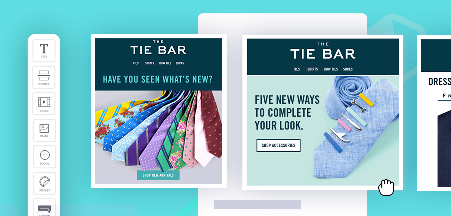
Email headers are important because they:
- Help to identify the sender and receiver of an email
- Help to track the progress of an email through the different servers
- Can be used to troubleshoot problems with email delivery
- Can be used to track down the source of spam or other malicious emails
- Can be used to verify that an email has not been tampered with in transit.
Importance of Email Headers
The importance of email headers cannot be overstated. They provide critical information that helps ensure your messages are delivered correctly and to the intended recipients.
Email headers also help prevent spam and other unwanted messages from reaching your inbox. By understanding what information is contained in email headers, you can better protect yourself from malicious emails and scams.
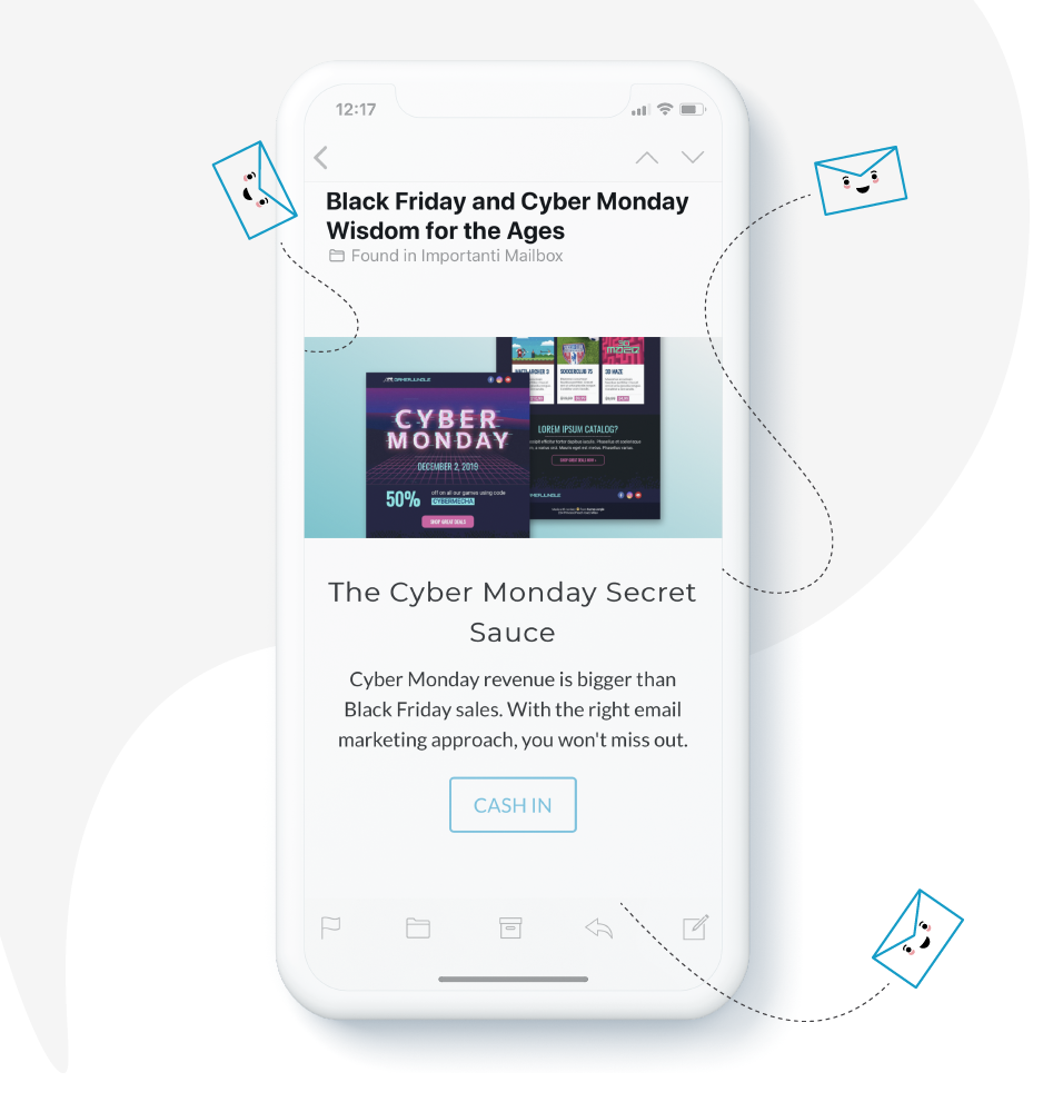
Full headers can be helpful when troubleshooting email delivery issues or trying to track down spam emails. They can also be used to find out more about an unknown sender. However, it is essential to note that forging email headers is a common tactic of spammers and hackers, so it’s always important to be wary of suspicious emails.
Some email clients, like Gmail, also allow users to filter emails based on their header information. This can be helpful for quickly identifying emails from specific senders or those with specific subject lines.
To view the full headers for an email message in Gmail, open the message and click on the down arrow next to Reply in the top right corner. This will display a drop-down menu with several options, including ‘Show original.’ That’ll open a new window with the full headers for the message. The headers will be displayed as a long list of name-value pairs, each header field on its line.
Best Email Header Design Practices
Email header design can be a tricky thing to get right. With so many different factors to consider, it’s easy to overlook something that could make a big difference in your results.
To help you out, we’ve put together a list of 17 email header design practices that you should keep in mind the next time you’re designing an email campaign.
1. Keep it simple
The first and most important rule of thumb for email header design is to keep it simple. A complicated or busy email header will only serve to distract and confuse recipients, which is the last thing you want.
Stick with a clean and straightforward design that includes only the essential elements: your logo, a brief message, and maybe a call to action.

2. Make sure it’s easy to scan
Another essential consideration for email header design is making it easy to scan. When recipients open your email, they should be able to quickly and easily identify what it’s about and whether or not it’s something they’re interested in.
To achieve this, keep your header short and to the point. Use clear, concise language and make sure the most critical information is prominent and easy to find.
3. Use contrasting colors
When choosing colors for your email header, it’s important to use contrasting colors that will help it stand out from the rest of the email content. A good rule of thumb is to use a light color for the background and a dark color for the text.

This contrast will make it easier for recipients to quickly identify the header and read the information.
4. Keep the fonts simple
When it comes to email header fonts, less is more. Stick to one or two simple fonts that are easy to read, and avoid using anything fancy or decorative.

The goal is to make sure your header is easy to read, so steer clear of any font choices that might get in the way of that.
5. Make sure it’s optimized for mobile devices
With more and more people reading emails on their mobile devices, it’s essential to make sure that your header is optimized for those devices.
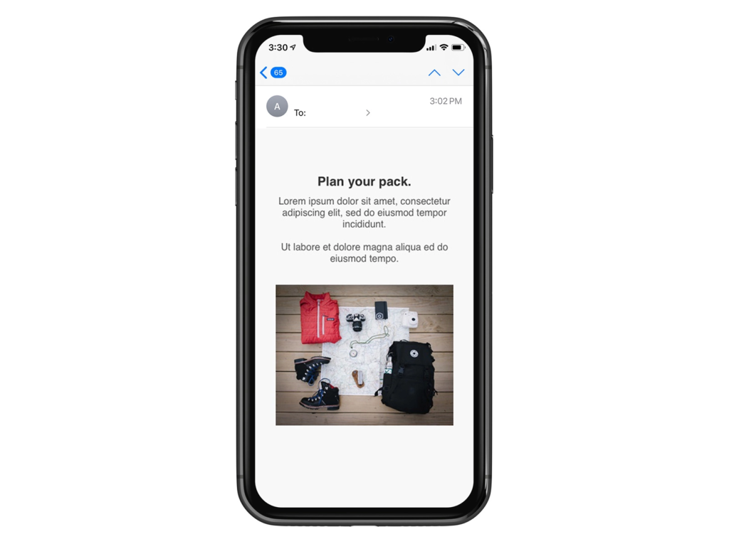
That means using a simple, easy-to-read font and keeping the design minimal so it doesn’t take too much space on the screen.
6. Use images sparingly
While images can be a great way to add visual interest to your email header, you should use them sparingly. Too many images can slow down loading times and can also be a drain on your recipient’s data plan.
If you choose to use images, make sure they’re high quality and sized correctly for mobile devices.
7. Don’t overuse icons
Icons can be a great way to add visual interest to your header, but you should use them sparingly. Too many icons can clutter the design and make it difficult to read.
Stick to one or two icons relevant to your message, and that will help recipients quickly identify what your email is about.
8. Make sure your logo is prominent
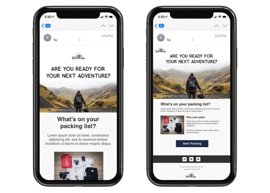
Your logo should be prominently featured in your email header so recipients can quickly identify who the email is from. Ideally, it should be placed on the left side of the header, where it’s easily visible.
9. Use a Call to Action
A call to action (CTA) is a great way to encourage recipients to take the next step with your email. Whether you’re asking them to click through to your website, download a white paper, or sign up for your newsletter, a strong CTA can help you achieve your goals.
Your header is the perfect place to include a CTA, so make sure it’s prominently displayed and easy to find.
10. Use graphics and images wisely
Graphics and images can be a great way to add visual interest to your email header, but you need to use them carefully. Too many graphics can slow down loading times and can also be a drain on your recipient’s data plan.
If you choose to use graphics and images, ensure they’re high quality and sized correctly for mobile devices.
11. Don’t forget the alt text
When including graphics and images in your email header, don’t forget to add alt text. This text will be displayed if the image doesn’t load, so it’s essential to be descriptive and helpful.
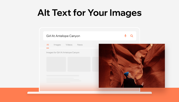
The alt text should also be brief, so it doesn’t take up too much space on the screen.
12. Use headlines and subheads
Headlines and subheads can be great to highlight the most important information in your email header. They can also help you break up the design and make it easier to read.
Use headlines and subheads sparingly, so they don’t overpower the content and make sure they’re sized correctly for mobile devices.
13. Stick to one link
When including links in your email header, stick to one link per header. This will help reduce clutter and make it easier for recipients to click through to the page you’re linking to.
14. Use a clear and concise subject line
Your headline is the most important element in your header design. It should be attention-grabbing and compelling enough to make recipients want to read more. Avoid using weak or generic headlines. Make use of good email writing tips to do that.
The subject line is one of the most important parts of your email, as it is what people will see first. Make sure it is clear and concise and tells the recipient what the email is about.
15. Test your header before you send it
Before you send your email, test your header to make sure it looks the way you want it to. Send yourself a test email and view it on both desktop and mobile devices to see how it looks.
You should also run your email through a spam filter tester like Mail Tester or IsNotSpam to ensure your header isn’t triggering any spam filters.
16. Incorporate your brand identity
Make sure that your header design reflects your brand’s personality and values. Use your brand colors, fonts, and logo to create a cohesive look. This will help your email stand out and be recognizable, even if recipients only see the header.
17. Get feedback from others
If you’re not sure whether your email header is effective or not, get feedback from others. Show it to your coworkers, friends, and family and ask them their opinions.

Are they able to quickly identify the message of the email? Is the design easy to read? Are there any elements that are confusing or distracting? Soliciting feedback can help you change your header to make it more effective.

Creating the Best Email Header Design
Email header design is one of the most critical elements of your email, so it’s important to take the time to design it properly. You can create a header to help you achieve your marketing goals by following these tips.
FAQs
Ensure that your sizing is correct. Most of the time, people ignore the email if it is not optimized for their screens.
The internal header should include sender details, receiver details, subject, and date.
Click the email you want to see the headers for. Right-click on the email body and click ‘View all headers and message.’
Latest Blogs
Learn how to rank on AI search engines like ChatGPT, Perplexity, and Gemini by optimizing your content for authority, structure, and relevance. Stay ahead in AI-driven search with this strategic guide.
Explore the best healthcare SEO services for your medical practice. Improve online visibility and effectively reach more patients in need of your services.
Discover top social media agencies specializing in banking solutions, enhancing financial services and driving engagement.
Get your hands on the latest news!
Similar Posts

Design
7 mins read
15 Best Firms Offering Design Services in India

Design
5 mins read
All You Need to Know About Data-Driven Design

Design
6 mins read