7 Landing Page Design Tips for High Conversion

Table of Contents
- Introduction
- Tip 1: Don’t Beat Around the Bush!
- Tip 2: Play Around with the Colours
- Tip 3: Use the Brand Logo Strategically
- Tip 4: Don’t Overdo it with the Visuals
- Tip 5: Edit and Format
- Tip 6: Don’t Ignore the Power of Social Proof
- Tip 7: Consistency is the Key
- Key Takeaways
- FAQs
A landing page is like a gateway to your brand. It tells a story about your product and who you are as a brand. Unfortunately, companies increasingly overlook the importance of this critical marketing element and end up designing landing pages just for the heck of it. If you read through the landing page design tips discussed in this article, you will realize just how simple it is. In fact, they are so obvious that it is quite easy to overlook them. No wonder most landing pages fail to do the job they are supposed to do from a marketing perspective.
Good landing page design tips include making your content brief, structured, and appealing. Remember that the objective of designing a landing page is to generate interest and curiosity in the viewers’ minds. And if this is clear, then there is simply no reason you would not dedicate as much time and effort to landing page designing as to spending millions on marketing collateral. This article covers the seven most effective landing page design tips to help you attract and retain your viewers.

Tip 1: Don’t Beat Around the Bush!
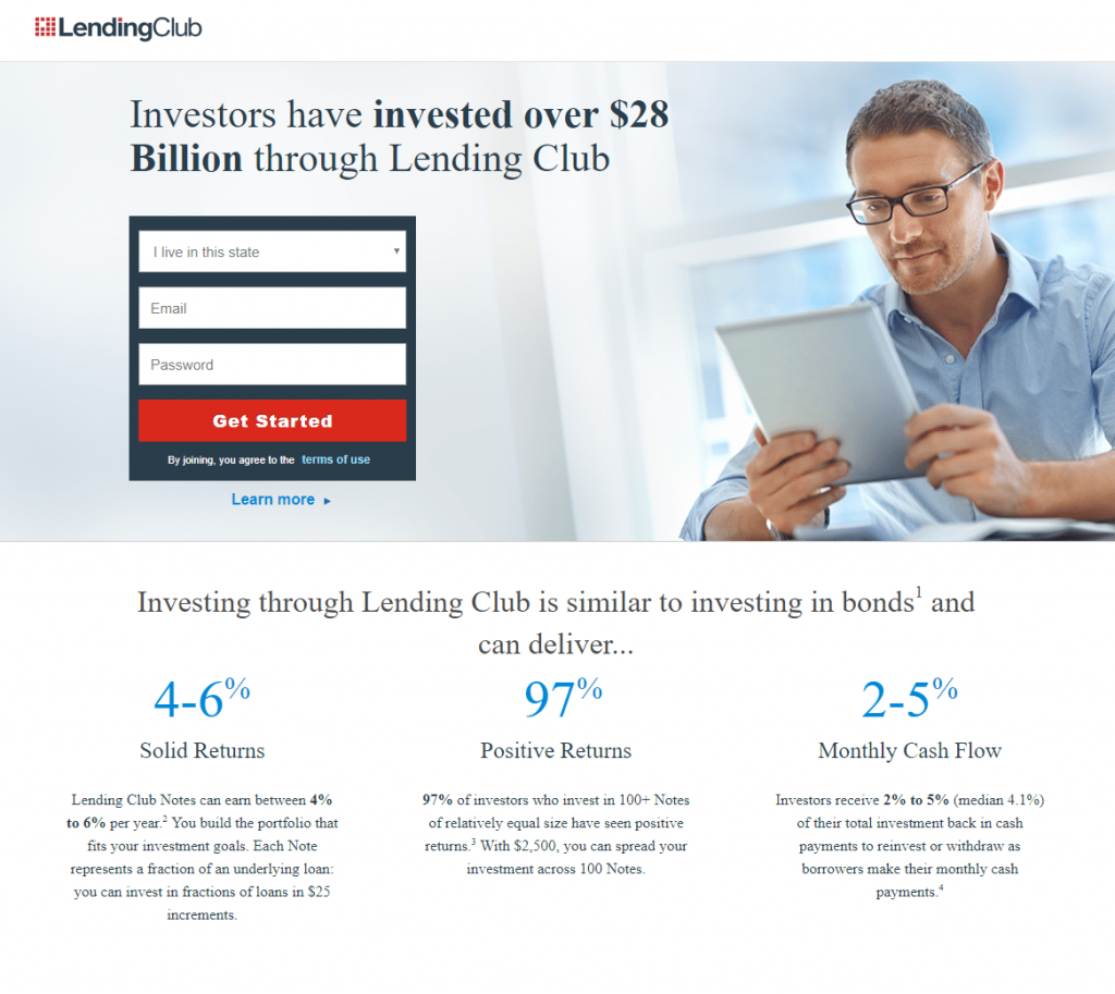
One of the easiest places to start for tips for landing page design is to stress brevity. Getting straight to the point ensures that you don’t lose the attention of your viewers. Let’s face it – human beings have extremely short attention spans. Why not use that understanding in landing page designing?
In the digital marketing era, where people are really crunched for time, they would not want to go through big content blocks. What they will be interested in, though, is to look for information just by skimming or visually scanning a page. And for that reason, this is one of the best landing page design tips. You don’t need to give long introductions to set the context. Your viewers already know what they are looking for.
So, get straight to the point. And keep it brief, and address the reason why a viewer will want to know more. A key to brevity is the ability to highlight how your product or brand will add value to the person’s life. And doing it succinctly is important. Use headers, sub-headers, and bold fonts to emphasize key points. Sticking to a structure always helps keep it brief and to the point. The image shows how briefly but efficiently the data and hence, the main points are captured.
Tip 2: Play Around with the Colours
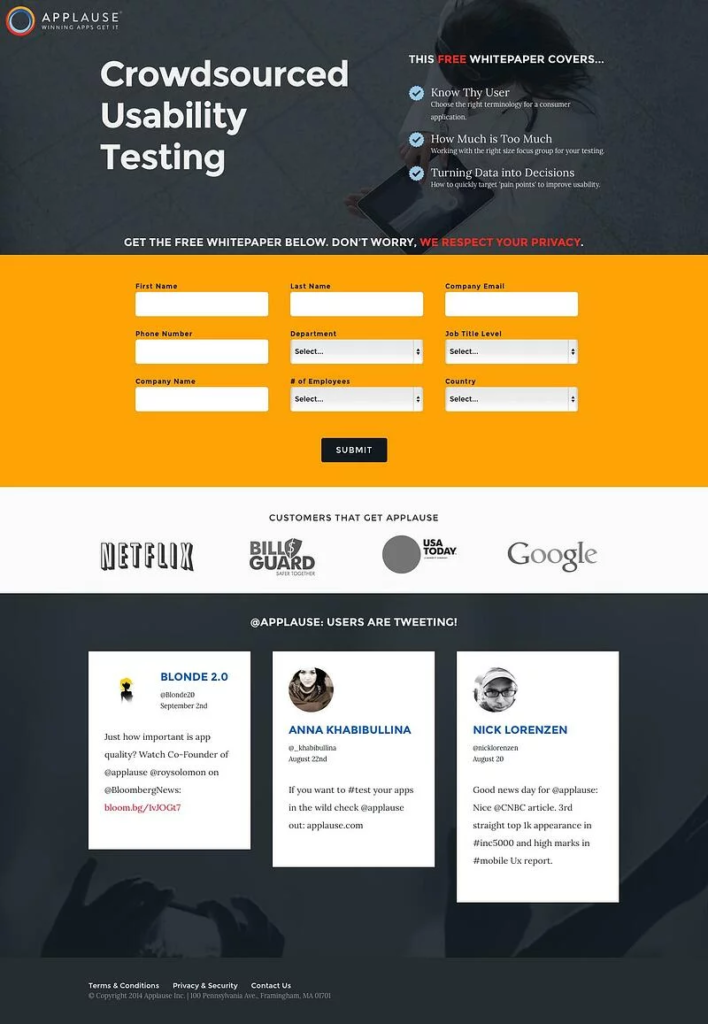
What stands out for you in the above image? One of the key landing page design tips has to do with the colors you use and how they will appeal to your viewers. A smart way of doing this is always to keep your CTA (Call-to-Action) button or the section where you want to capture contact details contrasting colors. Notice how the entire page is in shades of grey except for the section highlighted in yellow, which captures viewer details. Use contrasting but complementary colors to capture the attention of your visitors quickly. This type of landing page design will enable the final outcome, capturing viewer details, pop out in the form of a button or a link, etc.
Tip 3: Use the Brand Logo Strategically
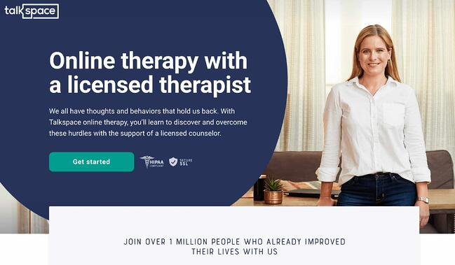
Your landing page should literally scream your brand name. And the easiest tips for landing page design are those that ask you to put your logo out there in the face of the readers. Your readers must look at your logo instantly when they land on your page. This means that your logo should be placed strategically on the landing page. It doesn’t have to be the main attraction of the page, but at the same time, it should be visible clearly. And in a way that viewers keep hovering around it organically. Again one of the effective landing page design tips, as is visible from the above example, is that it’s important to highlight the core value of your business. Try not to move the logo too much across pages to give it a more consistent feel.
Tip 4: Don’t Overdo it with the Visuals
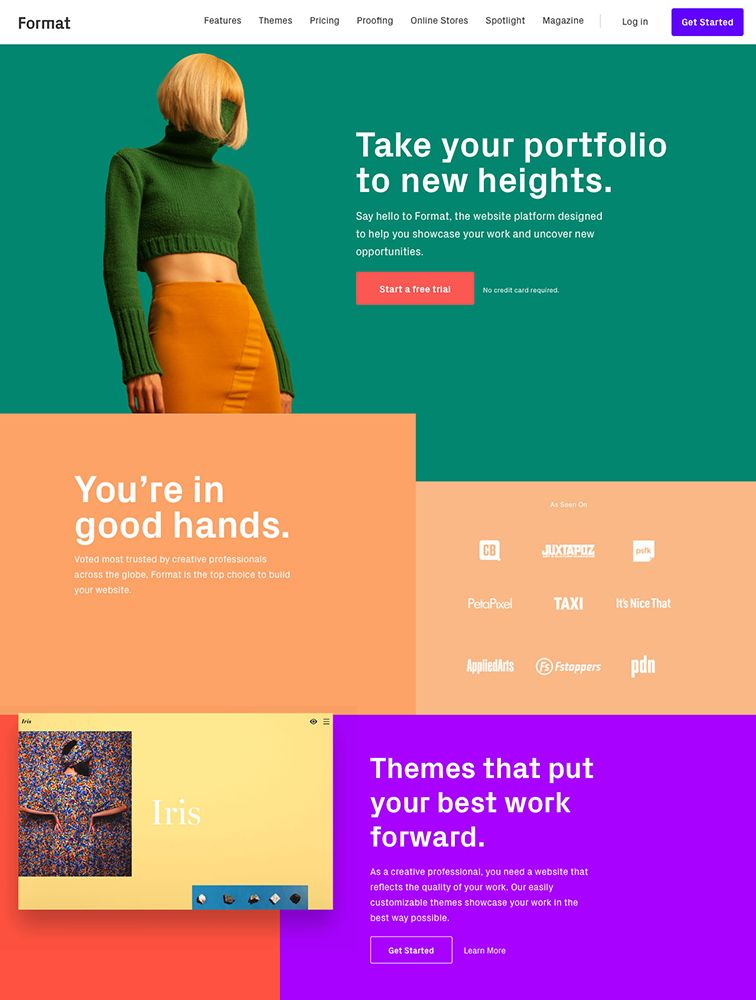
What stands out in this example is how simply the business’s core value proposition has been put forward. Visuals are critical to good landing page designs, but it is important not to go overboard. You need to avoid visual clutter to increase conversion. Too many images and loud colors may distract the visitors and are not recommended as effective landing page design tips. The other problem with too many graphics is that it increases the load time on your website – an absolute no-no when it comes to landing page designing. A study conducted by the Aberdeen Group brought out a very interesting statistic. It said that even a one-second delay in load time of your webpage might lead to a whopping 11% fewer page views. What’s worse is that there could be a decrease in customer satisfaction by as high a margin as 16% and a 7% loss in conversions. All this for a mere one-second delay in load time!
Tip 5: Edit and Format
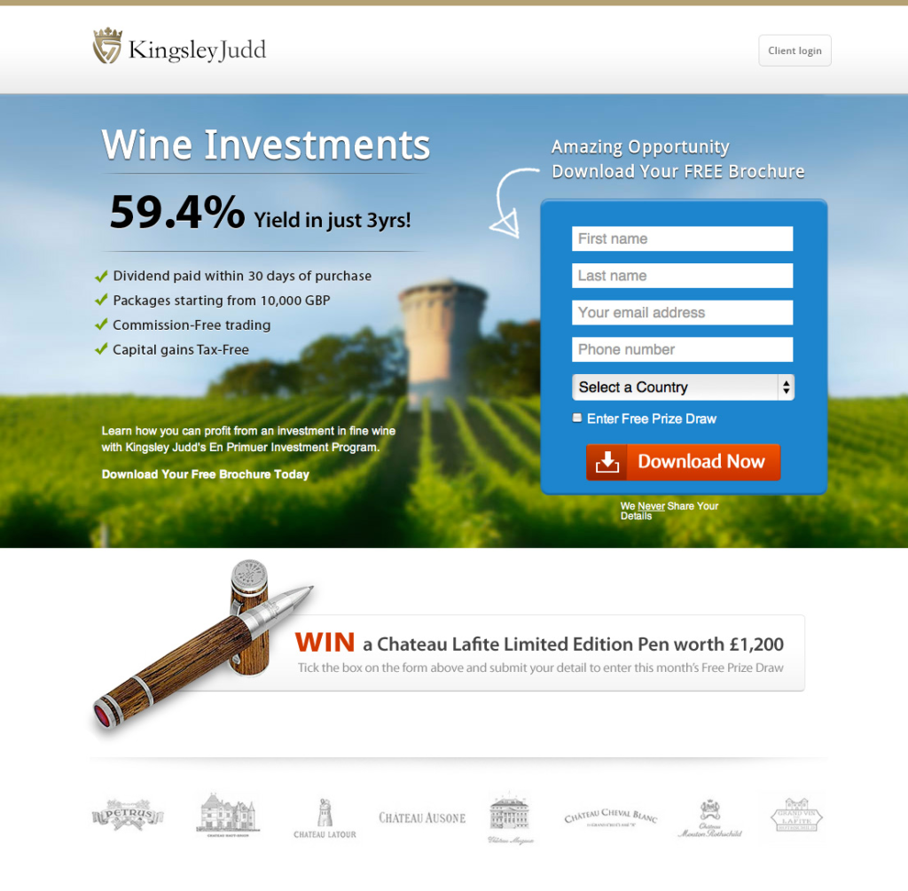
One of the most effective landing page design tips and probably the most obvious is the importance of formatting. Good landing page design tips must always be about well-formatted pages. It takes little effort to edit and format a page into an organized piece, which can go a long way in achieving the desired outcomes. Everyone likes to read through well-organized content into relevant sections, has compelling copies, well-aligned images, and a logical flow. Use bullet points, wherever possible, to keep things crisp and to the point. Aesthetic formatting is one of the best tips for landing page design.
Tip 6: Don’t Ignore the Power of Social Proof
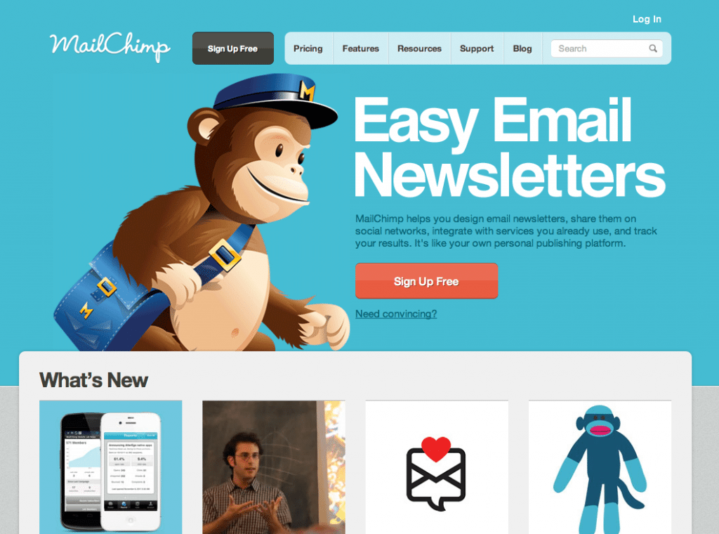
Just like case studies or customer reviews, social proof can be embedded as a very compelling content of your landing page. Adding third-party credibility to your content helps build your brand image, thereby increasing conversions. You can also embed social media links from Twitter or Instagram, or any other platform of your choice. You can share screenshots of good customer reviews. The landing page of the email marketing site, MailChimp, is filled with testimonials and recent updates from the digital marketing domain, which makes the content relevant and leaves the viewers asking for more. This ultimately leads to conversions and makes this one of the smartest landing page design tips.
Tip 7: Consistency is the Key

Consistency in the page layout is also crucial in landing page designing. This is directly linked to its performance. If you alter the page elements too much, it makes it difficult for visitors to navigate your website. It confuses them too much, and they are more likely to leave the page, thus hampering your conversions. Look at this landing page from Shopify – it is consistent with its colors, fonts, and layout. It, in fact, captures most of the landing page design tips discussed so far, which will probably result in higher conversions.
Key Takeaways
Here is a summary of what constitutes good landing page design tips:
- Landing pages offer a quick summary and sneak-peek into what’s in store for the visitors.
- Landing page design tips are important to lay out the page’s objective and design an appealing page.
- It is important to be brief and to the point to retain your visitors’ attention and finally lead them to conversions.
- Put some thought into the colors you use on your landing page to make them contrasting and complementing.
- Your Call-to-Action (CTA) button should ideally be in a color that pops up and readily catches the eye.
- Place your brand logo strategically on the landing page and other pages of your website, and be consistent with the position throughout.
- Don’t go overboard with the visuals – avoid too many images and over-the-top graphics, lest they become a distraction for the visitors from the main point.
- Edit and format your page into well-organized sections, using headers, sub-headers, and highlighted fonts.
- Use social proof as embedded links on your landing page to increase the weightage of your brand value.
- Being consistent helps your visitors navigate smoothly and finally contributes to conversion.
If these landing page design tips make sense to you, then dive right in. And start designing a compelling landing page that boasts of your brand value. The conversion will flow automatically.
FAQs
A good landing page design maximizes conversions by hooking visitors with a well-structured and highlighted design.
You can design a good landing page by using contrasting colors bullet points to be brief, placing your logo strategically, and using social proof.
You can improve the readability of a landing page by minimizing different fonts and increasing the white space.
Try to include plenty of white space, and use minimalist colors that are contrasting, yet complementing.
Use pop-up colors like red, green, orange, etc., to highlight your CTA buttons to increase conversions.
The most effective landing page design tips include brevity, consistency, usage of social proof, contrasting colors, and logo placement.
Latest Blogs
Explore how Google’s 2025 AI search updates triggered ranking chaos. Learn actionable strategies to adapt your SEO for AI Overviews, zero-click searches, and SERP volatility. Stay ahead now.
Learn how to rank on AI search engines like ChatGPT, Perplexity, and Gemini by optimizing your content for authority, structure, and relevance. Stay ahead in AI-driven search with this strategic guide.
Explore the best healthcare SEO services for your medical practice. Improve online visibility and effectively reach more patients in need of your services.
Get your hands on the latest news!
Similar Posts

Design
7 mins read
15 Best Firms Offering Design Services in India

Design
5 mins read
All You Need to Know About Data-Driven Design

Design
6 mins read