Table of Contents
- What Is a Landing Page?
- Advantages of a Landing Page
- 5 Tips For a Good Landing Page Design
- Conclusion
- FAQs
Landing pages are essentially first impressions. All interactions take place based on conclusions derived from these first impressions. Online businesses with consistently good traffic and conversions always create an excellent first impression. For a digital marketing campaign to be impressive, it must be user-friendly, easy to navigate, and contain relevant information.
What is a Landing Page?
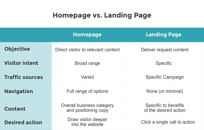
A landing page is an online marketing tool designed for lead capture and driving conversion. Landing pages and homepages are entirely different concepts. The homepage is the front page of a website with any number of internal pages. It serves as the main page with basic information about the website and links to all the other pages on the site. A homepage has multiple functions. In comparison, the landing page is a different concept altogether. The biggest distinction between a landing page and a homepage is that a landing page is a standalone web page.

Being a standalone web page, a landing page can only hold limited information. Therefore, landing pages have only the most relevant information required to attract visitors to fulfill a particular call to action. Unlike homepages that contain information and links to multiple features or pages, a landing page puts its laser focus on the most crucial information or link. This eliminates the dilemma and distraction caused when irrelevant information is presented to a user. This lack of distracting content makes it easier for a landing page to convert traffic into an action that fulfills a particular call.
Landing pages are often presented to specific user groups through search engine results, targeted online advertising campaigns through emails or social media, or advertisements on websites.
Advantages of a Landing Page
1. Better initial impressions
First impressions are essential to create and maintain a good brand image. Displaying content that distracts or confuses visitors is detrimental to creating and maintaining a good brand image. Landing pages display what the user wants to see and strategically places opportunities to fulfill the desired CTA.
2. Better lead conversion rates
The strategic placement of content attracts users to heed the call to action. Landing pages offer a higher chance for traffic to be converted into a desired action such as a purchase or subscription.
3. Meticulous branding
As landing pages are designed to target specific user groups, they provide a meticulous branding opportunity that conveys an image of credibility as it addresses user pain points in the first visit itself.
4. Better SEO
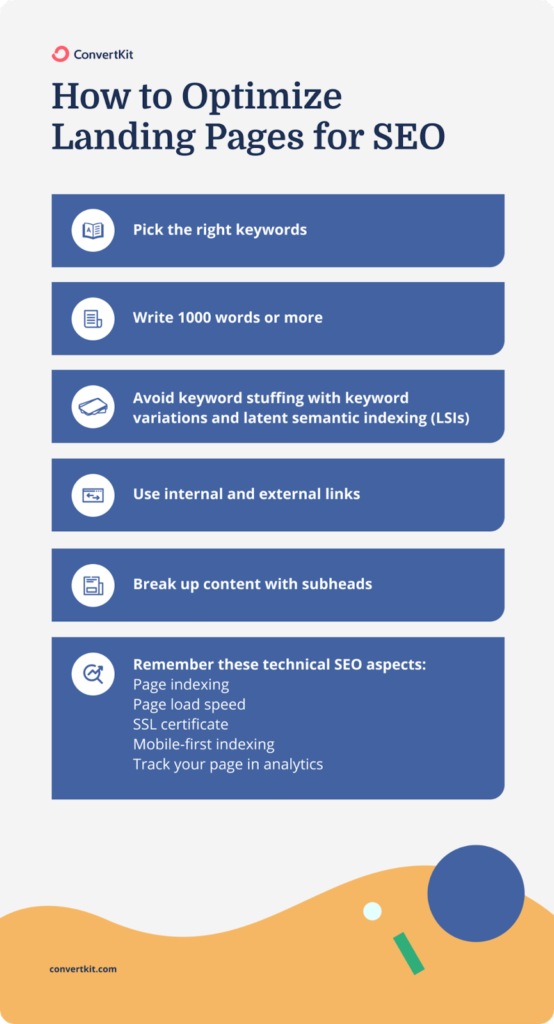
Good landing pages display optimized content for better reach through search engines. Content on landing pages is crisp and to the point, making it easy for search engines to display them among relevant results.

5 Tips For a Good Landing Page Design
Building a good landing page is a balancing act. Designers and programmers must pay attention to multiple factors that attract good organic traffic volumes and persuade them to fulfill the required call to action. The solution lies among multiple factors ranging from content optimization to fonts and color schemes of the page.
The following five tips cover all the critical aspects of designing a good landing page:
1. Simplicity is key
A minimalistic design is a major attraction for visitors to use the CTA. Creating a simple webpage does not require a lot of design experience. Instead, focusing on some simple elements will get the work done.
Using a lot of white space around the area of focus will prevent users from getting overwhelmed by too much information. Use a flat design to keep the page simple and functional simultaneously. Take care not to oversimplify the page. Oversimplification can make your landing page difficult to use.
2. Build trust and credibility
Your brand may be unfamiliar to users, making it difficult for them to trust your brand. Placing something users trust on your landing page is one way of building trust and credibility. These are called trust signals, and they could include anything from mentioning a trusted payment gateway as your payment partner or strategically placing analytics and customer reviews on your landing page without distracting the user from the CTA.
3. Optimized CTAs
Conversion of traffic to action is the end goal of a landing page. Optimizing the CTA for users to know exactly what they are required to do is a surefire way of getting them to heed the CTA and respond to it. The CTA has to be specific and capable of piquing user interest. Placing the CTA in the right place is also an important step.
4. Engaging content
Oversimplifying your landing page will prove to be counterproductive. Using only text to present your offer or advertisement could make users lose interest in your landing page and, consequently, your product or service. You could use simple images or animations to keep users engaged as they interact with your landing page.
5. Use contrasting colors and legible fonts.
Contrasting colors make your landing page visually attractive and make the information more accessible. Black lettering on a black background renders the content invisible. Using fonts that users can easily read is also important in conveying the right message.
Key Takeaways
- A landing page is an online marketing tool designed for lead capture and driving conversion.
- The homepage serves as the main page with basic information about the website and links to all the other pages on the site.
- A landing page’s most prominent distinction is that it is a standalone web page.
- A landing page puts its laser focus on the most crucial information or link. This eliminates the dilemma and distraction caused when irrelevant information is presented to a user.
- Landing pages offer a higher chance for traffic to be converted into a desired action such as a purchase or subscription.
Conclusion
Landing pages are highly specific online marketing tools with a high traffic conversion rate. A good landing page could provide the right first impression to users and result in more responses to the CTA. A good landing page also helps build brand image and trust. A good landing page must follow a simple design pattern and have a clear CTA, engaging content, trust signals, and a clear message.

FAQs
A homepage is a multipurpose page on a website. A landing page is a standalone webpage with the sole purpose of traffic conversion.
In this context, conversion refers to users’ visits translating to an action that fulfills the CTA.
CTA or call-to-action is the factor that persuades users to take a particular action based on the content.
A good landing page is effective in converting traffic to the desired action. This can be credited to a simple design, targeted keywords, and a clear call to action.
A trust signal is something that makes your landing page credible and trustworthy. This could include logos of trusted brands that your brand is associated with.
Colors and fonts contribute to the aesthetic value and the clarity of the message and the CTA.
Latest Blogs
Learn how to rank on AI search engines like ChatGPT, Perplexity, and Gemini by optimizing your content for authority, structure, and relevance. Stay ahead in AI-driven search with this strategic guide.
Explore the best healthcare SEO services for your medical practice. Improve online visibility and effectively reach more patients in need of your services.
Discover top social media agencies specializing in banking solutions, enhancing financial services and driving engagement.
Get your hands on the latest news!
Similar Posts

Design
7 mins read
15 Best Firms Offering Design Services in India

Design
5 mins read
All You Need to Know About Data-Driven Design

Design
6 mins read