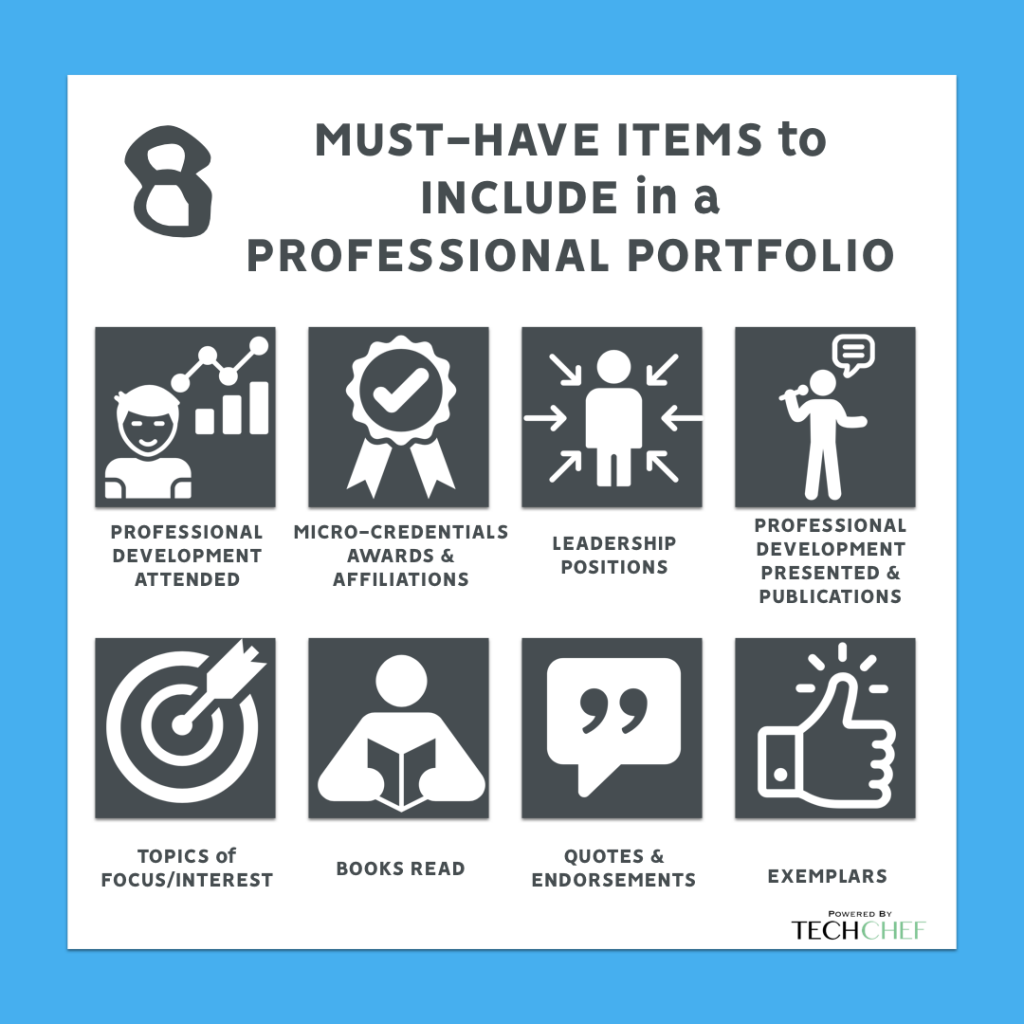
One way to get more work as a freelancer is by having the best portfolio. And this does not mean just having more work to show, but making the portfolio look and feel attractive. Clients looking for talent go through hundreds of profiles every day, so it is essential to have your portfolio stand out. Let’s call this process “showing off.”
3 Top Tips to Create the Perfect Portfolio
We can break the process down into three phases.
1. Show what’s good
A portfolio is not just about showing everything you have done but cherry-picking the best work. This could be anything from the names of the clients, your published work, or your achievements. Your portfolio does not need to be a barrage of information. The above portfolio by Stephanie Breckler is the perfect example of minimalistic yet effective documentation of work.
Keep in mind that quantity is not always essential. Focus on the quality. Have fewer pages and fewer selections; just make sure that whatever you include in your portfolio is relevant. For instance, if you are a graphic designer, winning an essay contest in college is not relevant information for your portfolio: it’s just a way to fill up space.
Here are some sections you can focus on when making a portfolio:
- Introduction
- What you are working on currently ( essential for freelancers)
- Work (divided by types of projects)
- Past clients
- Sample work
- Personal strengths
- Contact information

To further understand how to grow your portfolio and reach out to more clients, you can refer back to Elevate, a summit hosted by Pepper Content. Prominent speakers like Roshan Abbas, Ankur Warikoo, and Suchita Salwan had many insights to offer.
2. Show it well
Now that you have all the information you need, find a way to present it well. You cannot expect to submit a Word file and win a potential client’s attention. The portfolio should have a perfect balance of aesthetics and readability.
You can use a combination of two or three colors instead of keeping the portfolio monochromatic. Use logos of past clients rather than just their names. You can use tools like Canva or appoint a professional design service to make the portfolio better-looking.
The ideal format for the portfolio is a PDF file. Add links, images, graphics, etc., to showcase information in a more interesting manner. To ensure scannability, consider using bullet points, tables, and charts.
3. Show more than your work
Your portfolio is not your résumé. Think of it as a dating profile, but for a professional setup. You have to add your own personality to it too. Make the portfolio as “you” as possible. Share personal stories, achievements, and strengths, along with your career-related details.

Finally, before sending your portfolio to clients, send it to a few trusted friends and run multiple proofs. Doing so will help you get rid of spelling and grammatical errors, enhance readability, and make sure the document is sound design- and structure-wise. Follow these simple three steps, and you’ll be on the road to making an impressive portfolio!

Latest Blogs
Learn how to rank on AI search engines like ChatGPT, Perplexity, and Gemini by optimizing your content for authority, structure, and relevance. Stay ahead in AI-driven search with this strategic guide.
Explore the best healthcare SEO services for your medical practice. Improve online visibility and effectively reach more patients in need of your services.
Discover top social media agencies specializing in banking solutions, enhancing financial services and driving engagement.
Get your hands on the latest news!
Similar Posts

Freelancing 101
5 mins read
11 Resources For Designers to Find Freelance Jobs Online

Freelancing 101
6 mins read
30 Freelance Industry Statistics to Get You Started

Freelancing 101
5 mins read