
Do you have designer’s block and lack creativity for your next eBook design? Fear not! Even the finest of writers and designers have it.
It’s admirable that you want your eBook design to match the excellent material, but designing an eBook is no easy undertaking. You must address everything from font and text size to unique graphics, photos, and colors.
To assist you in developing eye-catching eBooks, here are a few steps which you need to take care of with content and users in mind.
The design of eBooks, reports, manuals, or any other material that you consume is as vital as its content. Do not prioritize one over the other. Posts that are poorly written but well designed will not affect your viewers and vice versa.
How To Design an eBook: Top 10 Tips
Here given are the top 10 tips for designing an eBook:
1. Follow your brand’s rules!
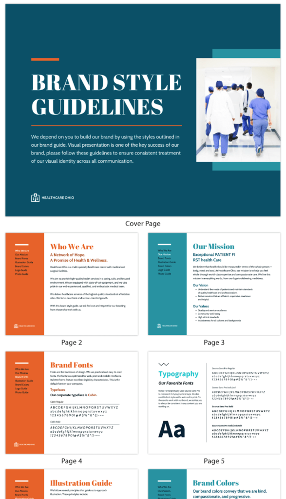
But don’t make them all the same! While designing an eBook, the devil is in the details, as you will learn. Keep the style consistent, but modify what you can to make it appear unique. Your material will seem professional, trustworthy, and most importantly, recognizable as readers go from case studies and research reports to thought leadership pieces and white papers.
Establish the brand style of your marketing assets. It includes corporate fonts, header size, primary body text size, colors, business or partner logos, icons, and photography/imagery — and then build your eBooks using these building blocks. Consider using specific title positioning or assigning a corporate color to each eBook to differentiate them. Have fun and follow the brand standards!
2. Keep the front cover basic and appealing

The front cover of your eBook should entice people to download it or flip the page. What’s the best way to do so while creating an eBook? A stunning image is an answer.
In a bookshop or music store (yeah, we think they still exist), you’ll notice the intense and aesthetically appealing front cover against the one with a blank backdrop. We are drawn to visuals on a page because they capture our eye and attention.
There are, of course, exceptions to this rule. An eBook with a white backdrop and a title in substantial bold letters may be as appealing. Thus, picking the right front depends on your website’s design, brand requirements, and overall company image when designing an eBook.
3. Consider your eBook thumbnail
You should think about having an eBook thumbnail while designing an eBook. The thumbnail is a smaller version of your eBook image that allows website visitors to click through to the main eBook. It should inform the website visitor what they should click on and why they should care.
4. Use multiple font sizes to help your readers
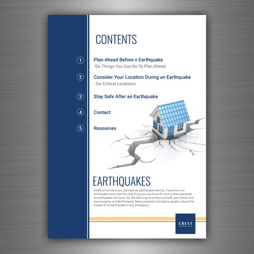
It is a valuable tip for your website, landing pages, and eBooks.
Paragraph content and headers can assist you in leading your readers. While designing an eBook, try to make pull-outs and facts stand out, use larger, bolder fonts to emphasize their relevance to the reader.
But why is it significant?
It is irritating to download an eBook that seems appealing, engaging, and thought-provoking, only to get a PDF with lots of text in size 11 typed on a white backdrop. The lack of headers, sub-headers, or even pull-out quotations or analytics makes it difficult to assimilate the information on the page. Designing requires attention to detail.
5. Don’t forget the pictures
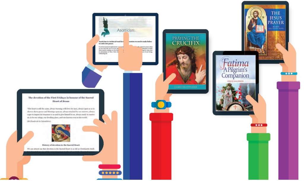
You should also use headers, subheaders, pull-out quotations, strong fonts, and other features to guide the reader. You can utilize artwork to break up text and help distribute it more equally while designing an eBook.
Also, users will remember and recognize your eBook based on its appearance rather than the text contained on the page. Use fantastic artwork, and don’t scrimp on it. Poor photography instantly devalues your eBook’s design.
6. Make use of customized graphics
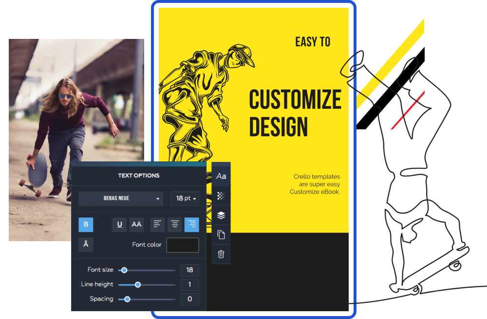
Icons and images are great ways to emphasize your points. Using little symbols and visuals with facts, statements, numbers, and statistics can help them stand out and capture the reader’s eye.
For example, infographics are a great information format. You should use graphics to convey information quickly and clearly. Infographics produce a lasting impression on readers because they use visuals and link them to particular information.
According to a study by the UK’s Content Marketing Institute in 2018, infographics are among the most widespread content marketing arrangements for B2B marketers.
7. Make use of white space
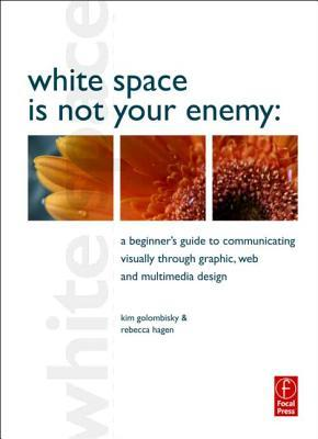
We like bright colors and huge graphics, but sometimes a little white space is just as good. While you want to incorporate lots of text, headers, photos, pull-outs, quotations, and figures, you also want to keep things orderly.
Take a peek at Apple’s website. Apple uses high-quality photos, bright fonts, and colors but keeps its design simple, allowing visitors to focus on the content without being distracted.
The NVIDIA website is another. Main page banner image with compelling call-to-action and four photos. The banner picture is separated from the thumbnail photos underneath, allowing visitors to focus on each provided item.
White space keeps eBooks (and other content assets) looking clean, sophisticated, and readable.
8. Don’t go crazy with color
Colour is vital too, but not too much!
When developing corporate material, only utilize brand colors. You should stick to two or three significant hues to keep things consistent and fluid when website users navigate from web pages to eBooks while creating an eBook.
Colour can be used to draw attention to certain areas of the page. While red can emphasize, blue can be used to create a conservative backdrop. When designing an eBook, the use of colors can help convey information on the website and create content assets.
9. Make it easy to share
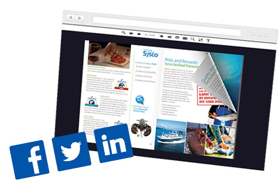
If you invest time in generating great content, make it easy to distribute.
If you didn’t know, PDFs might contain internet links to other websites and social sharing buttons so users can easily share the eBook landing page to Twitter, LinkedIn, and other sites. Share the landing page and not the PDF itself to find out who’s viewing it!
10. Make it distinct
Your rivals and comparable firms may also be designing eBooks, studies, and guides, so you must ensure that your material is distinctive and of excellent quality.
If you follow your brand rules to the letter, your work will be consistent, and your target audience will learn who you are and what you do. If your design is uneven, sloppy, or amateurish, it will reflect poorly on you and reduce downloads of your content assets.
Yes, great content is critical, but so is a robust and consistent design. The aesthetically pleasing design supports high-quality content: cool colors, captivating photos, structure, white space, and bespoke graphics.
But not too much. Make your eBooks seem professional and straightforward. Good design doesn’t draw attention away from the content but instead highlights it.
Follow these ten designing eBook tips recommendations and stay true to your brand requirements.
Key Takeaways
The availability of eBooks in widely recognized formats and the vast advances in the e-reading experience has been the reason behind the enormous growth of the eBook industry today.
There are a few things to take care of before developing an eBook.
Listed below are some crucial elements to your eBook’s success:
- Designed for reading on the go.
- A flow of the text
- Reading is possible both online and offline.
- Compact sizing
- Singular packaging
- Use a standard and available technology.
- Low-cost production
- Widespread availability
Designing an ebook requires a few extra tips, such as:
- Pick a topic that suits your audience
- As you write, try to outline and break down each chapter
- Design your eBook with fantastic colors and pictures
- Don’t forget to use quotations and stats
- Include suitable CTAs in your eBook
- Make it a PDF
- Make an eBook landing page
- Promote and track your eBook’s success
FAQs
The aesthetically pleasing design supports high-quality content: cool colors, captivating photos, structure, white space, and bespoke graphics. But not too far. Make your eBooks seem professional and straightforward.
The marketing eBook is also known as ePaper.
Currently, eBooks are considered digital versions of online publications, though many other titles are used for content marketing. Among others: FlipBook, ePaper, LookBook, etc.
From a small beginning, eBook sales now reach millions annually, with a global market worth $18.13 billion by 2020. A solo eBook entrepreneur may quickly obtain a portion of that market.
The Write Practice defines a small print book as 25,000 words (about 100 pages). The average length of short eBooks varies by category, from 123 pages for children’s novels to 519 pages for big and meaty law eBooks.
Creating an eBook involves structuring material to make it an effective tool in your content marketing mix. Electronic books (eBooks) are digital files containing long-form content. The eBook design may be one of the most acceptable methods to create company leads when done right.
eBooks are responsive and generally have extensive topic guides. Popular eBook subjects include SEO, inbound marketing, and eCommerce. HubSpot’s ‘YouTube for Business’ booklet is one example designed for desktop, e-reader, and mobile reading.
The typical Kindle eBook is 300 pages long, 75,000 words, and has a 2.6 MB download size.
Although a completed eBook is automatically copyright protected, registering it with the US Copyright Office verifies it and qualifies the copyright owners for damages and legal expenses.
Latest Blogs
Explore the best healthcare SEO services for your medical practice. Improve online visibility and effectively reach more patients in need of your services.
Discover top social media agencies specializing in banking solutions, enhancing financial services and driving engagement.
Explore top B2B content marketing agencies of 2024. Engage decision-makers with impactful, high-quality content strategies.
Get your hands on the latest news!
Similar Posts

Books and Ebooks
5 mins read
7 Tips on How to Write an e-Book Successfully in 2022

Books and Ebooks
6 mins read
A Complete Guide to the Perfect Professional Ebook Cover Design

Books and Ebooks
5 mins read