Top 3 UI Design Case Studies for Every Creative to Read

Table of Contents
- Importance of UI Design
- Examples of UI Design Case Study
- Key Takeaways
- Conclusion
- FAQs
You have heard time and again how companies like Spotify, Airbnb, Dropbox, Netflix, etc., dominated the market with their solid product design from the beginning of their product development. Outstanding interface design aided them in creating a platform that piqued people’s interest in no time. They are exceptional UI design case studies to take inspiration from for anyone.
User Interface Design is about creating an interactive experience through an interface with clear and simple choices for the user. It revolves around the proper placement of a text field, radio buttons, sliders, icons, tags, notifications, menu bar, message boxes, modal windows, search field, toggles, footer, lists, etc. All these elements directly impact the user’s interaction and overall experience.

Importance of UI design
A good user interface gives its users a sense of control. They feel more at ease, learn faster, and gain mastery over the product quickly. It saves their time, reduces confusion, improves customer experience and satisfaction. An efficient user interface increases conversion rate and SEO functionalities. Strategic planning and accurate decision-making at the initial stages act as brand differentiators, resulting in increased sales and revenue opportunities.
A successful user interface design contributes to a positive user experience and can attract new customers. The effort made to provide a consumer-tailored interface could increase the overall business reputation.
An intuitive and user-friendly interface causes fewer problems and frustrations for designers at later stages. When done correctly, the projection of the user interface design reduces costs, time, and effort, implying that the strategic decisions made at the start of the project determine the cost and performance in the future. All in all, it makes the software efficient, functional, aesthetic, accessible, and stylish.
As a UI designer, you investigate all possible interactions and behaviors of the user with a product to create a prototype that best adapts to the user’s needs. Your product has to be easy to comprehend, access, and operate, in which most of the decision-making is automatic. However, a good UI design is hard to achieve when a product requires constant updates of new features.
Sometimes, it’s tricky to integrate complex functionalities into one product. You may cripple with the decision-making of elements to be revealed or concealed. Which one should you hide or put under a menu? How many orders of action are possible? Which order is the best for wireframing? You will have to make too many decisions for feature placement, size of buttons, typography, color, ease of access, and to ensure low cognitive effort.
Examples of UI Design Case Study
In such a situation, learning from a previous UI design case study and its outcome can alleviate your mental blocks. Let’s look at the following UI case studies and find what you can learn from them.
Case study #1: Designing A Better Cinema Experience
Designer Ariel Verber recognized some pain points with booking cinema tickets in Tel Aviv, Israel, where he lives. He pointed out a tiresome ticket booking experience in his UI case study.
The user had to feed all the information like movie name, time, theater, location, etc. Also, after going through the entire process, there was no guarantee of confirmed ticket booking. He picked up the most popular cinema app – Cinema City, to improve its UI/UX design for a seamless cinematic experience.
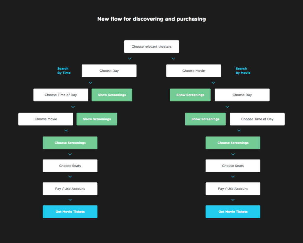
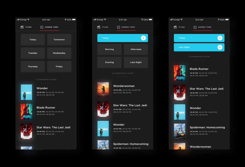
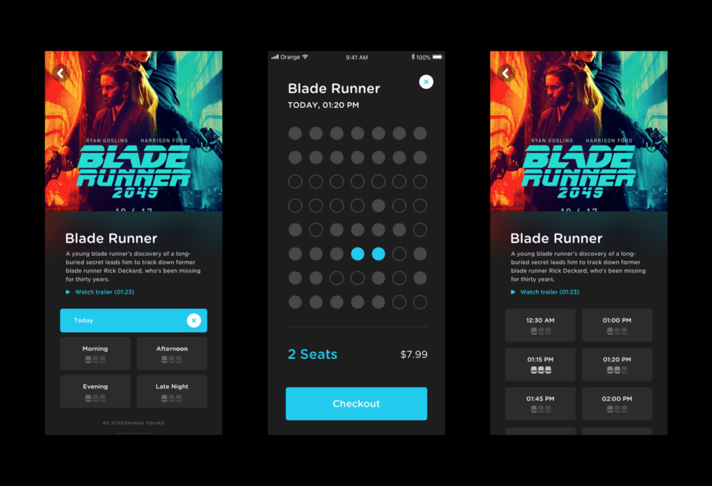
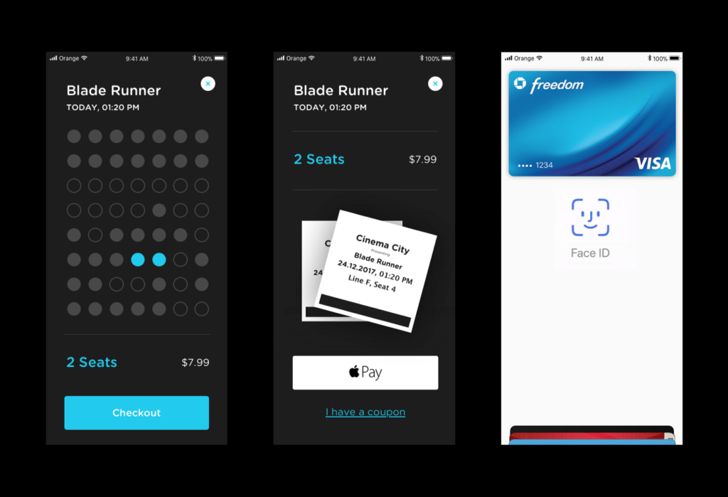
So, he decided to segregate the browsing functionality into ‘Search by Title’ and ‘Search by Time’ in his new UI design. That helped the interface become simple and easier to navigate. He further reduced the cognitive load by replacing the date pickers with large buttons displaying weekdays for the current week. He introduced morning, afternoon, evening, and late-night buttons under the ‘Search by Time’ category. Besides each screening tab, he added beautiful graded icons showing seat availability. Lastly, payment through Apple Pay or Google Pay was the icing on the cake.
Case study #2: Simplifying The Jambb Score
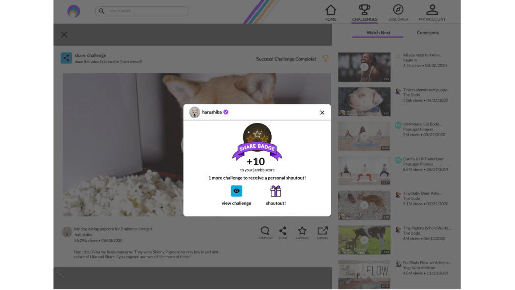
Finna Wang and her team of UI designers designed an incentive for the fans of famous comedians to join Creator Aggregator Platform – Jambb. This platform aims to help creators grow their communities by rewarding 99% of fans who contribute in non-monetary ways.
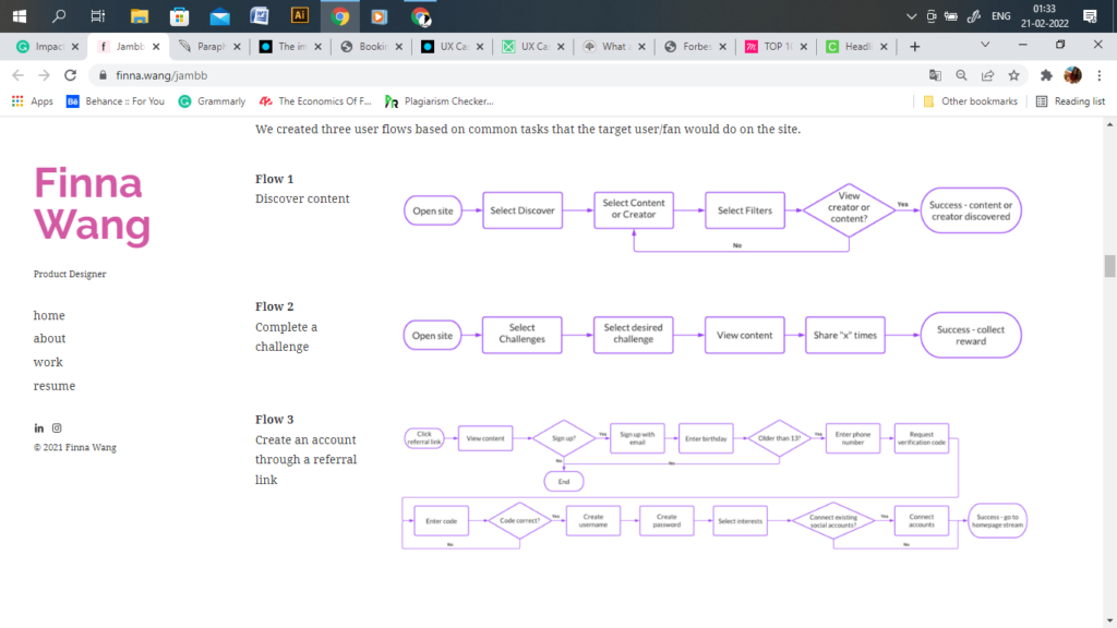
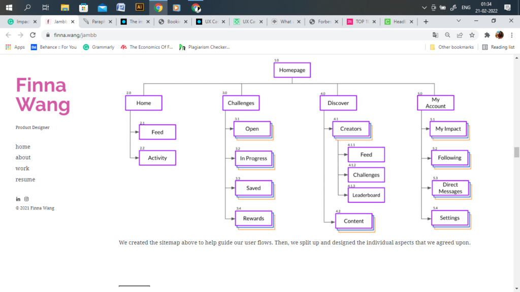
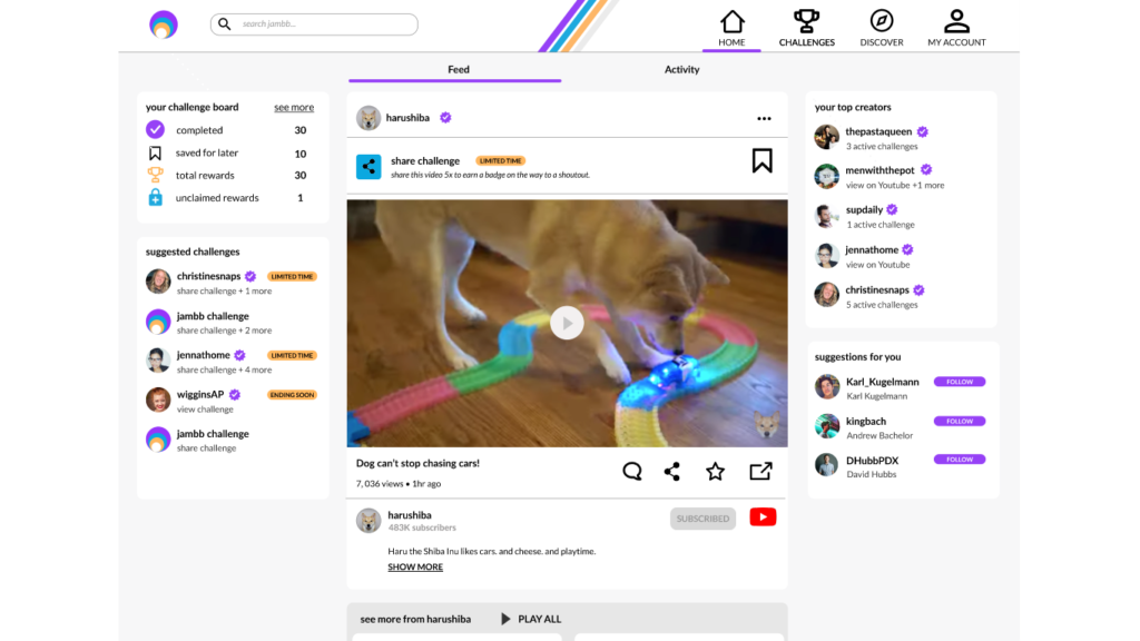
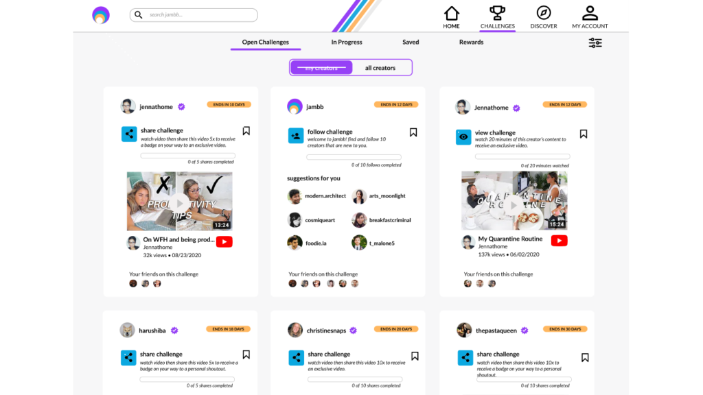
Finna Wang redesigned the Jambb interface after taking inspiration from YouTube. They introduced a “Jambb score” – that represented the attribution given to individual creators by the fan. Then they placed a button to access the onboarding tutorial to clarify the Jambb score.
Her team created various symbols that were applied throughout the site, such as typography, colors, and buttons. They turned these symbols into components and assembled them into the display cards seen throughout the prototype.
She, with her team, improved the basic UI to an interactive UI that enabled creator-wise easy content access. Furthermore, the ‘My Account’ section displayed the number of times this user has attributed each of his favorite creators.
Case study #3: Redesigning Cooking Application
While having dinner with his wife, designer Vitaly Dulenko thought of creating an application that could advise him what to cook. He thought how amazing it would be if you’d pick ingredients from your refrigerator and get some recipes instantly. He wrote the user flow to add the following three crucial functionalities:
- Finding interesting recipes quickly
- Search for and edit the ingredient you’ve chosen
- Adding your ingredients and recipes
He created paper prototypes of the cooking app and validated them by user testing. After testing and concluding the findings of his case study, he came up with a clean and light UI design.

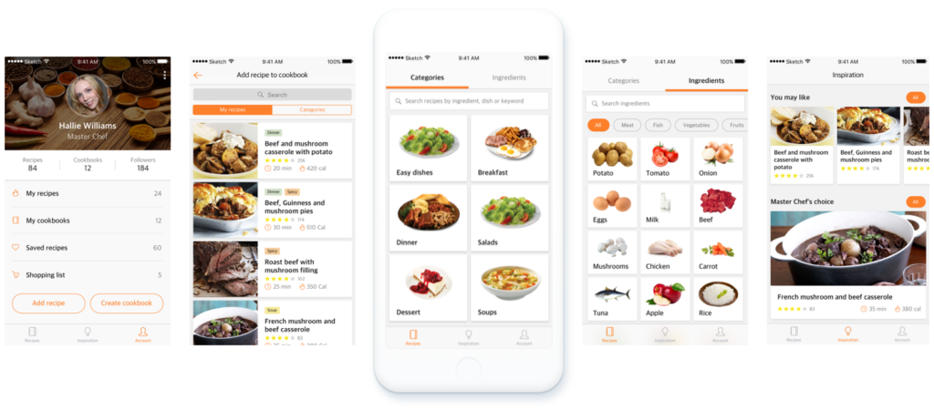
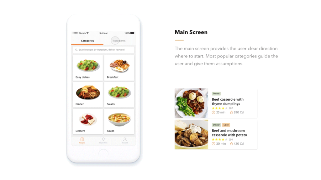
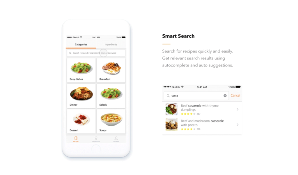
The Main Screen was designed with two visual columns: Categories (means breakfast, lunch, dinner, etc.) and Ingredients. It provided a clear direction to the user as to where and what to look for.
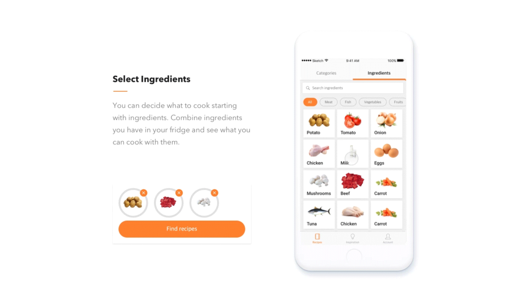
With the “Select Ingredients” feature, a user can decide what to cook by combining the ingredients in the fridge. Moreover, he clubbed auto-complete and auto-suggestions functionalities in the Smart Search Feature.
Key Takeaways
- User Interface Design is about creating an interactive experience through an interface with clear and simple choices for the user.
- A successful user interface design contributes to a positive user experience and can attract new customers.
- It saves their time, reduces confusion, improves customer experience and satisfaction.
- The effort made to provide a consumer-tailored interface could increase the overall business reputation.
- A good UI design is hard to achieve when a product requires constant updates of new features and a minimalistic appearance.
- You can take lessons from a previous UI design case study to help streamline the design process.
Conclusion
The goal for UI designers today is to produce user-friendly interfaces: interfaces that encourage exploration without fear of negative consequences. An efficient UI design provides the user a seamless experience, saves time, reduces cognitive load, and improves overall satisfaction.
In turn, this helps you to increase the number of people who use your product. To create a good design, you investigate all possible interactions and behaviors of the user through detailed prototyping and user testing. Never assume user behavior while designing.
You can assimilate complex functionalities in your design by researching a similar UI design case study. They can provide you with some direction and alleviate your mental blocks. Doing research and testing prototypes may be time-consuming, but it’s the best way to create an accessible, functional, and aesthetic product that users will love.
FAQs
It refers to the input, navigational, informational, and stylistic decisions that a designer makes when creating a product. Interaction design, visual design, and information architecture are all combined in UI design.
UI design case studies help the employers/recruiters understand the skills of a UI designer to solve interface problems. They also serve the designer and showcase their problem-solving skills and visual design talent in their portfolios.
It typically includes an introduction to the concept and the team, project description, UI design decisions, customization features, wireframing, card creation, adding engaging photos, explanation of the modifications, and a brief discussion of the impact. A UI design case study can vary from one another.
An efficiently designed user interface saves user’s time, reduces confusion, improves customer experience and satisfaction. It makes the software efficient, functional, aesthetic, accessible, and stylish.
The interface design of your software or hardware product can make or break your business.
Latest Blogs
Learn how to rank on AI search engines like ChatGPT, Perplexity, and Gemini by optimizing your content for authority, structure, and relevance. Stay ahead in AI-driven search with this strategic guide.
Explore the best healthcare SEO services for your medical practice. Improve online visibility and effectively reach more patients in need of your services.
Discover top social media agencies specializing in banking solutions, enhancing financial services and driving engagement.

