9 Guidelines for Exceptional Web Design

Table of Contents
- Introduction
- 9 Best Practices for a Great Web Design
- Lucidity in Design
- Attaining Visual Order
- Easy to Navigate
- Call for Consistency
- Responsive Designing
- Web Accessibility
- Conventionality
- Maintaining Credibility
- User-centricity
- Key Takeaways
- Conclusion
- FAQs
As a professional designer, when you design or redesign a website, you are concerned with both the web design guidelines and the aesthetics. Is the red a shade too dark, or should the logo tilt another 5 degrees to the left? Is it OK if I put an animated figure bang on the middle of the page?
Did you know that there are close to 1.8 billion live websites worldwide and at least five times the number of visitors? It is not enough if your website looks nice; your web design ideas must include usability and easy accessibility. More importantly, it’s crucial to think about how much people would enjoy interacting with your website – and that’s what user experience (UX) is all about.
While a design institute may train you in the basics of design and demonstrate some creative website design ideas, you still need some website design guidelines to help you design a stunning website people would love to visit.

Here are 9 website design guidelines worth following:
9 Best Practices for a Great Web Design
1. Lucidity in design
There’s no doubting that your website must look stunning, but no one is interested in looks alone. The purpose of their visit has to be fulfilled, or they will leave disappointed.
Lucidity or simplicity in design means web design ideas that avoid unnecessary design elements with no purpose. Such features can only be overwhelming to a visitor and hinder them from accomplishing whatever they were hoping to in the first place.
From a design point of view, considering UX, clarity in design can help you more than you imagined. With unnecessary page elements, it is pretty challenging to be simple. You can apply simplicity in various forms like:
- Choosing colors prudently, or using very little of them, as popular website design guidelines from experts advise, use not more than four to five colors in your design.
- Selecting legible fonts and leaving out all the flashy, artistic curls and swishes on purpose. So, adhere to the barest minimum when picking or choosing your script fonts. And while determining the text color, ensure that it contrasts with the background, which gives better clarity. Website design guidelines recommend using no more than three typefaces.
- Graphics are appropriate only if they serve a specific purpose for the visitor, like helping them perform any task like a call-to-action, and not for the sake of displaying your graphics skills.
2. Attaining visual order
Attaining visual order or perfect hierarchy is related to the principle of simplicity. It simply means that you must organize all the website elements in a specific order, giving the visitor the liberty of gravitating towards the most relevant information first.
It is crucial to optimize your website for usability and user experience (UX) because the goal is to lead your visitors to complete the action they have in mind. They should enjoy the act and do it effortlessly, without feeling forced to do so. It is pretty easy to adjust the color, size, and position of a particular button or any other element to structure your website and render it easy for visitors to reach for it.
The example below for Spotify shows just the heading “Spotify Premium FREE” and the other details in the text are not so prominent. It is meant to grab the visitor’s attention, and that is just what it does. Of course, it features a CTA button that the visitor will click by default, which makes the action complete. Nine out of ten visitors will click on the CTA button out of curiosity, if not to subscribe.

3. Easy to navigate
According to web design guidelines, you must plan innate navigation on your website to enable visitors to find the information they need. There’s no point in a visitor landing on your web page to be clueless about what to do next. Website design ideas would include making navigation from one point to another effortless. You can achieve a navigation-friendly design by following web design guidelines to keep your website’s navigation structure as simple as possible, preferably at the top of the page. In any case, it would make sense to have a second navigation point at the bottom (footer), just for convenience.

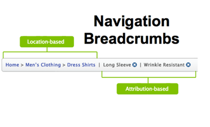
You may want to think of incorporating breadcrumb navigation on all pages to enable them to retrace and find their way back without too much of an effort. Visitors should be able to search for anything specific using the search bar at the top However, simplicity plays a role here as well; hence, having too many navigation options can only confuse visitors rather than help them. Similarly, interlinking your web pages is a great idea since visitors can navigate between pages without hassle.
4. Call for consistency
The call for consistency is loud and clear, whichever web design guidelines you refer to because you have to achieve an overall consistent look and feel throughout your website. Besides the backgrounds being similar, the color schemes and typefaces too must remain uniform. What’s more, the style and tone of writing in the content on your website also have to be consistent, as it helps bring about a positive impact on user experience and usability.
However, it does not mean that you should replicate the same colors and designs on all pages, which will make the pages look too much alike and have a silly effect. The trick lies in having uniform layouts for specific pages (e.g., Informational and landing pages). It is easier for visitors to find what they are looking for quickly and effortlessly when the layout is consistent. That’s the benefit of following web design guidelines, which have evolved from thorough research.
Take, for example, the homepage and other pages of any website’s travel booking sitemap depicted below, and you’ll notice the same layout applies for almost all the pages, which is common practice with most travel booking websites.

5. Responsive designing
According to Statista, 48% of views globally were from a hand-held device like a smartphone or tablet. HubSpot research indicates that 93% of the people viewing on mobile devices left because there was not enough clarity in the display.
If you want to provide an unforgettable experience, you must make your site compatible to view from a mobile device, and this is what responsive designing is all about. Responsive designing takes the trouble to achieve an extremely flexible website structure, regardless of the additional cost. When you use responsive design for your website, the content will automatically resize according to the device’s screen size. Using mobile-friendly HTML templates is an easy way to accomplish this. There are, of course, some people who believe in creating a unique mobile website as their budget permits it.
Whatever you do, don’t fail to provide the ultimate experience, regardless of the device your target audience uses. In addition to being mobile-friendly, ensure that your website is compatible with any browser, be it Google Chrome, Firefox, Safari, Avast, or any other. If you haven’t tested your website across browsers, now is the time to do it because it lets you know how your website looks and feels.

6. Web accessibility
Web accessibility is a practice that helps the designers design a website that can be accessed by any visitor, especially those with disabilities or limitations. It involves religiously following a specific set of web design guidelines and principles to ensure people with disabilities or limitations get a fair chance to gain a similar experience as those without such limitations. Accessibility is one of the most important goals for a web designer, as it ensures equal access to all.
The very idea of designing a website is to make it accessible to anyone, regardless of their lack of abilities or the limitations they have that may hinder them from having an enjoyable browsing experience. Web design guidelines dictate that it is the responsibility of a web designer to keep such users with disabilities in their UX purview.
Accessibility must not be limited to one or two pages; just like responsiveness, it should be uniform throughout the site, including the page format, visuals, site structure, text, and images. The web design guidelines for accessibility, known as the web content accessibility guidelines set by the World Wide Web Consortium, state:
- The content must be perceivable to make visitors aware of the website content.
- Operability is crucial, and the website functionality must be flexible in different ways.
- Ensure that the content posted on your website is easily understandable.
- Your website must be easy to access across various browsers, devices, and assistive technologies.
At Pepper Content, we provide outstanding website content writing services for your website. We have the Widest network of website content experts and 100% original content.

7. Conventionality
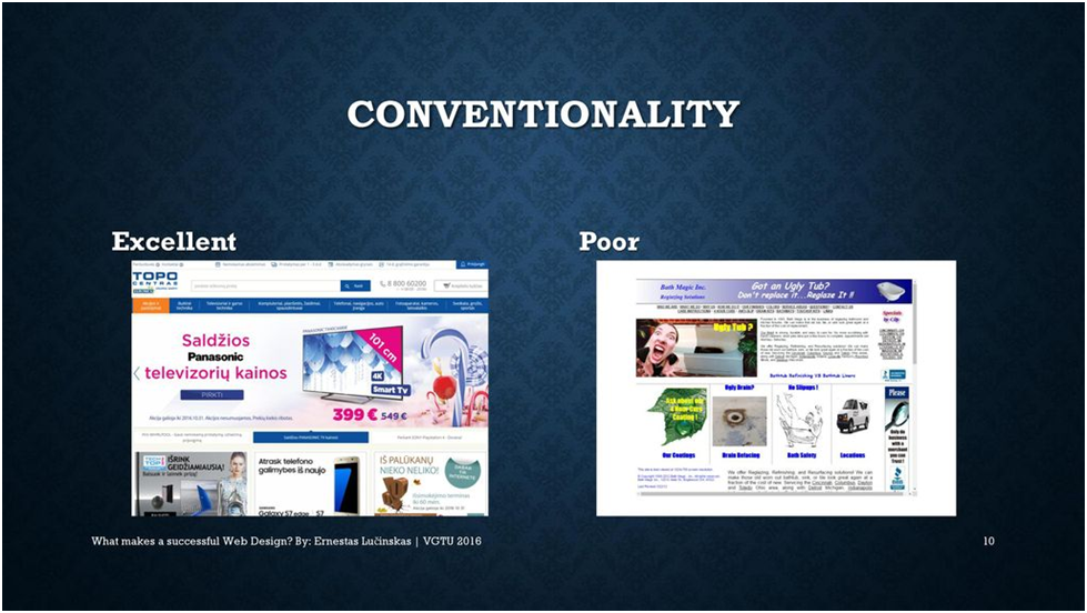
One of the biggest challenges web designers face is striking the right balance between originality and expectations. With most people being Internet-savvy today, they are all too used to certain conventions, some of which include:
- Positioning the main navigation on the top left corner of the page
- Positioning the logo on the top left corner, or middle of the page
- Creating a clickable logo enables you to bring back the visitor to the homepage.
- Having flashy links and buttons that change color as the cursor hovers over them.
- Having a familiar shopping cart icon displayed prominently (on an e-commerce site) shows the number of items added to the cart.
- Ensuring users can manually rotate slides by clicking on the image slider buttons.
Some designers who are sticklers for originality and like to be different would never use the above conventions, which can cost them dearly. The trick lies in showing your ingenuity and creativity within the conventional parameters.
Let’s look at another crucial field in design, the architecture part. Building codes exist to enable visitors easy access to spaces. A designer must be well-versed in deploying these codes to keep the visitors safe and comfortable. It is a delicate balance to meet user expectations without jeopardizing them while they are on your website. The trick lies in never putting the use to any discomfort, which can only frustrate them and force them to leave.

8. Maintaining credibility
Sticking to the conventions adds credibility to your website. Your website must appear trustworthy for people to browse without any inhibitions. And according to web design guidelines, one of the best user experiences you can give your visitors is by adding credibility to your site.
One of the easiest ways of establishing credibility is being completely transparent and being honest and open about the products and services you offer. You can’t have a visitor browse all your web pages to find out what you do or offer. You must clearly show that right on the homepage and dedicate some space to describe what you do and what’s on offer.
Some websites don’t believe in displaying a price list as the prices are subject to change, and they don’t like getting caught off guard. However, one of the best website design ideas you should consider is having a dedicated pricing page, which can be updated periodically. Also, ensure that the pricing page links to your homepage. Displaying your prices boldly (pun intended) on your web page adds more credibility and makes people believe you are trustworthy.
9. User-centricity
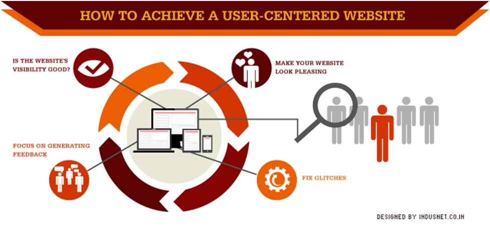
Ultimately, user experience and usability are personal preferences of the visitors, hence all the more reason to design for their benefit, rather than yours.
While they are not mandatory, the web design guidelines described above are a great place to start. However, the best way to test your website is to conduct user testing and collect testimonials and feedback from end-users. It helps you improve the website’s performance by making suitable changes based on the responses.
It is not a great idea to try and test usability as you are basically a designer. Leave the testing part to testers who haven’t had a chance to see the website and won’t be biased while testing.

Key Takeaways
Designers must provide a good user experience. Especially with smartphone users increasing by the day, you must ensure your site is compatible with hand-held devices, which you can accomplish through responsive designing.
Conclusion
Following the above guidelines should help you form the structure of your web pages and build a website promising an excellent user experience. Choosing the right typography and color are essential to designing a stunning website, but making it functional is essential.
FAQs
The basic web design guidelines you must adhere to include designing a website that understands users’ needs. To give your users a great user experience, make the design as simple and functional as possible. Another crucial point to remember is to ensure that your web pages load fast because slow-loading web pages result in higher bounce rates, forcing people to leave abruptly.
One of the basic thumb rules for good web design ideas is the visibility of system status. The website design guidelines include providing error messages in plain, understandable language. Your text must have large fonts and be jargon-free. Never use long sentences that confuse readers. Make sure the instructions are always in bold.
Aesthetics is one of the basic web design guidelines that highlight the pleasing qualities in the design. To have aesthetics in place, you must pay attention to factors like color, pattern, scale, movement, balance, shape, and visual appeal. Aesthetics are added compliments that complement your web design ideas by focusing on usability and also enhancing functionality by using attractive and functional layouts that don’t deviate from the standard web design guidelines.
Ensure that you give your visitors an interactive experience by engaging them with interesting information on your web pages. Using animation on the clickable portions helps make the experience engaging. To display a unique brand personality, you must create original illustrations instead of repurposing stock images. Try to have a uniform style and color on all your web pages to ensure uniformity, reflecting a consistent brand voice. One of the best creative website design ideas is using a unique font, which helps add a different personality to your website to make it stand out.
The key to writing UX guidelines lies in making them accessible to users without distinct abilities. In other words, make it accessible to all people in general. Your writing must be suitable for people of all reading levels, which is possible by avoiding unnecessary jargon and industry-specific terms that confuse laypersons.
Latest Blogs
Learn how to rank on AI search engines like ChatGPT, Perplexity, and Gemini by optimizing your content for authority, structure, and relevance. Stay ahead in AI-driven search with this strategic guide.
Explore the best healthcare SEO services for your medical practice. Improve online visibility and effectively reach more patients in need of your services.
Discover top social media agencies specializing in banking solutions, enhancing financial services and driving engagement.
Get your hands on the latest news!
Similar Posts

Design
7 mins read
15 Best Firms Offering Design Services in India

Design
5 mins read
All You Need to Know About Data-Driven Design

Design
6 mins read